Trends in Logo Design
by Margaret Penney | April 6, 2016
This year’s trends appear as off shoots of a sort from previous years and logo designs seem to be effected by digital representation more than ever. Let’s take a look at some of the main logo design trends for 2016.
Clean, Flat and Colorful
Clean, flat and colorful logo designs are one of the most popular visual approaches for companies, especially those within the IT sector. The use of color really makes these designs stand out on the page and screen.

Google Logo
The color also gives the designs some visual interest and edge and enlivens what would otherwise be a fairly basic approach. This design style continues to be popular, because they are UI friendly and look great on the screen and at a variety of sizes, including mobile, which is key.
Tip: When creating logo designs in this style letter placement and spacing becomes really important since there are so few elements to the design.
Hand-Lettered Logos
On the opposite end of the spectrum, logos in a hand-drawn style continue to gain favor. Fashion, home goods, food, entertainment and music businesses can be seen with logos in this current style. Hand-drawn logos speak to a realness and non-digital all natural reality that is the right look for an artisanal food company, for instance.
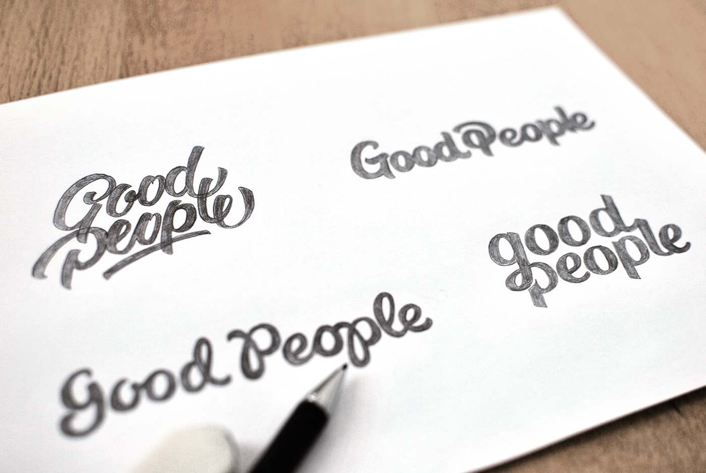
What is different in the logos we are starting to see this year is the sheer mastery of the hand-drawn script style. Take a look at this logo design for entertainment company Good People as a solid example of really clean, well-formed hand-drawn lettering. What we are also seeing this year is heavier hand-drawn logos which speaks to the development of the craft. Logos render better at different scales with a bold mark, so beefier hand-drawn logos, like the one for Good People, are an advancement in the style.
Tip: Learn basic guidelines for hand-lettering from one of Sessions College’s graduates, Dawn Nicole.
Monoline Logos
Monoline logos are in essence a contemporary reinterpretation of an ornate classical mark. The designs take their inspiration from the symbolic elements found on emblems, crests, monograms and badges from the past.
Icons that represent the church, state and the animal kingdom are represented. The style of a monoline logo is clean and minimalist, the line width is just wide enough to render well on screen and print.
Minimalist Wordmarks
Minimalist wordmarks are becoming more popular in fashion, interior design, furniture, architecture and the arts. Stylish, austere and reductive they play with letter placement and framing to create visual interest.
Tip: Clean, bold san serifs with balanced geometries are used in this design style.
Negative Space
Negative space logos never really go out of style since so many iconic logo designs have used this technique. Still, this year we are seeing an uptick in this design style again and designers using programs like Illustrator to really push the possibilities of this design style.
Offset Logo Designs
Logos in this category use Illustrator’s offset path to create clean monogram style logomarks that make the letters appear to be striped and weaved. This design style has a visual personality that appears retro modern with a hint of glamour. Offset letters have a lot of visual interest yet still are relatively easy to read.

Logo by Hello Creative
Tip: One thing to be aware of with this design style is that when the lines are quite thin, these logos will not render as well at small sizes.
Well, this concludes our 2016 logo design forecast. Hope you are feeling inspired and ready to break open your sketchbook and start your next logo design project.
Sources:
Just Creative, Logo Lounge, Creative Bloq

Margaret Penney is the Managing Editor of Notes on Design. Margaret is a teacher, designer, writer and new media artist and founder of Hello Creative Co.
Recent Articles

