Instructor Interview: New Approaches to Teaching Photoshop
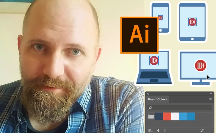
Instead, he’s come up with an innovative approach to introducing students to Adobe’s powerhouse program. We asked him about his new course.
Q: Now that Photoshop is a household name (and a verb), you would think it would be a simple, intuitive program. And yet it’s still a challenge for any newbie. Why?
That in itself isn’t an easy question. But part of the answer is in the question. Photoshop is a household name because it’s been around so long, and been so successful at so many things. And even though it’s accessible for anyone to use, it’s still a high-end professional tool. We take it for granted now, almost twenty years into its regular use.
It’s really our expectations that are deceiving. It’s a challenge for new users because there are some basic concepts that need to be understood before you get to the point of being fluent with it. And those concepts are not necessarily obvious. They’re kind of geeky. But once you get the idea of, say, resolution, or raster versus vector, then you start to get the idea of how this thing works. And then, how you can take advantage of it.
The first time you use it, it’s a bit daunting. But the way I developed the course, I start off with jumping right in, and photoshopping. We take objects from one context and put them in a totally different one. That’s photoshopping. And it’s pretty cool. In fact, even after all the years I’ve spent staring at my computer screen, moving pixels, it’s still cool. It’s still fun. And it still surprises.

Q: What were some of your main objectives in developing this class?
My first objective was to make Photoshop accessible, and fun. I want to empower the students right from the start. I want you to get in, and start photoshopping images, making scenes that are fun, and credible, but totally imagined from the scraps of images you have. From that point on, we get into some of the technical tools and the different features, but I did my best to build from one lesson to the next, building on the skills we start with, then translating them into some more sophisticated techniques as we go.
I want the student to realize that even though you see these high end sophisticated tools, sometimes the simplest, basic tools and techniques get you the best results. When you start mastering layer masks, you’re in the big leagues.
Q: Describe your model Photoshop student. What does he or she have to do to ace your class?
Is there really a model Photoshop student? It’s more about attitude and approach than anything else. Since Photoshop can seem so large, so daunting, so powerful, it’s best in my opinion, to have a sense of being an explorer, or an adventurer.
Dive in, take a few steps further than you’re comfortable with. As long as you take certain precautions or steps to ensure that you can undo (or at least trace back a few steps, since you really only get one undo in PS), you shouldn’t have fear. I appreciate the curious spirit. And I value a sense of levity and humor in work. So I suppose if you want to “ace” my class, bring your intrepid spirit wrapped in a sense of humor, and be bold.

Also, take your time when you’re working. Let it envelope you. When you present your work, do your best to make it seamless, and believable. I guess what I would ask is for you to be not just the creator, but act as a viewer as well. Take some time before you’re finished, to get away from the work. then come back to it, with fresh eyes, and see if it works for you, as a viewer. That’s more the technical aspect of it. No seams.
Q: What’s your favorite class project—can you describe the assignment and what skills it addresses?
I enjoyed each one of these assignments. They all come from real life work that I’ve had to do for clients. None of this is just academic. I suppose the multiplicity assignment is the most fun, since it asks you to create a small scene, which at its best tells a story. But also when creating that, I love the feeling of magic when using the brush, figures seem to appear out of thin air. But then, I also love just fiddling with the Zelig assignment, where we put you into a famous or recognizable photo. Then again, the colorizing lesson is another that I love. Taking a black and white and filling it in with some reality…I suppose I can’t have a favorite. It’s all Photoshop to me.

Q: How does the Photoshop of today (version 13) compare to the version 1.2, the first version you used? How much have Photoshopping fundamentals changed over the years?
Though I started in version 1.2, layers weren’t introduced until version 3.0. I remember writing a review of Photoshop back in 1994 for Digital Imaging Magazine, and the title was “Three Point OH”. We were guileless in those days. And it was exciting. Before layers, I would have to copy a piece of an image into memory, then paste it while holding the option key. That opened up a secret dialog window that let me composite the pasted image, using level and curve controls. It was a different world.
Today, we’re still doing the same thing, only we use layers and blend modes, masks and such, and we have more controls, and adjustments. But the fundamentals are still the same. Pixels are pixels.
But it’s also important to know a little of the history.
Since its invention, Photoshop has expanded its repertoire. Originally it was designed for print work. So you’d be working in RGB, and then when you were ready to go to print, you’d convert it to CMYK. Actually just before the Internet’s global popularity, we used it for what they called “Multimedia”, as in CD-ROM, presentations. But then the Web came along, and Photoshop did its best to encompass that field as well.
At first, it wasn’t that good at it. The transition from print to Web was never as easy as you’d want it. And creating files and Web site designs was better left for other applications, like Macromedia Fireworks. Dreamweaver was also developed at Macromedia. So if you follow the history, you know that Adobe bought Macromedia outright, bringing the best digital imaging tools into the Photoshop fold. And we see that now. The Save for Web and Devices was originally a feature of Fireworks. Slicing images was a Fireworks invention. It goes on.
But what you see is that Photoshop has expanded from just print and multimedia, to the Web. That is really the greatest difference from Photoshop’s humble layerless beginnings to its all inclusive and ubiquitous domination of the digital world. If Photoshop were human, would it have the cackling laugh of a mad scientist? Or is it just that I’ve spent too many hours using it?
Q: Possibly.. since Photoshop has so many bells and whistles, anyone can lose sight of the end goal. How do you keep the focus on creativity in the Photoshop course?
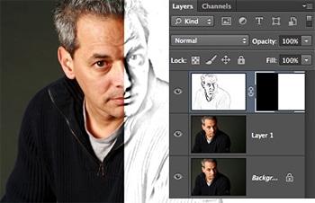
I tried to keep away from the prefabricated filters and highly complex tools. Using the basics of layers, of selection, of masking and blend modes, it keeps you focused on the image, rather than the tools that got you there. I’ll admit, it’s easy enough to fall in love with the tools. As designers, we all fall in love with our tools. I also write and draw, and I have an obsession on pens and pencils. I could spend as much time in an art or even office supply store staring at the pens, as I might in a bookstore.
The reality is that the piece we intend to make, the drawing, or composited image, is the thing that lasts. The process is ours, and that of course keeps us enthralled as we work. But the piece in the output is the one that we show, and that we look at again and again. It’s that intended piece that keeps us focused. So with that said, the trap of falling in love with the extraordinary tools that Photoshop affords us makes us easy prey.
I suppose I don’t have an answer, at least not while working. The proof or maybe the escape from the trap is in what we end up with. Is the piece we make believable? Does it say what we wanted it to, without distraction? Those are the aims and the questions that keep us on track, and safe from being caught in the technical trap.
Q: In the class, you made extensive use of video to present challenging concepts. What made video an effective teaching choice?
As I was working on the Photoshop course, Sessions College Director of Education Tara McKay acted as my editor and confidante, my consigliere, if you will. And as we came up with the idea of the Context Corner, a sort of summing up of the lessons, with a contextual bent, we came to see that it was a bit dry, and sometimes a bit technical.
The last thing an online course should be is a textbook. It should take advantage of the interactive, and multimedia features of the Web. Tara suggested that maybe we could give a bit more personality to the pieces with a short video at the end. Of course, it also gives you a sense of my voice, so that when you’re going through the lessons, you can hear how I might be saying it. Some of the context corners were more technical than others, and so having a real person talking is sometimes more effective than just having words on a screen.

We also provided the transcripts. This lets the student watch, listen, read and think. The only thing we couldn’t do was add taste and touch. But with the other parts of the senses working, we figured the message might stick. And hopefully be more entertaining as well.
Q: Looking ahead to the Photoshop future, do you see the program becoming more popular, more powerful, more… ?
Photoshop has reached an interesting point in its evolution. It’s become not just a general software application, that spans any number of fields, from design to medicine, to journalism, to videography. It does each of those fields with a level of professional expertise and precision. And that means that as users, we have both the overwhelming aspect of it being so big, so complex, that it paralyzes us, and also at the same time, gives us entry into so many different specific fields of employment.
The question is, where does it go from here? Does it become a piece of bloatware, like CorelDraw did, or Microsoft Word? Or does it keep its versatility in check with its agility? Does it get marketed as segments? Or does it keep the general and all consuming aspect it now has? I for one like the broad spectrum of tools it gives us. But I also tend to use about 15% of them in realtime. The tools I show the students, the ones I go through in this course, are the ones that I use on a daily basis as a designer. And those are the stalwarts that with those tools, like a good screwdriver, a hammer, and a saw, any carpenter could build a house.
I hope the course I’ve developed gives the students a strong familiarity and facility with Photoshop and photoshopping. As I say in the course, Photoshop is a verb. And verbs describe action. Now, what was that question again?

Visit sessions.edu for more information on photoshopping, taking a Photoshop course, or enrolling in online Degree and Certificate Programs at Sessions College.
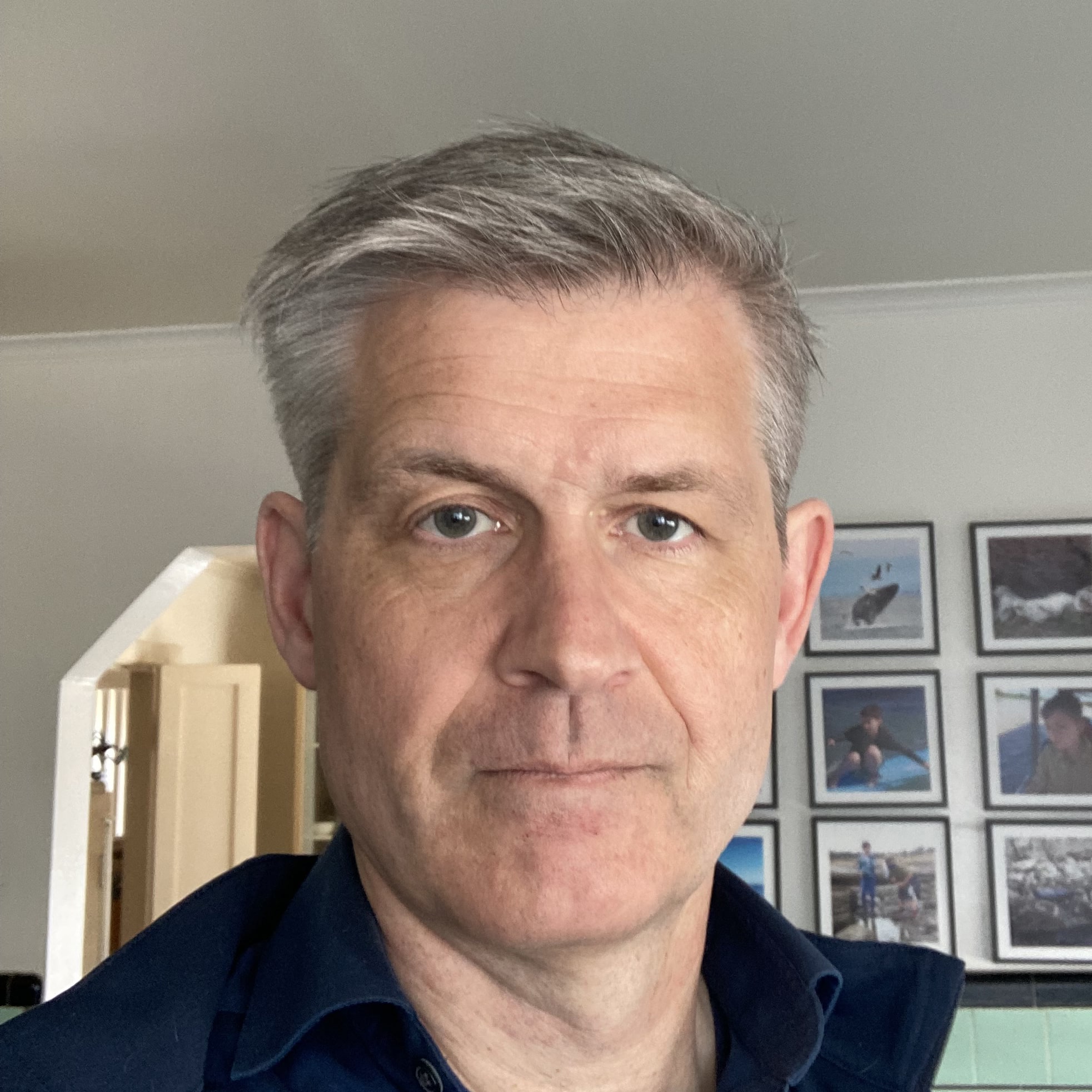
Gordon Drummond is the President of a Sessions College. He's passionate about education, technology, and the arts, and likes to surround himself with talented people. Read more articles by Gordon.
RECENTLY ON CAMPUS
