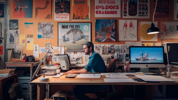


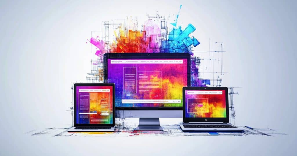
Web design is as seasonal as fashion trends. As people’s internet usage increases, their design preferences continuously evolve. The best designers love to tackle this challenge, staying up to date on the latest trends and exploring how they can bring them into their own design language.
Learn the top web design trends of 2025 so you can match skills with the best of them and create websites that bring in and dazzle visitors.
IN THIS GUIDE:
User Experience Prioritization
The Human Touch
Aesthetic Appeal and Modernity
Dark Mode Design
AI-Driven Personalization
3D Elements and Immersive Animations
Gradients
Micro-Interactions
3D Elements and Immersive Animations
Claymorphism
Voice Search Optimization
While there are many new web design trends in 2025, they tend to follow a few key tenets that are increasingly appealing to people online.
User Experience Prioritization
It’s easy to think your website design should focus on telling visitors all the information you want to get across. However, as people’s internet usage increases, so do their expectations for websites to cater to their preferences. A website that prioritizes user experience does a better job of drawing in visitors and getting them to take actions you want, leading to better conversion rates.
A good user experience also encourages visitors to spend longer on your website, improving the metrics that search engines use to rank your website. As a result, people are more likely to find your site when they look up topics related to it, helping you succeed.
Many site owners realize too late that their website doesn’t optimize the user experience and then have to invest a lot of time and money into redesigning their site. Focusing on user experience early into the design process saves valuable resources later on.
Curious about the outlook of web designer roles beyond 2025? Check out our web design career guide to better plan your future.
Human Touch and Imperfections
The traditional design strategy is to make all aspects of your website look pristine, with sharp edges and fixed scale. Many automated web design tools and drag-and-drop editors let you easily create these “perfect” designs.
But as a result, many internet users have grown tired of this design language, which can feel depersonalized. Today, imperfect designs that have a human touch communicate that real people designed and worked on your website, giving visitors something to connect with.
Even something as simple as a hand-drawn accent or a slightly off-kilter color palette can make your design feel more human. This builds trust, which is a valuable commodity in an age when internet users are wary of who may be on the other side of the screen. Showing authenticity with human touches convinces people that your brand is worth investing in, making them more likely to engage with your content or buy your products.
The emerging anti-design trend embodies the concept of imperfect design, encouraging atypical design features like:
- Overlapping artwork
- Asymmetrical layouts
- Extreme unbalance
- Clashing colors
While it may not fit everyone’s design sensibilities, it’s a good idea to take a look at anti-design concept art for inspiration when you start a new project in 2025.
Aesthetic Appeal and Modernity
People’s tastes in website aesthetics have evolved, changing modern web page design. Web surfers used to accept hard-edged boxes and busy, image-heavy pages that gave more to look at. But now people tend to like sleeker, less busy designs as they’re often visiting websites on the smaller screens of a phone or tablet. These are some modern design concepts that have aesthetic appeal in 2025.
Brutalist Designs
Brutalist design is inspired by iconic designs, like RAW magazine and punk rock aesthetics, favoring raw, honest presentation and stripping away decorative elements considered unnecessary. Its characteristic features include:
- Bold typography
- Simple layouts
- Unpolished elements
The trends toward simplicity give a lot of appeal to brutalist design right now. Designers are adopting grid-based layouts, monochrome color schemes, and minimal imagery as tools to create powerful visual impact. The goal isn’t to be intentionally difficult or aggressive but rather to communicate authenticity and directness.
Brutalist design is definitely a brand-specific choice, but it can be successful for brands that want to set themselves apart from the homogenized digital landscape and offer a refreshing break from the abundance of polished aesthetics. The rejection of current design conventions to feel more human and honest has, paradoxically, become modern.
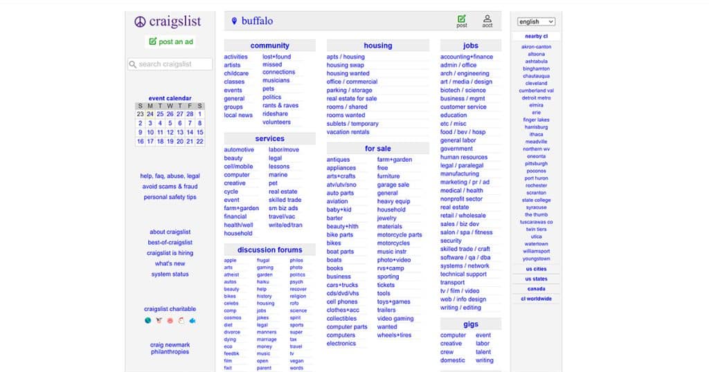
Craigslist is a great example of brutalist design, forgoing aesthetic appeal to make the website easier to navigate.
Motion Design
After excessive animation and 3D elements have dominated web design trends for years, 2025 beckons in a shift toward more refined, intentional motion design. Taking on a “less is more” philosophy, designers are using animations and 3D elements sparingly, with a clear strategy and purpose, rather than making them the default elements on their website.
This approach has many benefits:
- Improving site performance by reducing the number of objects and animations to load
- Cutting down on cognitive load for users, making it easier for them to navigate the website
- Making users’ interactions with your website more meaningful
- Giving your website a more sophisticated, user-focused feel
Emphasize Negative Space
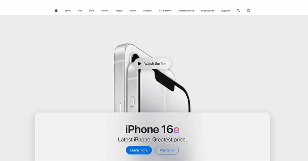
Websites that emphasize negative space carefully balance content with empty or “white” areas, making a clean, uncluttered layout. Key to this approach is simplicity and minimalist design, giving room to breathe to all your text, images, and buttons, along with enhancing focus and readability.
When employing negative space, keep these two tips in mind:
- Use margins, padding, and line spacing so there is a visual separation between different sections without overwhelming the user
- Let the typography—different font sizes and weights—naturally guide the visitor’s eye along your hierarchies
To understand what this looks like, check out the Apple website.
Text-Only Hero Images
Newspapers have a concept of “above-the-fold” content, which denotes everything you see without needing to unfold the paper. For websites, this is the section you see as soon as the page loads, before you need to scroll. When people use the internet from devices as small as smartphones, the above-the-fold section is similarly small.
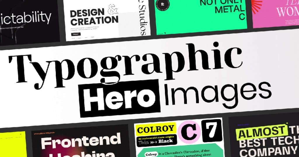
This means typical background hero images sharply reduce the available space you have to get across the content you want visitors to see. A modern web design trend is to replace this image with eye-catching typography. By using a bold, unique font, your full-page headers can quickly get visitors’ attention while still offering important information.
Dark Mode Design
The dark mode color scheme is a popular feature in many apps and operating systems, placing light-colored text, user interface elements, and icons on a dark background.
Users can toggle dark mode on and off according to their preference. Some operating systems and applications even let you switch automatically between dark and light mode based on ambient light conditions or the time of day.
Major operating systems like Windows 10 and 11, macOS, iOS, and Android all offer system-wide dark modes. In these cases, the setting affects all elements, including system menus, taskbars, and app interfaces, to provide users with a seamless experience everywhere on their device.
Benefits of Dark Mode
Dark mode web designs have become popular for a few reasons:
- Reducing eye strain. As people spend more time on their screens, their eye health is an increasing concern. Dark backgrounds with clearly contrasted white fonts strain the eyes less than bright backgrounds, making them an attractive choice.
- Extending battery life. OLED screens display black by just not lighting up a specific pixel. As a result, black backgrounds require fewer pixels to be lit up than light or colorful backgrounds, reducing the energy drain on your phone. At 100% brightness, switching to dark mode can save between 39% and 47% of battery life, according to a Purdue study.
- Aesthetic appeal. Dark mode gives your website an ultra-modern look that lets you highlight design points simply by darkening the elements around them.
Implementation Strategies
Here are some tips when you design for dark mode:
- Prioritize proper contrast for readability by avoiding pure-white fonts, using de-saturated colors, and making sure the colors you choose follow accessibility standards.
- Use images that are compatible with dark mode and transparent PNGs for logos, so they don’t have a white background when users toggle the mode.
- Test across different devices to make sure your design is consistent across platforms.
- Be careful with how you use shadows—subtle ones can add depth, but if they’re too visible in light mode, then they won’t mesh well with your dark mode theme.
- Try subtle gradients to make backgrounds visually interesting without compromising readability.
- Give users a toggle button so they can choose light or dark mode to match their preference for their device.
AI-Driven Personalization
Artificial intelligence (AI) has become vital to modern digital marketing strategies, with its ability to quickly interpret massive amounts of data. AI web design also makes it easier for you to depart from static interfaces and generic messaging that try to appeal to a broad audience at the expense of targeting any specific audience segment.
Using AI tools alongside your web design lets you:
- Better understand user behavior by analyzing click-through rates, browsing habits, and purchase history to find patterns in how visitors who are most likely to buy something on your website use it.
- Provide tailored content like personalized email campaigns and bespoke landing pages that make visitors feel like every touchpoint they find for your brand is relevant.
- Incorporate predictive analytics and smart design, so your website can anticipate what might appeal most to visitors — such as by recommending the products that most closely relate to topics they’ve been reading about in your blog section.
AI Tools for Personalization
These are some of the most useful AI tools we have found for personalization in your web design:
- ScaleNut: A strong tool for AI-driven personalization in marketing, ScaleNut’s generative AI is useful for creating hyper-targeted campaigns, predicting trends, and creating captivating content and assets that your audience will engage with.
- Midjourney: This AI design tool helps you create a wide range of visuals, such as images, illustrations, and even 3D models. As you keep using it, Midjourney’s AI learns your preferences and generates content that aligns with them.
- FigmaAI: Figma lets creatives and clients look at a design in real time so they can discuss and quickly modify the layout to streamline the planning process. FigmaAI provides a variety of features that further help designers create more efficient, effective designs, with functions like automatic layout suggestions, color matching, and font pairing.
Learn about other great web design apps for creatives.
3D Elements and Immersive Animations
Digital art and design have started to feel overused and generic to many people online. As a result, creatives are going back to hands-on techniques like painting and sculpting. This shift gives artists a way to connect more deeply with their work, rediscovering the unpredictable nature of physical materials and the satisfaction of creating something they can hold and handle.
By moving from the screen to the studio, artists are finding new inspiration in the dimensions, sensory impact, and textures that only real-world materials can provide. 3D elements lend a tactile feel to your website’s artwork that simulates this experience, bringing digital textures to life and turning ideas into something users can really feel.
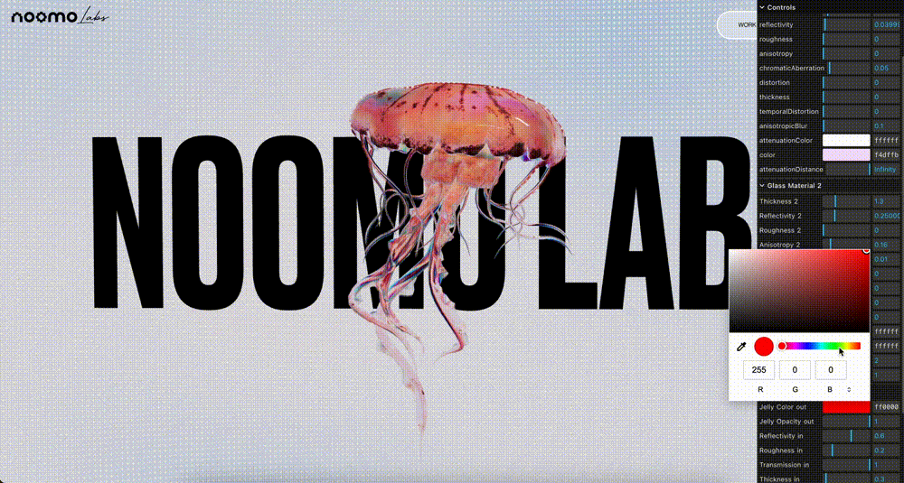
As the world becomes increasingly digital, more brands and designers are aiming to make their creations feel more real. For example, Nike’s product renders use rough-hewn materials that you can imagine getting your hands on.
Immersive animations enhance the feelings of interacting with a product. For example, an AI-powered company called Imersive elevates the online shopping experience by creating a 3D virtual store where shoppers can see the products lined up like in a physical store.
Learn more about the future prospects of virtual reality in design.
Techniques for Integration
Here are ideas to keep in mind for building an immersive 3D experience:
- Make smooth animations. Animations help guide users through your content and highlight important sections, improving the overall experience. For example, 3D animations can help you show how a product works so visitors can easily understand more complex features.
- Use 3D effects to highlight features. 3D effects can strategically draw attention to particular features of your website. For example, subtle 3D hover effects let users know about interactive elements like a button or link, improving the visibility and usability of these elements.
- Try parallax scrolling. You can create a parallax scrolling effect with 3D depth by moving your website’s background content at a different speed than the foreground content. Used strategically, this subtly highlights specific sections on your website.
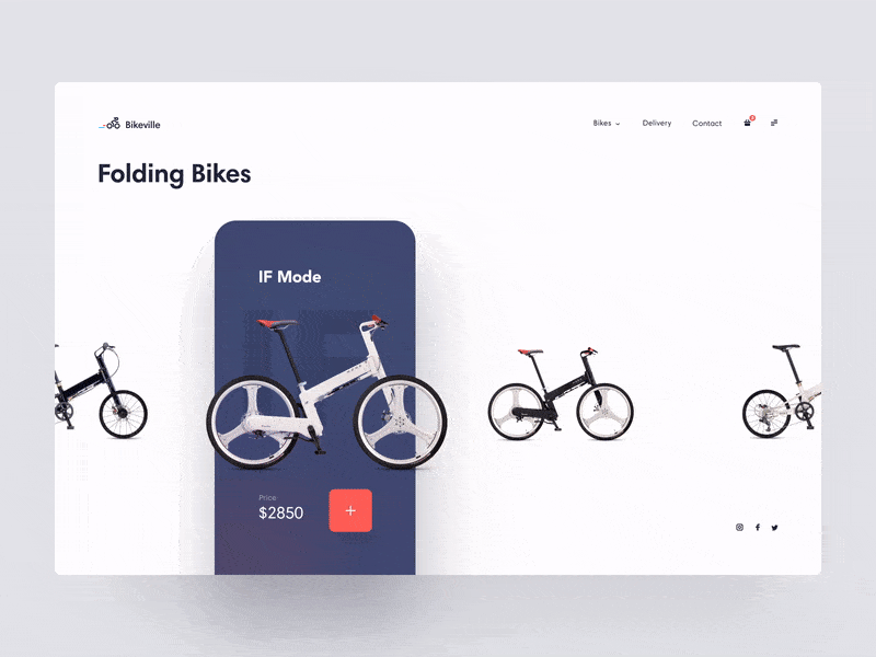
- Experiment with product visualization. Providing rotatable 3D models of products on e-commerce websites lets users check out the item from all angles. Amazon even has a feature that lets you see how an item would look in your house, so you can estimate its size and figure out if it fits.
- Offer a virtual tour. If you’re showing off a space, try providing an interactive 3D environment that a user can explore at their own pace. You will need to invest in a high-quality 360-degree camera and a program to put your pictures together, but the end results will engage users much more than static photos.
Impact on User Interaction
Trying to increase immersion with 3D elements and animations may feel like a style-over-substance approach to web design. However, it has a noticeable effect on user interaction. Benefits you can see with effective use of immersive animation concepts include:
- Higher engagement. With dynamic, visually stimulating environments, you attract users and encourage them to interact more actively with your website, leading them to explore many different features and content.
- Improved understanding. Interactive 3D models and immersive tours give users a closer look at your offerings from many more angles, helping them more clearly understand the features and qualities.
- Better visual appeal. High-quality 3D graphics enhance your website’s aesthetic appeal, making it feel more modern and sophisticated.
- Storytelling and guidance. Animations can guide users through your content, creating a narrative flow and highlighting important information in a hierarchical way that you craft for them. When done well, you can offer a narrative that really sticks with your audience.
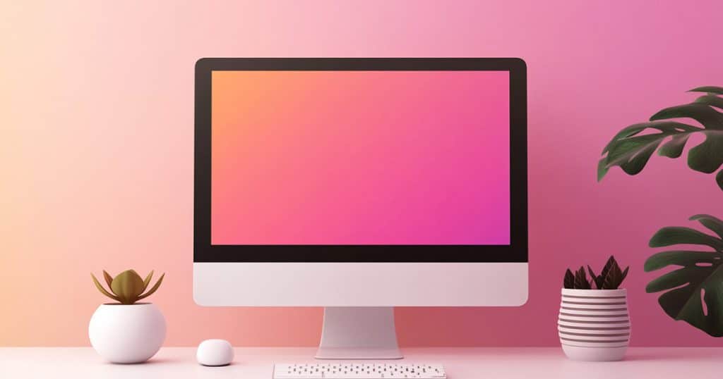
Gradients
Gradients are a gradual visual transition that creates the effect of colors seamlessly fading into each other. This gives a sense of depth, breathing life into digital interfaces that have typically used solid, monotone colors.
Because gradients combine multiple colors in different patterns, like linear or circular, they offer more scope to create unique graphics that stand out from the pack. With the right combinations, you can build visual journeys that evoke emotional reactions from your target audience.
Multi-Dimensional Gradients
Options for gradients in the past were more limited—largely flat transitions just from one color to another. In 2025, they have become more layered and complex, blending multiple different tones in more intricate patterns to create modern, immersive interfaces. For example, Canva uses a gradient of vivid blue, pink, and purple tones in its logo and specific sections of its website to subtly draw attention to them.
More Immersive Interface Designs
Gradients can encourage longer interaction times by contributing to a visually appealing interface. The depth and texture they offer can improve the user experience by distinguishing between different elements and sections, making for more intuitive navigation. Here are some places you can use them:
- Backgrounds. Well-designed gradient backgrounds contribute to a sophisticated, modern vibe that doesn’t overpower the content. For example, Apple’s use of soft pastel gradients in their product visuals makes the products feel more elegant and even innovative.
- Calls-to-action (CTAs). Buttons filled with gradients, in combination with contrasting text, grab attention and encourage clicks.
- Navigation. Interactive gradients that shift as the user scrolls act visually to build a seamless, memorable user experience. Using gradients to enhance active tabs can create a sense of fluidity and engagement.
Micro-Interactions

Micro-interactions are small interactions that give users subtle feedback. A common micro-interaction you’ve likely noticed is links changing colors when you hold the cursor over them.
Similarly, you can use such techniques to give more attention to other small elements that you want to stand out. For example, you could have a pop of color explode from the mouse pointer after clicking an element.
Micro-interactions enhance the user experience by giving users immediate feedback for their actions. This lets you guide them through tasks intuitively, along with adding a sense of delight through small, subtle animations and visual cues. Deliberate implementation makes even simple tasks feel more fluid and enjoyable, leading to a more positive, engaging user experience.
Examples of Effective Micro-Interactions
Here are some successful examples of micro-interactions:
- Loading animations. Providing a spinning wheel or progress bar when data is loading, showing the progress, prevents user frustration.
- Password error feedback. Users find it frustrating to fill out all their registration information, click on the final submit button, and only then find out their password doesn’t fit their requirements. Showing what elements are missing with a marked progress bar or even just setting the password input text box to red, with text below telling them the main issue, unobtrusively lets users know what’s missing.
- Contextual tooltips. Canva provides short tooltips as you select different objects and tools so you know what you can do with something right when you select it. With short copy, small icons, and transparent overlays, it makes tips as unobtrusive as possible.
- Hotspots. These small icons alert users and let them know they can click in certain areas. The writing assistance app Grammarly, for example, includes hotspots in its onboarding process to engage users as they try it out. The Grammarly browser extension also lets you know it’s available on a webpage with a small green dot, which you can click to start using it.
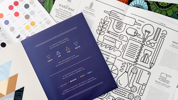
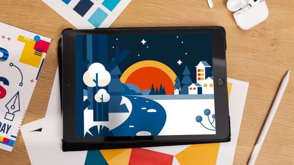
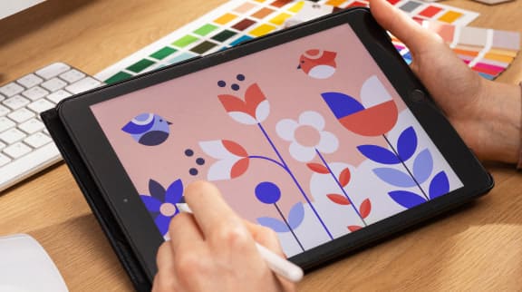
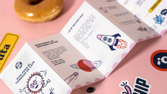
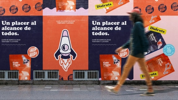
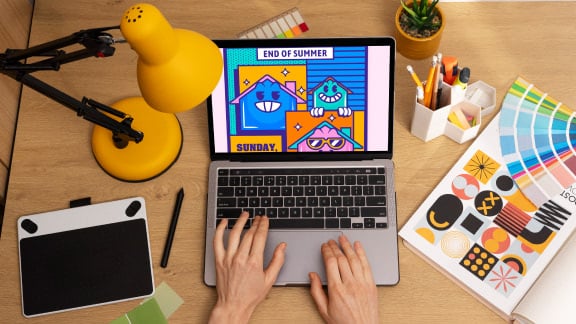
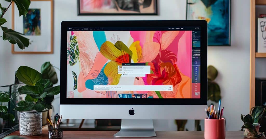
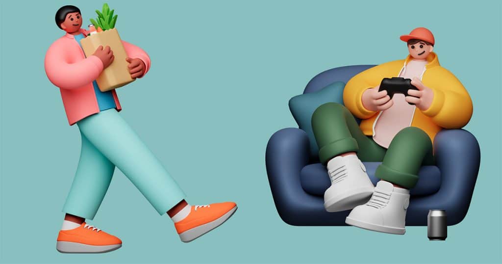
Custom Illustrations
Custom illustrations in your design give it a human element that increases the appeal of your site. Types of illustrations you can try include:
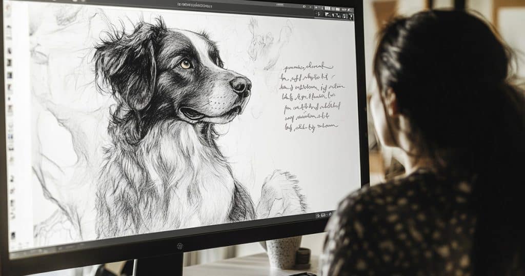
- Hand-drawn illustrations. One of the pillars of this trend, hand-drawn illustrations could be anything from fun doodles to detailed sketches and paintings. They bring branding and web design to life, breaking away from the typical stock imagery and generic icons.
- Organic shapes and lines. Straying from the conventional approaches of sharp corners and clean lines, you can instead use the fluid shapes and lines that you would find in nature, creating a flowing visual language. Use these shapes to create unique backgrounds, borders, or framing elements that have a more organic feel.
- Hand lettering and calligraphy. Custom typography is another great way to incorporate hand-drawn elements, using unique letterforms that bring authenticity to your branding and editorial design.
Custom illustrations are a unique way to set your brand apart, since you can create something that no competitor can replicate. Used consistently, your specific art style or custom lettering can become a unique brand element that your regular visitors immediately recognize in all your marketing materials.
Design Tips for Custom Illustrations
Follow these best practices for using custom illustrations:
- Fit your audience. Remember that these graphics aren’t just for aesthetic appeal — customers will connect with them better if your designs communicate with them. Your illustrations should align with your audience’s tastes and cultural backgrounds. For example, a children’s book publisher can get better results with colorful, playful character-based illustrations that appeal to young readers.
- Keep a consistent style. Once you have settled on a particular style, you could jar your readers by changing it up. Consistency is necessary when building any type of branding, so stick with that design style to build the connection with your users.
- Balance your space. As with any design element, remember not to clutter your website with illustrations. Make sure you have enough negative space to let your custom illustrations shine.
Claymorphism
Claymorphism is one of the more compelling user experience-focusing approaches today, distinct for its use of softly rounded corners and visible tactility. The British TV show Wallace & Gromit is a great reference for the claymation style this trend is based on.
An Emerging Trend
Claymorphism started gaining traction in web design around late 2020 and early 2021. It evolved from neumorphism, a style that added depth to the previous decade’s trend of flat designs. As a new design style, claymorphism allows brands to convey innovation, approachability, and a focus on user-centric design.
Voluminous Shapes
Claymorphic layouts make different areas look like discrete surfaces, each with different hardness, as though they were sculpted from clay. Surfaces like cards and dialog windows feature outer shadows that clearly stand out from background areas, with subtle inner shadows to emphasize the objects’ thick planes and rounded edges.
Clay-Like Textures
Claymorphism’s appeal comes from its tactility and touchability, no doubt related to its visual similarity to clay sculptures and claymation. This encourages users to engage more, welcoming them to an interface that is more dimensional. Chunky, sculpted cards can stand next to each other in the working area, buttons can look like blocks on top of dialog layers, and strong color cues can direct the eye.
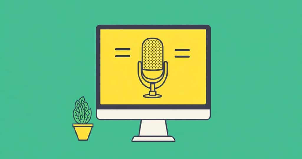
Voice Search Optimization
Voice search optimization is the practice of tailoring your website content for voice search engines to easily understand. The main facets of this practice are using natural language and long-tail keywords to make sure your site ranks high in voice search results.
Adapting to User Behavior Changes
Voice transcription software keeps getting better. As a result, while many people would have never considered it 10 or 15 years ago, nearly 150 million Americans used voice assistants in 2024, and this number is projected to keep growing.
Siri has become a mainstay in many households, as has Google Assistant, Alexa, and similar products. Many people also now use voice-to-text on their phones so they can save time typing.
Best Practices for Voice Search
Here are points to keep in mind for voice search optimization:
- Target question keywords and long-tail keywords. People use different language when they make voice searches compared to typing in a search query. The sentences are usually longer and more specific. Your website should in turn try to target longer, more specific keywords so voice search engines can easily recognize that you are answering their questions.
- Use conversational language. Voice searches are conversational. To align your content with the keywords in a voice search, your language needs to be similarly human-sounding.
- Optimize for mobile. The mobile user experience and low page load times are integral elements for Google’s rankings. Responsive, mobile-friendly design that loads quickly even for users on data is vital for showing up prominently in voice searches.
Tips for Integrating These Trends Into Your Website
Keep these general tips in mind to successfully incorporate the biggest web design trends for 2025:
- Prioritize the user experience above all else—even if that means skipping some of these trends for your site.
- Optimize negative space so the elements you use can shine.
- Keep your target audience’s tastes in mind.
Finally, remember that, while incorporating these trends adds value, the most well-designed site still needs strong content. Make sure you implement these elements in your web design in ways that supplement your information, not overpower it.
Web Design FAQs
How Do I Keep Up With Web Design Trends?
There are many ways you can discover new emerging design trends:
- Following design blogs and websites
- Engaging with online design communities on social media
- Attending industry conferences and workshops
- Subscribing to design newsletters and podcasts
- Analyzing changes to popular websites and apps
- Joining online forums like Behance or A List Apart to discover new techniques, styles, and color trends
How Can I Learn Web Design?
Learning web design typically starts with a strong education base in HTML and CSS, as well as design principles like typography and user experience optimization. You can build this base with an online web design degree.
Beyond that, your best ways to learn are to break down popular websites and apps, figuring out what works and doesn’t, along with why. You should also experiment with your own designs so you can find your personal style and hone your abilities.
What Web Design Trend Will Dominate in 2025?
While we feel confident that the trends we’ve listed will all become more prominent in 2025, here are the ones we expect to dominate:
- Dark mode design as users get more conscious of how to preserve their eyes and device batteries with their higher screen times
- Voice search optimization to keep up with the increasing trend of people mainly using mobile devices to surf the internet
- Custom illustrations for standing out against the growing sea of AI-generated visuals
Learn More About Web Design
In a field as fast-moving as web design, keeping up with emerging trends is how you stay ahead. But to get the most out of what you know, you need to supplement it with a strong understanding of web design theory and best practices.
Sessions College is here to help you build that expertise so you have the tools to adapt to any new trends in the industry. Learn about our web design resources and get a headstart on the digital future.

Nihaal has 10 years of experience in creative writing and two years of experience with SEO editing. Combining the two, he brings out the narrative in any topic to build content that keeps readers engaged. He's most familiar with healthcare, fitness, and technology topics.
Read more articles by Nihaal.


ENROLL IN AN ONLINE PROGRAM AT SESSIONS COLLEGE: