5 Inspiring and Creative Poster Designs
Inspirational art and design work to fuel your creative endeavors.
Graphic designers just love to design posters—it’s a fact. Poster design is a great opportunity to design something bold, creative and long-lasting. You can make a statement with a poster design. Poster design encompasses all the ‘arts’: collage, illustration, painting, and photography. Iconic poster designs go down in history; they become cultural landmarks of their times.
For inspiration, here are five poster designs from current designers that are totally creative.
City Poster Series
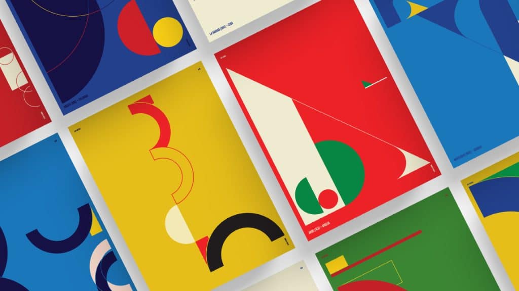
The City Poster Series by Vasty is a bold, colorful, and geometric design that plays the line between typographic form and abstract shape. The color palette is derived from the flags of the countries and gives the design a formal and classic feel.
What is most impressive is how the designs are so abstracted and yet have the same visual language which gives the design series uniformity and cohesion.

Curiositas
The Curiositas poster is a print design and an animated poster. The poster was created by Rémi Wyart and Jérémie Solomon for an exhibit at Galerie Jahidi about curiosity cabinets. The poster design resembles a contemporary curiosity cabinet and has a classic lithographic style and bright and fresh color palette.
The design was translated into animated versions for use on social media. The project is a clever example of how design for print and media can work together to create a highly original and successful campaign.
Techno Parade
A recent Techno Parade poster is an interesting example of a poster made for a music event. The design style is reminiscent of the punk aesthetic of the late 70s and early 80s, with the torn paper edges and bold tall sans-serif display type. Conceptually, this design style is a bit of an ironic and clever choice for this design, since the kind of music the poster presents, electronic techno, is essentially the complete opposite in expected visual style.
The design appears very ‘meta’ in this way. The poster design also considers the environment in which it will be posted—in the city, on a wall, and probably with many other event flyers and posters from old shows.
It would be quite fun to look at a wall of torn up posters to find one with the “torn up” element embedded in the design itself and also in a punk rock style for a techno event.
Airbnb Trips: London Poster
For AirBnB, designer Andrew Nye created a series of travel posters. The designs appear inspired by the iconic travel posters of deco master designer Cassandre, although the color palette is softer and more contemporary. The illustrative elements in the design speak to the character of London today as a market town and big city.
BITEF 2016
BITEF 2016 was an arts and culture event series that took place in Belgrade. The poster design by Jana Misheva is a key element of a larger advertising design campaign. The design is an excellent example of illustration mixed effectively with photography. The geometric masks appear like warrior paint or like an abstracted bull’s head and overlay low contrast black and white portraits. Conceptually the design riffs on identity, culture, and creativity.

Margaret Penney is an experienced Brand Designer and Art Director as well as a teacher, designer, writer, and new media artist and Founder and Principal Designer of The Design Craft and 9& Studio.Read more articles by Margaret.
ENROLL IN AN ONLINE PROGRAM AT SESSIONS COLLEGE:
