5 Key Photography Composition Techniques
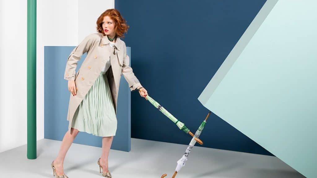
Creative techniques to consider in your creative projects.
Photography composition is an art unto itself and a skill that can be developed over time with practice. Some new photographers have a sense of composition from the get go, a natural eye, but for others, this is not the case and these skills need to be learned in a more formal way.
Outlined here are five rules for creating photographs with strong compositions.
Simplicity
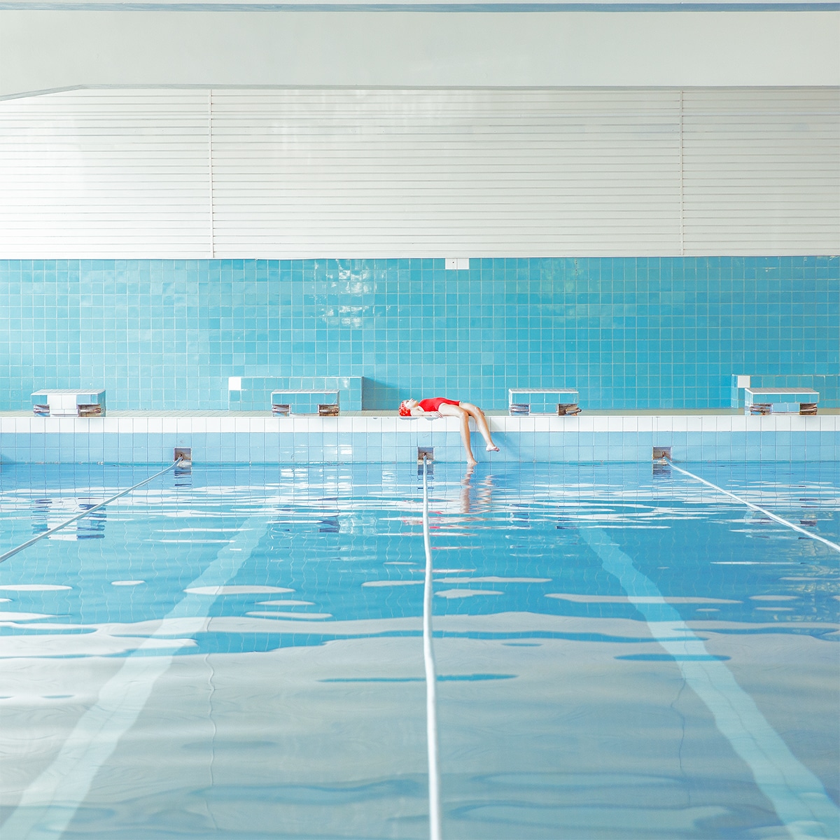
A good way to start developing strongly composed images is to keep the images fairly simple. Make sure you have a focal point that is mid-range and then begin to add in elements, like objects in the foreground and foliage or a landscape in the background.
Contrast
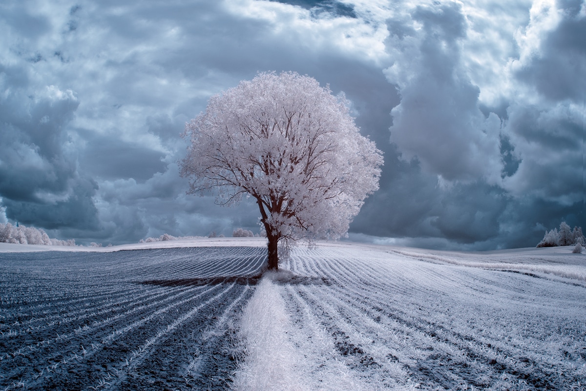
A well-composed shot often uses contrast effectively. A good example would be an image where the central element was lit up and in a bright or light color and the background was dark and in a more neutral shade—this is a clearly contrasted image.
New photographers may consider working with more clear and extreme contrast to enhance the subject matter of their images. A more seasoned photographer, with a clear understanding of contrast, may experiment more with it and dial it back in some instances depending on the subject matter or mood of the photograph.
Rule of Thirds
Rule of Thirds is pretty much the holy grail of composition. Imagine your image is dissected vertically and horizontally by lines into nine equal segments.
The rule of thirds states that you should try to get the most important elements of your image along these lines and where they intersect.
If you do this your image will be imbued with visual harmony and immediately look a lot more appealing. Many digital cameras come with the option to superimpose the rule of thirds grid over the screen which can be quite helpful on a shoot.
Pattern & Lines
A great way to add visual interest to your photo is to include pattern elements and lines. Lines are particularly useful to use as a way of ‘pointing’ at the focal point and also demonstrating a sense of depth and perspective. Pattern can be used more decoratively and also as a way of flattening space.
Using pattern and line in combination can create a good visual contrast within your image.
Framing
Framing is a great technique for creating a strong and interesting composition that plays with space and perspective. If you do enjoy this technique try not to make the composition dead on, but offset it a bit, this allows for more of the depth of field to translate better visually—it makes the image appear less flat.

Margaret Penney is an experienced Brand Designer and Art Director as well as a teacher, designer, writer, and new media artist and Founder and Principal Designer of The Design Craft and 9& Studio.Read more articles by Margaret.
ENROLL IN AN ONLINE PROGRAM AT SESSIONS COLLEGE:
