5 Type Foundries Worth Watching
Creative business tips to kickstart your career as an artist, designer, or content creator.
As graphic designers, our choice of type can completely change the mood of our work. It’s a lot like casting for a movie. We’ve seen a number of different actors play Batman. While the essential story of Batman remains the same, each actor brings with them a different voice to the role, influencing the overall flavor of the film.
Type is the same way. It offers designers another dimension of self-expression. Our type choices speak both to our taste as designers and the voice of the project. If you’re a graphic designer you’re always on the lookout for new typefaces, so here are five type foundries you’ll want to keep on your radar.
VJ-Type Foundry
VJ-Type Foundry is a Paris-based, two-person team comprised of Violaine and Jeremy. Born from the process of designing custom typefaces for their graphic design clients, the two decided to create a foundry to further explore typographic works.
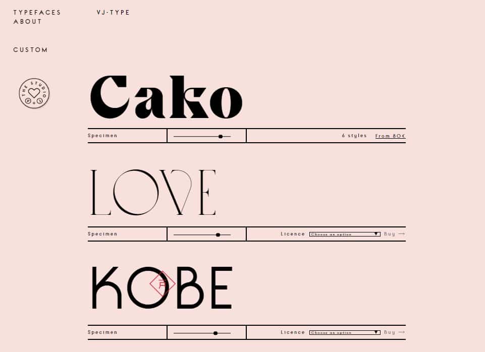
Their typefaces are gestural and full of surprising irregularities to keep things interesting. My personal favorite is Traviata. Check out VJ-Type here.
Klim
Klim is an award-winning New Zealand-based type foundry founded by Kris Sowersby. Their focus is on craft and their library consists of a large range of functional typefaces in a variety of contemporary styles.
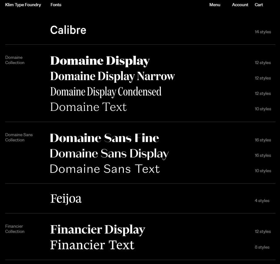
Whether you’re designing pamphlets for an accordion museum or the signage for a miniature subway system, you’re sure to find something that tickles your fancy. You can browse their full collection here.
Letters from Sweden
Renowned for their custom typefaces, Letters from Sweden is a type foundry based out of Indonesia. Just kidding, they’re from, you guessed it, Sweden. They’ve created custom typefaces for a range of domestic and international clients including VSCO, Fjällräven, Acne Studios, and Ericsson.
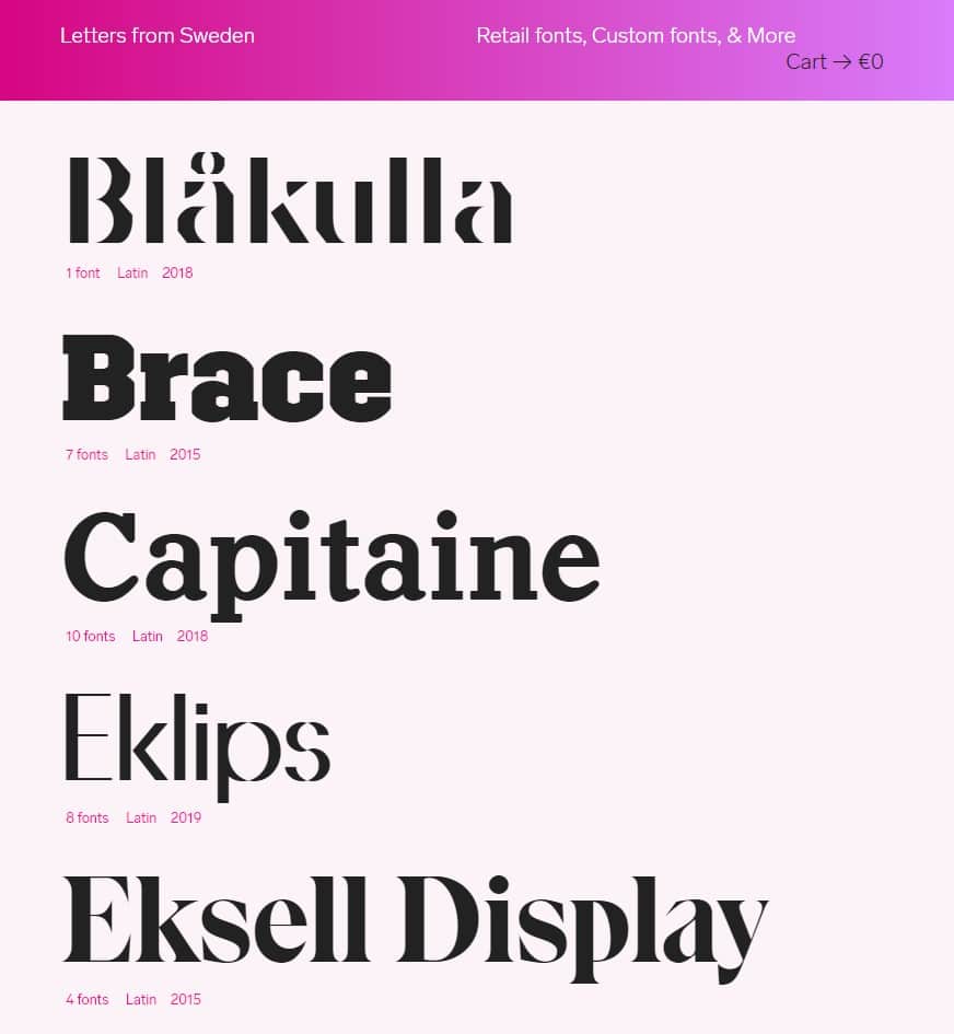
Their catalogue is equal parts functional and quirky. Check out Letters from Sweden here.
Studio René Bieder
Studio René Bieder is a Berlin-based type designer, art director, graphic designer, and my personal favorite on the list. His typefaces range from playful to classic, with nods to the history of both typography and architecture.
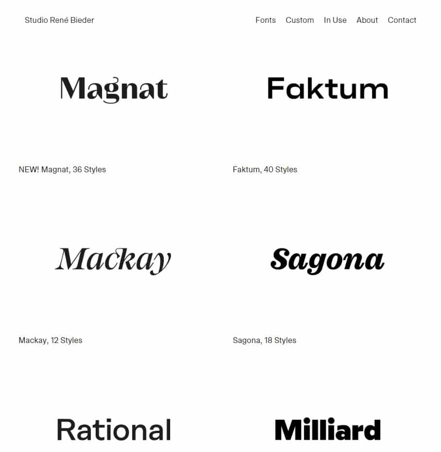
It’s hard to choose a favorite from his catalogue but I’m partial to Sagona and Mirador. Check out Studio René Bieder here.
Hoefler&Co
Most of the other foundries on this list consist of individuals or small teams. Hoefler&Co is a much bigger operation. With a team of 14 and over 1500 typefaces under their belt, they are heavyweights in the typography world.
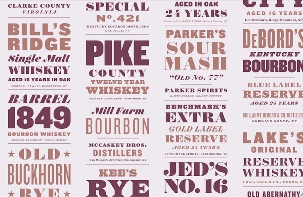
Browse through their extensive library and you’re sure to be struck with Deja vu. Their work can be found on products from Coca-Cola, Apple, and Tiffany & Co. Check out Hoefler&Co here.
As the resources to learn typography continue to become more widely available, new perspectives will enter the fray and our typographic options are sure to become more interesting. Be sure to keep an eye out.
Taylor is a concept artist, graphic designer, illustrator, and Design Lead at Weirdsleep, a channel for visual identity and social media content. Read more articles by Taylor.
ENROLL IN AN ONLINE PROGRAM AT SESSIONS COLLEGE:
