A Guide to Color Theory

From the calming blues of a serene landscape to the bold reds of an eye-catching ad, color has a way of intimately connecting with all of us.
But why do some combinations instantly grab our attention while others don’t have the same effect? Why do certain colors trigger specific emotions?
The answer lies in the study of color theory, a discipline that explores the principles and guidelines behind color selection and combination. Learn what color theory is and why it’s a critical tool for anyone working with visuals and design.
IN THIS GUIDE:
What Is Color Theory?
Understanding Color
The Color Wheel
How To Choose a Color Scheme
Applications of Color Theory
Frequently Asked Questions: Color Theory
What Is Color Theory?
Color theory helps us understand how colors work together and how they can influence what we see and feel. It’s like a guide to smarter color choices, whether you want to create a sense of calm, draw attention, or just make something look amazing. Sometimes that might mean choosing colors to create harmony and flow. Other times it’s about using bold contrasts to make something stand out.
No matter the purpose, understanding the basics of color gives you the power to make your designs more intentional.
At its core, color theory rests on three principles:
- The color wheel: A visual map of the relationships between colors, making it easier to create harmonious or striking combinations.
- Color harmony: The practice of selecting colors that work well together to evoke balance, contrast, or emotion in a design.
- Context: The environment or purpose in which colors are used, influencing how they are perceived and their emotional impact. For example, a vibrant red can communicate urgency on a website but warmth in a restaurant logo.
Color theory applies to every creative visual field. Graphic designers use it to create brand palettes that evoke trust or excitement. Interior designers use it to create moods and feelings in a space. Photographers rely on it to edit images with complementary hues. Painters rely on it to balance light and shadow.
When you understand these principles, you gain a powerful tool to elevate your work and amplify your message, spark the right emotions, and craft designs that leave a lasting impression. In the following sections, we’ll discuss the foundations of color—such as the color wheel and how colors interact—before looking at more practical applications and how to pick the right color scheme for your project.
Understanding Color
To get the most out of color theory, it helps to break down how colors are categorized and used. Two key systems—RGB and CMYK—determine how colors are created, while primary, secondary, and tertiary groups organize and create a color palette to work with.
RGB vs CMYK
RGB, which stands for red, green, and blue, is the color model for light, used in digital screens. Mixing lights of these three colors in different intensities produces a huge range of vibrant hues—think of the bright, glowing colors on your phone or TV screen. When all three overlap at full strength, they create white light.
Print media relies on the CMYK model. Standing for cyan, magenta, yellow, and black, this system layers inks to create colors. Unlike the light-based RGB model, CMYK absorbs and reflects light, resulting in a softer, more muted palette that’s perfect for printed materials like posters or magazines.
Primary, Secondary, and Tertiary Colors
The basic building blocks of color are the primary colors: magenta (or red), cyan (or blue), and yellow. You can’t create these colors by mixing others, which is why they’re the foundation of every palette.
From there, you get secondary colors by mixing two primary colors. For example:
- Blue + yellow = green
- Red + yellow = orange
- Blue + red = purple
Secondary colors can have an extra element of vibrancy and energy than primary colors, helping add a pop of boldness to a design.
Tertiary colors are formed by mixing one primary color with one secondary color. For example, combining blue and green creates turquoise, while blending red and orange produces vermilion. These colors are often used to add depth and complexity to a design, as they create subtle variations within a color palette.
The Color Wheel
The color wheel is one of the most iconic tools in design. First dreamed up by Sir Isaac Newton in the 17th century, this circular map of colors shows how they connect and transition naturally. It’s a simple yet brilliant idea that has become a go-to tool for artists and designers, helping them understand color relationships at a glance. Want to see it in action? Try the Sessions College color calculator to explore its possibilities.

Color Wheel Basics
The color wheel is divided into 12 segments, with the three primary colors (red, blue, and yellow) equally spaced apart. The secondary colors fall between the primary colors they are created from, while the tertiary colors fill in the gaps between secondary colors. This arrangement makes it easy to spot complementary or analogous colors and create harmonious color schemes.
Hue, Shade, Tint, and Tone
While the wheel maps out relationships between hues (pure colors), designers manipulate shades, tints, and tones to achieve the desired effect. For example, designers may use value to guide color choices (how light or dark a color is) instead of solely by hue.
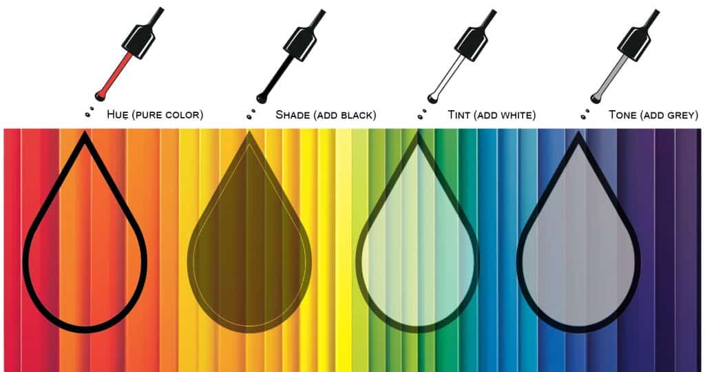
Shades deepen the hue by adding black, creating drama and intensity with contrasted darker colors, while tints lighten a color with white to enhance softness and subtlety. Different tones, achieved by adding gray, often provide a muted, balanced look. Varying these properties creates dimension and depth in an art or graphic by suggesting shadows and highlights.
Color Harmony and Schemes
Color harmony is the art of combining colors in ways that are pleasing to the eye and effective in design. By using specific schemes, you can create visuals that feel balanced and cohesive or intentionally striking and bold.
Imagine a branding project where a shade of blue projects reliability, a tint of pink softens the design with romantic charm, or a green tone balances it with natural simplicity. Each choice carries its own meaning and impact, allowing you to craft messages that resonate with your audience on a deeper level. For an in-depth exploration of this concept, check out Sessions College’s guide to color harmony.
The following are common color schemes and how to apply them.
Monochromatic Color Schemes
Monochromatic schemes stick to variations of a single hue, adjusting shades, tints, and tones to create depth and interest. This simple approach is perfect for minimalist branding or a clean, polished look. For instance, a branding palette based on varying tones of green can evoke calmness and eco-friendliness, while a monochromatic blue scheme of cool colors can convey trust and professionalism.

To avoid a sterile design, introduce contrast through texture, saturation changes, or accent elements in neutral color tones. This subtle diversity ensures the design remains engaging while retaining its simplicity.
Analogous Color Schemes
Commonly associated with nature, analogous color schemes combine neighboring colors, such as blue, blue-green, and green. This natural progression creates a sense of unity and calm, making these schemes popular for branding that seeks to convey trust and stability, such as wellness or lifestyle industries.

The trick is balance: Stick to three or four hues, and let one color dominate while the others act as subtle accents. This keeps the design from feeling overly flat. Discover more about this technique with Sessions College’s detailed exploration of analogous color schemes.
Complementary and Split-Complementary Schemes
Complementary colors, such as purple and yellow, that appear on the opposite sides of the color wheel bring drama with their ability to heighten contrast and draw attention. This boldness makes them a favorite for sports team logos or action-oriented marketing.

Split-complementary schemes tone it down a bit by replacing one opposite color with its two neighbors. For example, pairing purple with yellow-green and yellow-orange creates a dynamic but less intense palette, often seen in website themes and editorial layouts.
Triadic and Tetradic Color Schemes
Triadic schemes use three colors evenly spaced around the wheel, like red, yellow, and blue. They’re vibrant and fun, great for projects like toy brands or playful advertising.

Tetradic schemes step it up by combining two complementary pairs, such as purple and yellow with blue and orange. These combinations are bold and versatile but require careful planning. Let one color lead while the others support to create a palette that is bold yet cohesive.
How To Choose a Color Scheme
Choosing a color scheme is about aligning aesthetics with intention. Whether you’re carefully crafting a brand identity or designing a quick mock-up for a digital interface, the right colors elevate your project’s message and make sure it connects with the intended audience.
Understanding Your Project’s Purpose
Every project has a purpose, and your color scheme should support it. Start by identifying the primary goal: Is it to evoke trust, create excitement, or foster a sense of community? Your audience also plays a critical role—bright, bold colors might resonate with younger viewers, while muted tones could appeal to a more professional demographic.
Think of color as a language. A charity campaign might use soft pastels to communicate care and compassion, while a gaming app could employ neon hues for energy and excitement. By tying your palette to your project’s goals, you create designs that speak directly to your audience without uttering a single word.
You’ll also want to consider the context and medium of your design. Will it be used in a print format or digital? Will it be seen in a web browser or on a physical product? This can inform your color choices and make sure they are optimized for the intended platform.

Leveraging Tools Like the Color Wheel Calculator
There are many online tools available to help you choose the perfect color palette for your project. Experiment with different color combinations and refine your choices to create a cohesive and impactful design.
Use the Sessions College color calculator to easily select colors from the color wheel and see how they harmonize with each other. This calculator offers options for monochromatic, complementary, split-complementary, triadic, and tetradic color schemes, as well as the ability to save the hexadecimal, RGB, and CMYK colors for your Web or print projects. You can even see your color swatch applied to design samples and share them with others for feedback.
Practical Tips for Applying Color Theory
While selecting a palette can be an exciting and creative process, keep the following tips in mind to implement color theory effectively in your designs:
- Emphasize visual hierarchy: Use bold colors for key elements like headings or call-to-action buttons, while supporting elements can have softer hues.
- Prioritize accessibility: Check color contrast ratios to ensure that text is legible and meets accessibility standards. This is especially critical for web designs.
- Maintain balance: Avoid overwhelming your audience by balancing bright colors with neutrals or desaturated tones. Contrast can create visual interest, but too much can be jarring to the eye.
- Limit your palette: Stick to three or four main colors to keep your design focused and avoid visual clutter.
- Iterate and test: Test your design in its final environment and make adjustments as needed. Colors can look different depending on lighting, screen calibration, or material.
Applications of Color Theory in Art and Design
Color is a universal language in creative visual fields, and basic color theory provides the grammar and rules that shape its effective use. From graphic design to painting, these principles allow creators to enhance messages, evoke specific emotions, and guide the viewer’s eye. Whether it’s the reliability of a bank’s blue logo or the vibrancy of a sports brand’s palette, color choices are carefully made to align with cultural meanings, audience appeal, and emotional impact.
In branding, for instance, color builds trust and recognition. Similarly, interior design often uses warm colors and tones for cozy spaces or neutral shades to create calm environments.
What is color theory in art? A photographer might use analogous hues for harmony in a landscape, while a painter balances complementary colors to heighten contrast and vibrancy. These deliberate choices help transform ordinary compositions into works of art that captivate and inspire.

Beyond simple design choices, color theory is a powerful storytelling tool. Every stroke of paint, pixel on a screen, or carefully chosen shade conveys meaning and purpose. By unifying vision and execution, color theory enables artists to communicate ideas and create meaningful visual experiences.
Mastering color theory requires curiosity and practice. Experimenting with unconventional combinations or studying how lighting affects color can lead to creative breakthroughs. More than just a technical exercise, deepening your understanding of color theory is an opportunity to unlock creative freedom and transform your work into something unforgettable.
Whether you are a beginner or a professional, there is always room to expand your knowledge and elevate your craft. Sign up for the Sessions College Color Theory course to push the boundaries, experiment with new color palettes, and discover the transformative power of color in your art. Your future creations will thank you for it.
Frequently Asked Questions: Color Theory
What is Color Theory in Simple Terms?
Color theory is the study of how colors work together. It helps artists and designers understand how to mix colors, create color combinations, and use colors to communicate emotions or ideas. It’s like a guidebook for making visuals more appealing and effective.
What are the 7 Types of Color Schemes in Color Theory?
The seven types of color schemes in color theory help designers create harmony and contrast in their work:
- Monochromatic: Variations of a single color (e.g., light blue, dark blue).
- Analogous: Colors next to each other on the color wheel (e.g., yellow, yellow-green, green).
- Complementary: Colors opposite each other on the wheel (e.g., red and green).
- Split-Complementary: A base color plus the two adjacent to its complement (e.g., blue, yellow-orange, red-orange).
- Triadic: Three evenly spaced colors on the wheel (e.g., red, blue, yellow).
- Tetradic: Two complementary pairs (e.g., blue, orange, red, green).
- Neutral: Neutral tones like black, white, gray, or beige.
What is the Three Color Theory?
The three-color theory is based on the idea that all colors can be created by combining three primary colors, such as red, blue, and yellow (subtractive method), or red, green, and blue (additive method, used in screens). This concept is fundamental in understanding color mixing and creating balanced designs.
What is Color Theory Psychology?
Color theory psychology explores how colors affect human emotions and behavior. For example:
- Red can evoke excitement or urgency.
- Blue often creates feelings of calmness and trust.
- Yellow conveys energy and happiness. This knowledge is crucial in design, marketing, and branding to influence audience perceptions and evoke desired reactions.
At Sessions.edu, our courses delve into how to use these principles effectively in creative projects.
Why is Color Theory Important in Design?
Understanding color theory empowers designers to make intentional choices that evoke specific emotions, communicate messages, and establish brand identity. For example, a warm palette with reds and yellows might convey excitement, while blues and greens create a sense of calm.

Nathan Mahr is a long-form content writer and copywriter with five years of experience working with companies ranging from large finance corporations to small tech startups. Aside from writing, Nathan is a dedicated musician and an enthusiastic world traveler. He is passionate about helping to produce content that connects with audiences. Read more articles by Nathan.
RELATED ARTICLES:
SESSIONS NEWS:
ENROLL IN AN ONLINE PROGRAM AT SESSIONS COLLEGE:


