Approaching Anatomy: Bridgman
How do you draw the human figure? In our Approaching Anatomy series, we recommend some learning resources for life drawing.
One might think that drawing the body would come naturally, after all, we spend so much of our time looking at one another, surely we possess an intimate understanding of the human figure.
This is true, to a degree. The trouble lies in where this information is stored.
The familiarity with the human form lives in our unconscious minds, and accessing it on command can prove to be a difficult task. When proportions are exaggerated to a great degree, as often found in cartoons, it’s easy to identify how they differ from a realistic figure. However, when the differences are subtle, as found in a student’s attempt at realism, the culprit becomes a bit more elusive. We sense that something is off, but we can’t quite put our finger on what exactly.
Paradoxically, while being the subject we should be most familiar with, the human body can be one of the trickiest subject matters to grasp.
There are as many different approaches to learning anatomy as there are teachers. As with everything, which approach will benefit you the most will depend on your personal disposition. I have yet to find any single approach to be all-encompassing and I recommend you try each and incorporate the aspects you find to be helpful.
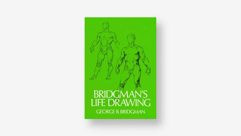
If you’ve ever looked into the study of anatomy from an artist’s perspective, you’ve likely come across the books of George B. Bridgman. His books on the subject are a bit less rigid in structure when compared to those of his contemporary, Andrew Loomis, whose books also come highly recommended.
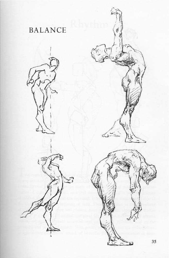
Having worked through both, there are a number of areas in which I found the Bridgman texts to be superior. Bridgman does an excellent job of communicating weight. Even when using line in a rather economical fashion, he manages to give the figure a sense of gravity. Part of this is due to posing and his use of contrapposto, but I think more importantly than that, it’s his abstraction of the forms that give them a sense of movement and rhythm.
By using simple shapes and angles, he exaggerates the way different sections of the body stack and influence one another. This makes it easier to feel the weight of the figure, even without the use of value.
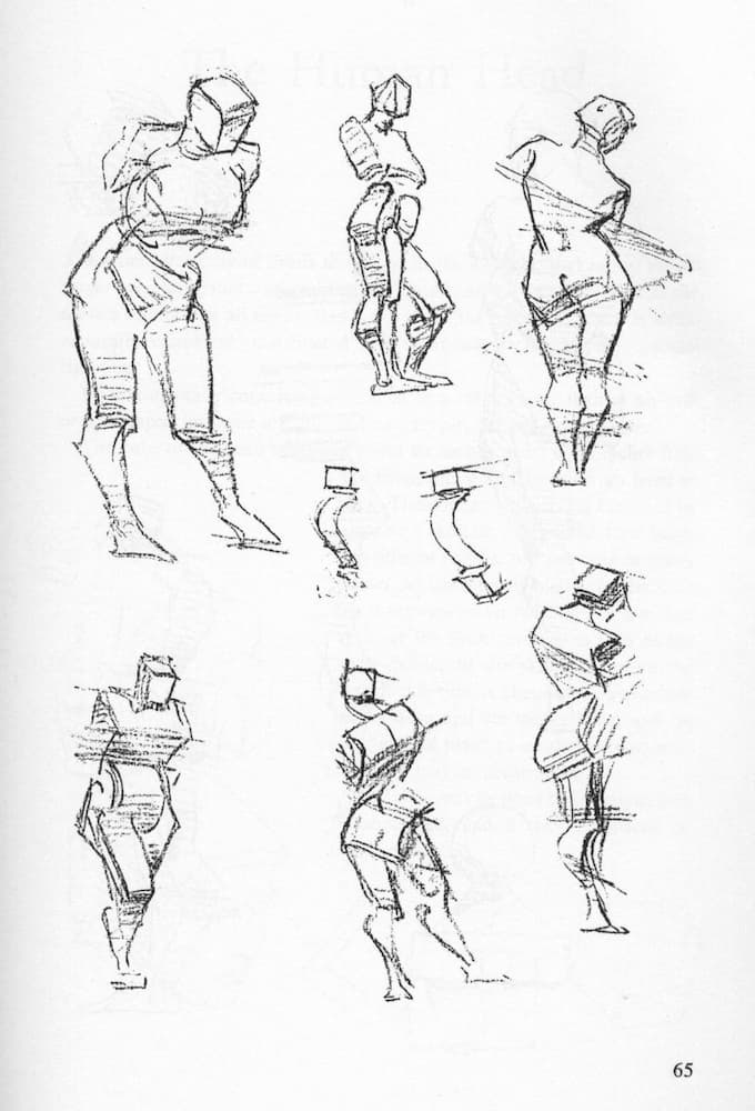
Despite being overly dramatic and geometric, his approach to drawing the figure allows students to quickly achieve a more naturalistic look when compared with those who study Loomis.
I think this stems from the structure of each approach. The Loomis method is very linear, with early focuses on proportion and pose, but little in the way of successfully bridging the two. The result is typically decently-proportioned mannequins in stiff poses. I’ve found that by simply copying the sketches from the Bridgman books, you start to internalize the important masses of the body and the rhythms of how they insert and overlap.
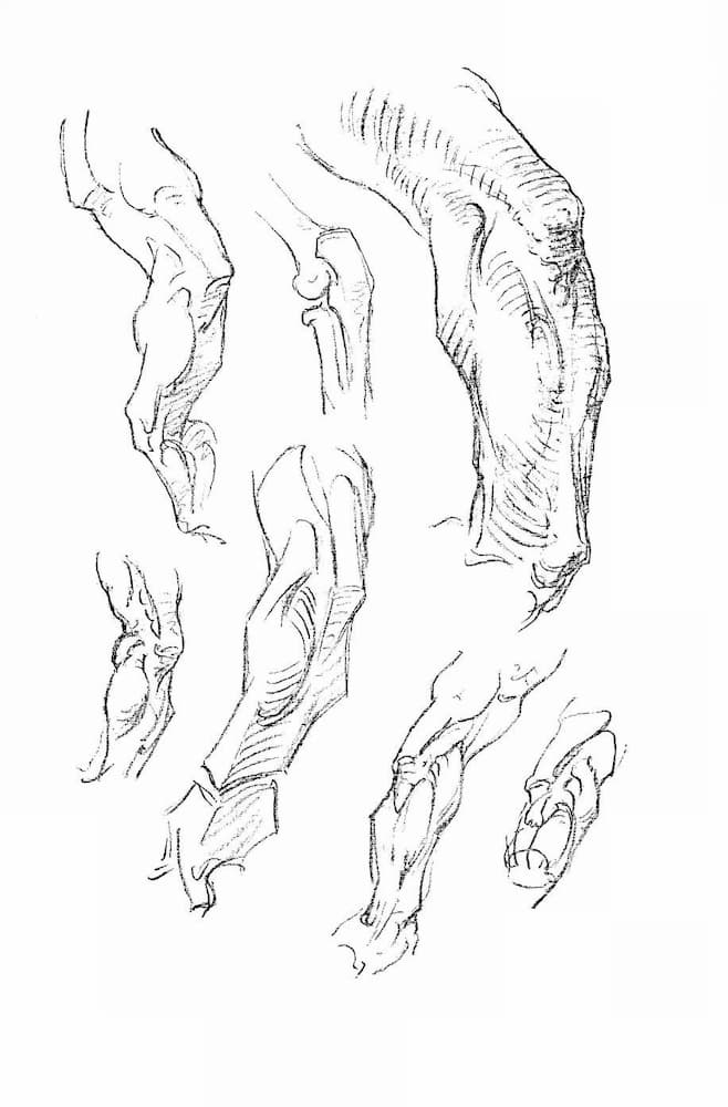
I’ll cover Loomis in a future article, but I find Bridgman to be more approachable, so he seemed like a better place to start. There are principles in the Loomis books that Bridgman omits entirely, like perspective and scale, but approaching these as a beginner can quickly lead to frustration, which is another reason I find Bridgman a better place to start.
The Bridgman approach certainly feels more artistic, at least in my mind, when compared to Loomis, which has a very obvious commercial illustration leaning. However, Loomis does offer more technical information and may serve as a better, more general reference. Which you find to be the most useful will depend on your goals as an artist, and as I said before, I recommend you to use both.

Taylor is a concept artist, graphic designer, illustrator, and Design Lead at Weirdsleep, a channel for visual identity and social media content. Read more articles by Taylor.
ENROLL IN AN ONLINE PROGRAM AT SESSIONS COLLEGE:

