Approaching Anatomy: Loomis
How do you draw the human figure? In our Approaching Anatomy series, we recommend some learning resources for life drawing.
Anatomy is a complicated subject matter. It has long been a hotly debated topic among those involved in art education. Some believe it’s best to start with the skeleton and work outwards to the muscle and skin, while others believe the exact opposite. There are many different schools of thought as to how best to approach the subject as an artist.
For the purpose of drawing, artists don’t require the same degree of knowledge as someone pursuing a career in medicine, though some level of understanding is necessary if one wishes to draw a convincing figure, especially if doing so from imagination.
So who should you listen to? Within the art world, there are a few names that are commonly recommended to those looking to begin the journey of anatomical study. One of these is Bridgman, whose approach I recently covered in another article. The Bridgman technique is perhaps more useful for those looking to create artistic renditions of the human figure, with gravity, weight, and movement taking precedence over realism. If your focus is on expression rather than accuracy, Bridgman is your man.
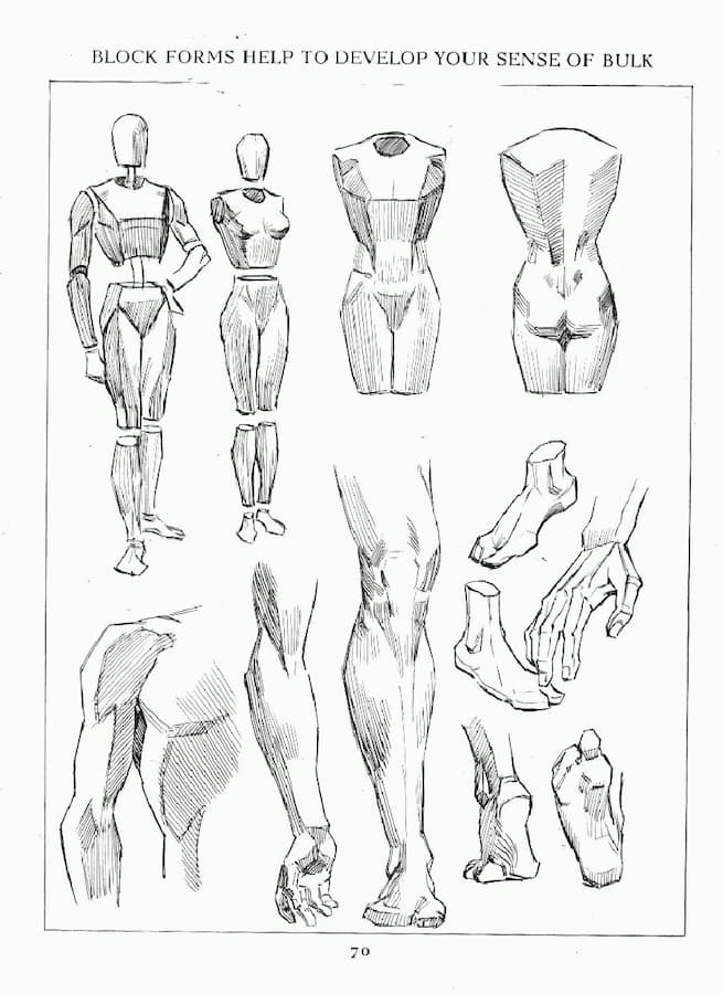
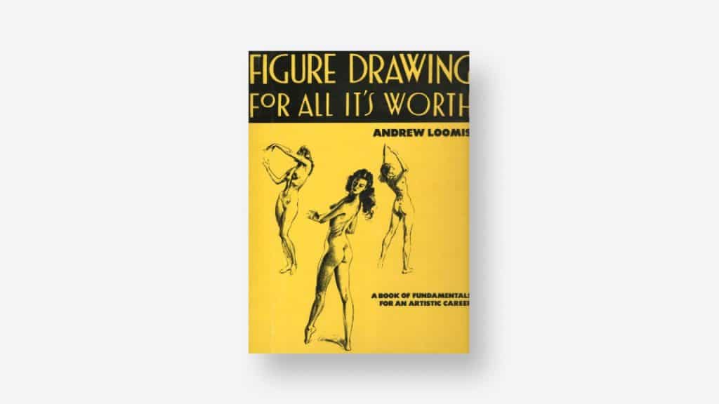
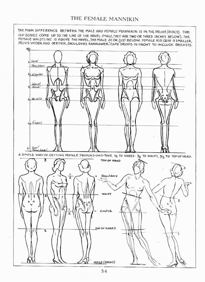
However, for those looking for a more technical approach, life drawing books by Andrew Loomis are hard to beat. He cut his teeth during the golden age of illustration and later wrote a series of books sharing what he learned. His books cover not only practical approaches to drawing the human figure but also how to manipulate those figures within the composition using perspective.
His books aren’t the most beginner-friendly, though, so it’s important to approach them with low expectations. His approach is easy to understand but hard to apply. If you stick with it, though, you’ll be able to create fully realized figures from your imagination.
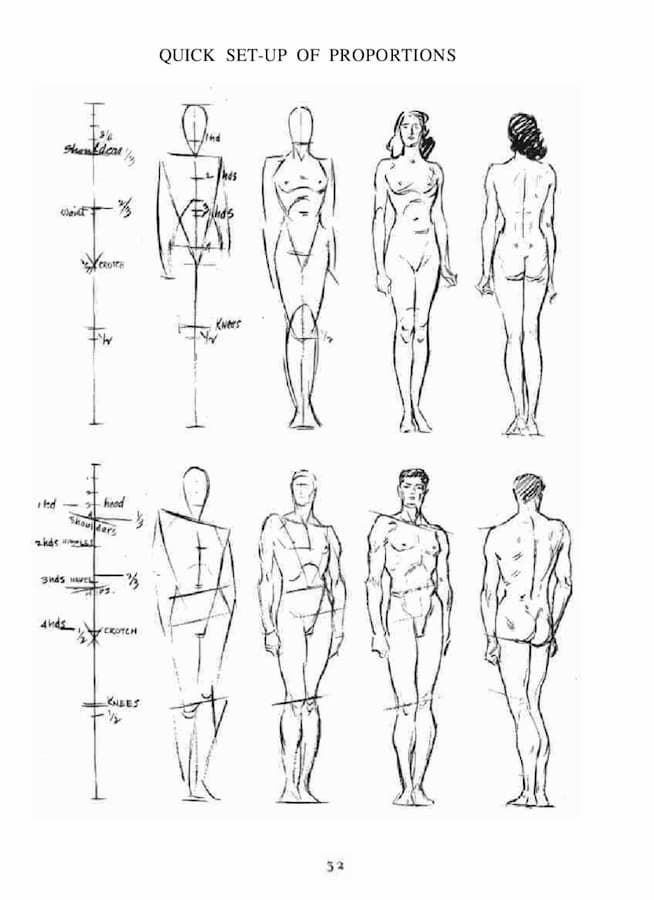
Loomis has also written a number of books that are more specialized in nature and explore some of the trickier aspects of the figure in greater detail. Drawing the Head and Hands is one such book. A significant portion of the book is devoted to drawing heads of all varieties.
Loomis explains the differences between male and female heads as well as the differences between young and old, offering key points to focus on when aiming for each. He also offers shorthand methods for approaching proportions, perspective, and the planes of the face. There’s even a bit about expressions and how the different muscles of the face move in order to communicate emotion.
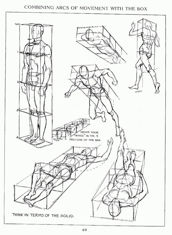
Critics of the Loomis method point out that figures constructed this way can often feel overly posed and stiff. This may have more to do with the style of illustration work Loomis created. He’s demonstrated that he’s certainly capable of lively, expressive illustrations, but his work dealt mainly with lifestyle advertisements in which men were expected to look strong and impressive, and women were delicate and elegant.
Some of the plates in the book do feel a bit dated, mostly due to the hairstyles, but the foundational knowledge is as true today as it was when it was first published. When it comes to Loomis and Bridgman, it’s hard to recommend one over the other, I find it much easier to recommend both.

Taylor is a concept artist, graphic designer, illustrator, and Design Lead at Weirdsleep, a channel for visual identity and social media content. Read more articles by Taylor.
ENROLL IN AN ONLINE PROGRAM AT SESSIONS COLLEGE:
