Best Practices for Brochure Design
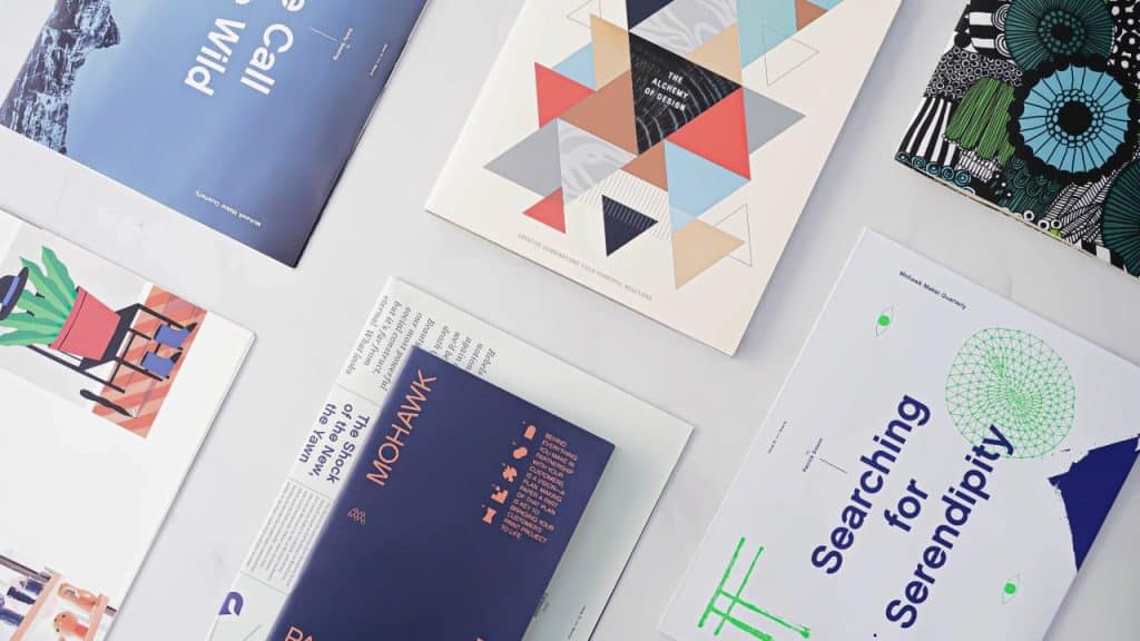
Creative business tips to kickstart your career as an artist, designer, or content creator.
As with any creative project, a brochure design has its own unique parameters and factors to consider. It’s a good idea to follow some best practices to design a beautiful brochure. Outlined here are a few significant ways to ensure your design is off to a good start and in the run to be a great design.
Design for Content
You can design a brochure in a few different sizes and with options for folding. The versatility of brochure design gives designers more of an opportunity to design for content.
So, it’s key that you have a clear idea of how much content the brochure has from the start in order to decide what kind of brochure design will work best.
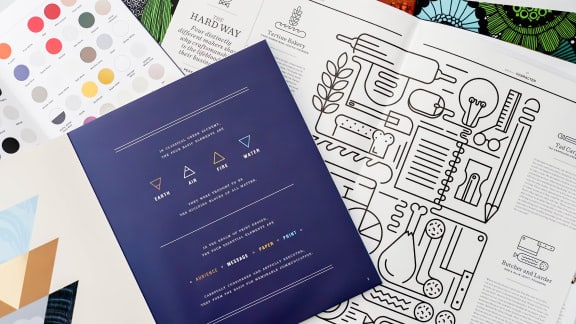
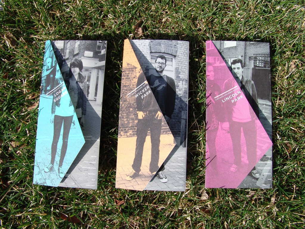 Chicago Neighborhoods brochures by Brandon Souba
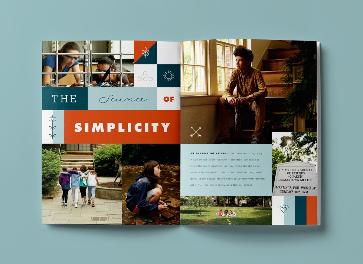
You want to also consider factors like image-to-text-ratio or whether the content has a lot of call out boxes or bullet points. A tri-fold brochure is often not the best choice for an image-heavy brochure or one with a lot of call out boxes with large text since the width of each side of the brochure is so narrow. A square booklet style brochure might be a better choice for a design that has large images and impactful text.
Design for Customers
Brochure design functions quite often as a company or product introduction for a customer, so it’s really important to design it directly for that customer. Do thorough research and come up with a detailed mood board that relates directly to the target market. Find out what other brochure designs for the demographic and market space looks like and consider those designs as inspiration.
Limit Font Use
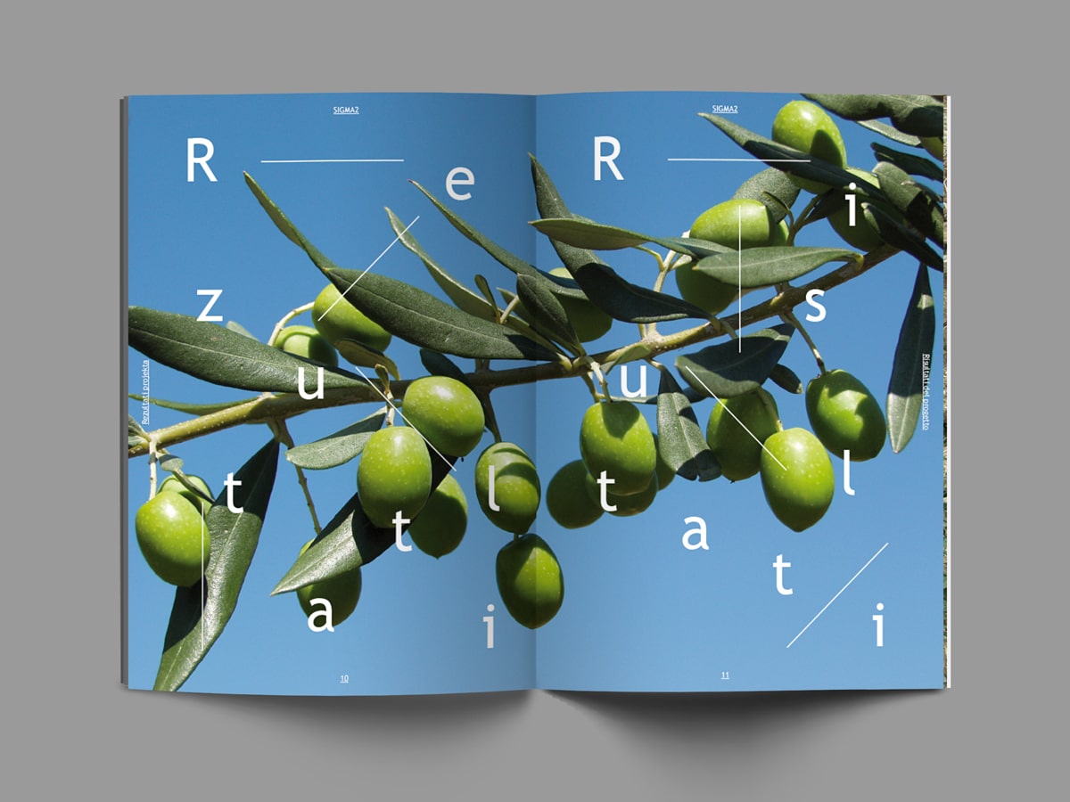
Brochure designers often like to use a lot of fonts in hopes to create an eye-grabbing design, however this is not the way to achieve that result. Unlike larger format designs, brochure design is working within a limited amount of space. As with any design that is limited in space it’s best to not use too many fonts.
If you want to make the typography powerful and exciting consider using scale and color instead. Get creative with the layout and variate the scale of type elements greatly. If you want the letters to pop, add contrast, like yellow on black.
Research your Paper
Since brochure design is an ‘IRL’ (in real life) product you can add a lot of value to the design by choosing the right paper stock and finish. Visit your local printers and talk up paper options for brochures or request paper samples from quality online printers like Mingo Press.
Try to work with print shops that value print quality and design. Paper quality and finish is a key way a brochure design can communicate quality about a company, service or product.
Use High-Quality Imagery
Beyond what paper you use, photo and illustration content is the other factor that makes for an impressive or cheap looking brochure design. Ideally, hire a photographer and use original photography. If you don’t have the budget for that consider using stock photography and illustration but try to find source material that does not look too much like stock.
If your client provides you with low-quality images you can use Photoshop to enhance the images or apply color effects to them that improve their look and obscures the quality of the original images. If you don’t have good quality images it would be better to create typographic compositions instead that use color and layout in interesting ways.
Write for Design
Your client might hand over a document that reads like a short novel. If you can, ask them to revise it to include succinct and clear statements that a customer can read quickly and on the go. Clear and short statements are easier to design in interesting typographic ways that are also immediately informative to the customer.

Margaret Penney is an experienced Brand Designer and Art Director as well as a teacher, designer, writer, and new media artist and Founder and Principal Designer of The Design Craft and 9& Studio.Read more articles by Margaret.
RELATED ARTICLES:
SESSIONS NEWS:
ENROLL IN AN ONLINE PROGRAM AT SESSIONS COLLEGE:

