By Hand or on the Computer? The Threat of the Uncanny Valley
Creative business tips to kickstart your career as an artist, designer, or content creator.
When I was a design student, we’d take tours of design studios. At the end of the tour we were offered a question and answer period. One question was asked again and again, “Do you do things by hand or on the computer?”
Why was this asked over and over? Why was the question phrased as if the two are mutually exclusive? There is a strong appeal to the handmade and handcrafted, particularly as technological gadgets make it easier than ever to create mathematically perfect shapes.
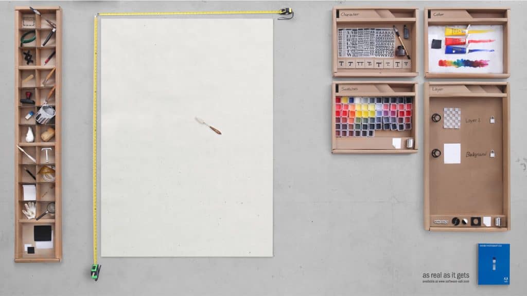
This photo of an ‘analog Photoshop’ came across my Facebook feed a few days ago. It was immediately popular and re-shared several times. (Sorry, friend on Facebook, whom I don’t even know that well… this one isn’t new. It was shot in 2008.)
So what’s the appeal to the hands-on, real ‘Photoshop’?
In part, the detail (the locks on the Layers panel, the small pots of paint in the Swatches panel) is as alluring as the imperfections. The measuring tape is a tiny bit angled, the T for the Text tool is a tiny bit askew. The entire effect is incredible, don’t get me wrong. But why IS it so incredible? It’s a less-perfect version of something that designers use practically every day. It exists in the tangible world of three-dimensional objects and is imperfect, as the tangible world tends to be.
This imperfection is key to the attraction.
Psychology Today ran an article about imperfection and attraction, specifically regarding the allure of the imperfection over the perfection.
“Author Jeff Riva claims: ‘I love imperfect characters; both while reading and while writing. Most of the characters I create have some or the other imperfection in them. Imperfection is actually the new perfection. The smudge of Imperfection in characters adds an unexplainable and undefinable appeal… Imperfection makes a character more real.”
To err is human, after all, and our world is full of imperfections.
The computer allows us to push past the imperfections into the perfect. Mathematic circles are at our fingertips and begging to be used. Straight lines have never been straighter and text lines up like magic.
Yet so many designers tell us to work out our concepts on paper before turning to the alluring brilliant screen. We’re told to sketch our ideas, to brainstorm, to let loose. We’re encouraged to draw because, we’re told, the brain is freer without the constraints of technology, without wondering how to execute a function. We’ve been using pencil and paper reliably and without software updates for decades. We can easily let our imaginations run wild without wondering how to coerce the software to make the text go in a circle.
The brain can move more freely without the constraints of technology.
Too few imperfections lead to a creepy level of discomfort, which is called the Uncanny Valley. The uncanny valley describes a point at which a human-like animation or robot looks too close to a human and generates a feeling of revulsion or distaste. The interesting part is that this is not a linear progression, but a very abrupt one. Human beings will be fond of or empathetic to an object that is human-like but is clearly not human (think of adorable stuffed dolls, for instance). But once the dolls become too close to the ‘perfect’ human being, we’re immediately creeped out (this is why some baby dolls are just, plain creepy).
The animated film Shrek initially hit the uncanny valley with the princess character, Fiona. She was just a bit too close to life-like, causing children in the audience to cry. Computer animation can strike the uncanny valley by creating a character that was too perfect. So perfect that it was creepy.
Computers can create perfect lines and shapes, but often sterility, as well. This sterility is related to the uncanny valley concept; each may be very precise and technically correct but lacking in some sense that we can’t even put a finger on. What is it missing?
In some part, the answer is the human hand and using our tools wisely. By starting with a hand drawn sketch, your designs are springing from your imagination, not from a set of pre-determined shapes. Sketches are not just happy accidents and charmingly imperfect. Sketches lead to clean and well-thought-out designs. The computer is a tool with which we can execute the design; it is not a substitute for design. Milton Glaser was more biting, “Computers are to design as microwaves are to cooking.”

Glaser may have loved New York, but he didn’t love computers.
Microwaves save me time when I defrost frozen leftovers or melt butter, but I’d never use it to cook a lasagna or bake cookies. Used for its intended purpose, a microwave can save time and energy but it’s no substitute for my oven. A computer can save time and energy (would you like to lay out type by hand?) but is no substitute for a sketch.
By first creating a design by hand and allowing the imperfections, the crazy whims, and the ridiculous concepts to pour out, we can then refine the best designs. Avoid the sterility of your Mac, dive deep with crayons or colored pencils, chalk or charcoal. Make a mess. Use that mess to let the brain run free. Use the computer later, to work on your designs organically. Allow a little bit of imperfection, of humanity and soul to shine through.

Sessions Staff is a restless soul who loves to share relevant news and design industry information with current and prospective students. Read more articles by Sessions Staff.
ENROLL IN AN ONLINE PROGRAM AT SESSIONS COLLEGE:

