How do you use color effectively? Our Understanding Color series explores the psychology of color.
Citron yellow is a fantastically bright yellow with a hint of green, like the color of the citron fruit. Citron is similar to chartreuse as a favorite in fashion and home decor for its modern intensity—yet citron is less green and more summery and natural.
Citron is also a divine color for Tibetan Buddhists, the yellow citron fruit is an attribute of the goddess Cunda-devi and of the gods of wealth Jambhala, Vaishravana and Kubera. The Sanskrit term for this yellow means victorious and women who wear it are expected to be bountiful both in babies and in resources. An unusually shaped citron is even named after the divine himself, the Buddha’s Hand citron varietal.

Buddha’s Hand
Like other intense almost neon shades, citron can be used quite differently depending on the contrast of the colors it’s combined with.
Citron paired with neutrals like dove grey, beige and cream is an elegant combination often seen in upscale products and environments. The subdued neutrals add a calm subtlety to the palette while the citron appears as daring. Take a look at these Tolix chairs at the restaurant Paparazzi for citron used in this way.

Vintage Tolix Chairs at Paparazzi
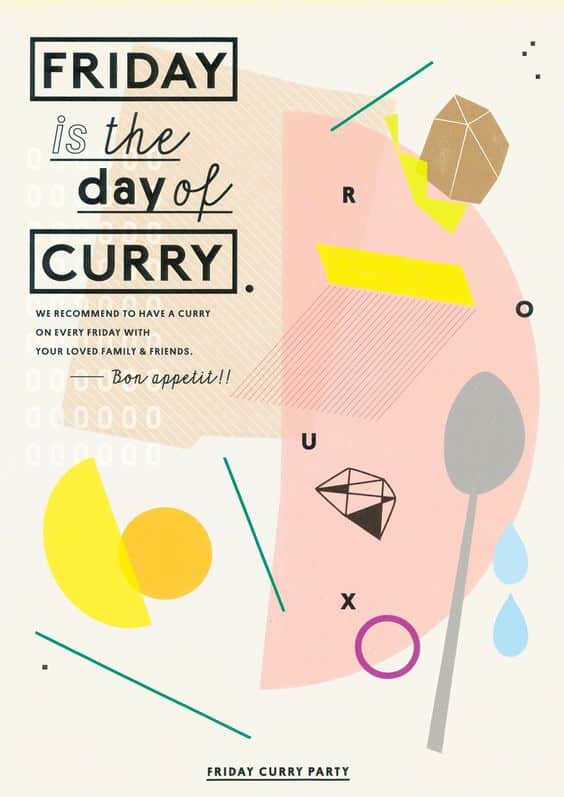
A soft combination for citron is with pastel shades of blue or pink. It’s a contemporary, soothing yet bright palette, like in this poster design by Kazunori Gamo and the following paintings by Lynne Woods Turner.
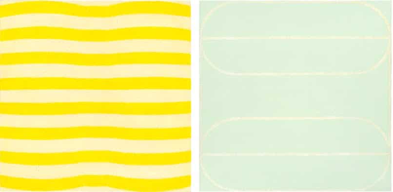
Paintings by Lynne Woods Turner
On the flip-side, when citron is paired with darker colors like dark grey and brown, the contrast is so great it gives citron an almost otherworldly zing. Take a look at this incredibly welcoming front door.

Citron Door
For graphic designers, citron is a great accent color when paired with black and can be used to create edgy, bold designs.

Tour & Taxis

Switch Design Team newsletter
Citron and black was also a favored color combination in the 1960s and this is how it was used often as a ‘modern’ color. Take a look at this 60s inspired fashion photo to see the color used in this mod way.

Inspired by the 60s
To really amp up the visual power of citron, the best way to use it would probably be solo or paired with other intense yellows.
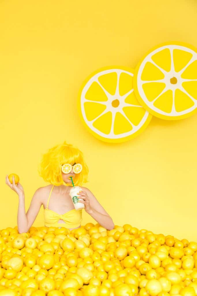

Studio DIY Lemon Booth Photoshoot
This photoshoot for Starbucks from Studio DIY takes Summer to 11 with an all yellow palette. Fun, happy, bright—if you are having a summer fest this would be a great look.
Citron also looks lovely as its 100% natural self, when paired with other earthy colors it would be seen with in nature, like the colors of stems, leaves and soil. Take a look at the narrative atmosphere project by Abbey Withington and this bold wall as examples of citron used in a more down-to-earth way.

Abby Withington Collage

Citron Wall and Window

Margaret Penney is an experienced Brand Designer and Art Director as well as a teacher, designer, writer, and new media artist and founder of Hello Creative Co. Read more articles by Margaret.
SELECTED ARTICLES:
RELATED PROGRAMS AT SESSIONS COLLEGE:

