Color Series: Using Value to Guide Color Choices
by Taylor Slattery | October 28, 2021
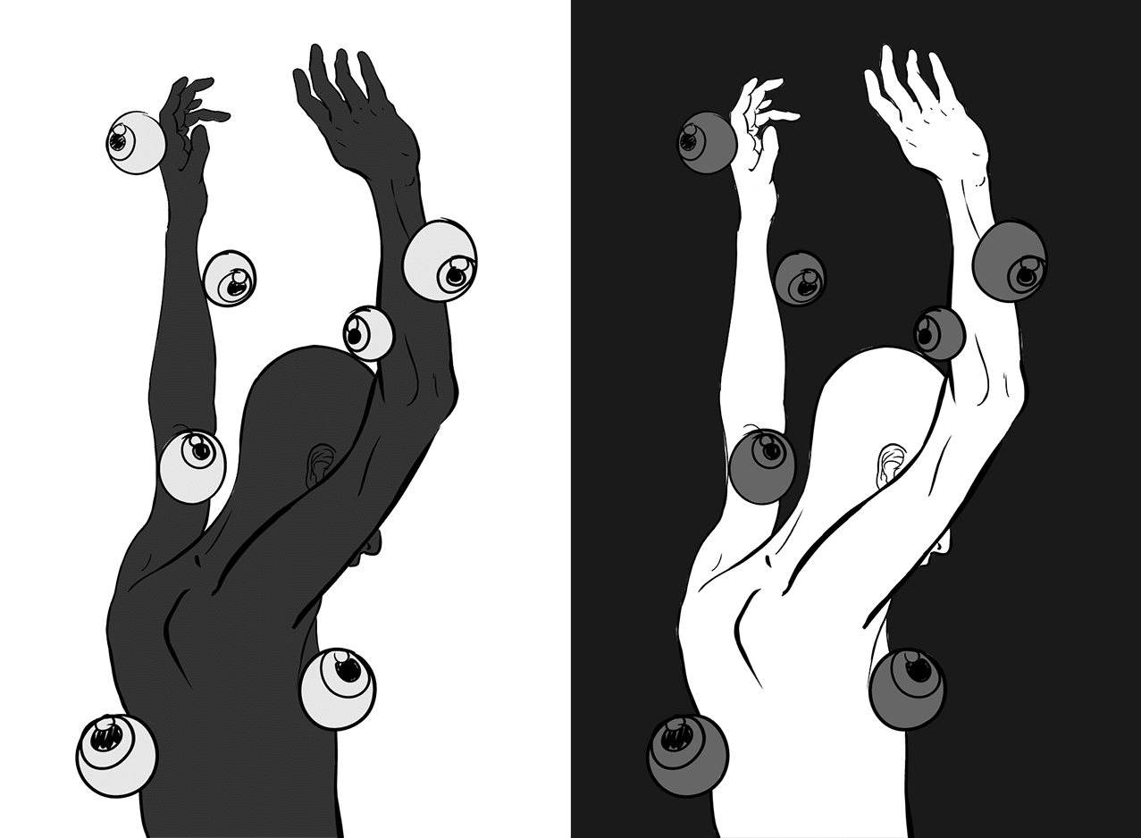
We’ll now take a look at how we can use these various sketches as we move into the next stage, by using them to inform our color decisions. To do this we’ll first need to take a quick look at how value and color relate.
Color can be measured in different ways in digital and traditional environments and within the realm of those used digitally, there are several ways to describe the same color. You’ll often see RGB, which divides colors into red, green, and blue, and is used to represent colors in digital spaces, and CMYK, which uses cyan, magenta, yellow, and black, and is used for print. The third common measure, and the one we’ll be using for the sake of learning and thinking about color, is HSV/HSB. These stand for hue, saturation, and brightness/value. In terms of describing how colors relate to one another and navigating the color wheel, HSV/HSB is the most useful.
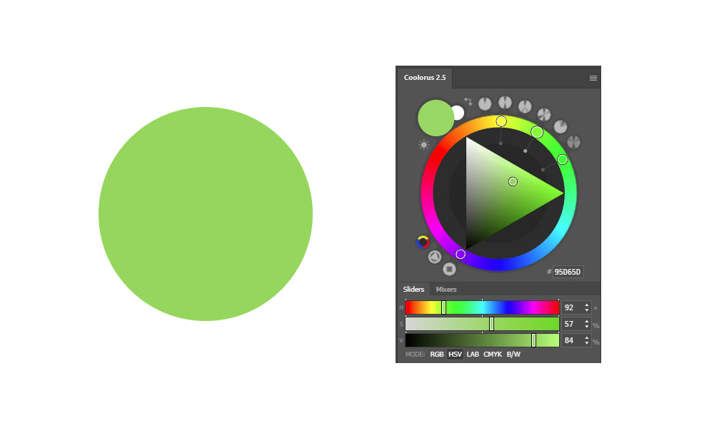
Any given color can be described using these three values. Take this green for example. We can see that the first value, for hue, which denotes its position in the color spectrum, is 92. The second value, its saturation, is 57, and the final value, representing its position between black and white, is 84. For the purpose of bringing our value sketches into color, we’ll want to pay particular attention to this last value.
Our goal moving forward will be to maintain the feel we created in our value sketch while adding color. To check our success we can do one of two things. The first, and the most simple, is to squint. Squinting removes detail and unnecessary information and allows us to more easily judge and compare values. The second, and more precise method, is to remove the color from your image to see its exact value. In Photoshop, this can be done by creating a new layer at the top of your stack, filling it with black, and changing its layer mode to color. This will show us exactly what we need in order adhere to our value sketches.
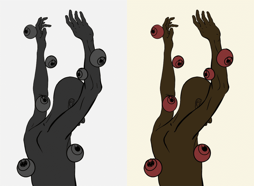
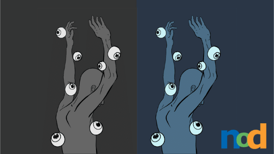
Using the second technique, I added color to the value sketch on the left, resulting in the image on the right. It’s important to note that the combination of these three variables: hue, saturation, and value, have an impact on any color’s perceived value, and by changing one variable, the whole is affected. Here’s a selection of four colors, each with identical saturation and brightness values, only the hue has been changed. Notice how differently the same four colors are perceived when checking their values.

You can test this for yourself by creating a solid fill layer beneath the color mode layer we created for checking values. Open up your color picker and drag the hue selector through the color spectrum. Notice how much variation there is in value, despite both the saturation and brightness values remaining numerically the same.
Different hues each have their own chroma, which is the combination of saturation and value where the color appears its strongest. For yellow, its chroma occurs at a higher value, and for blue, its chroma is much lower. For this reason, when you’re using a value sketch to guide your color decisions, just squint and trust your gut. Don’t worry about matching numerical values exactly.
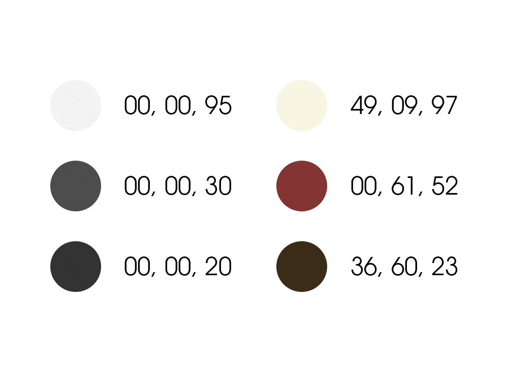
To further illustrate this point, I’ve color-picked the colors used in the two images side by side. Despite both giving a value of 30 while desaturated, notice how with hue and saturation added, the value of the red has now become 52. However, if we squint, the desired effect of keeping the values of the eyes and figure close is still achieved, so it passes the squint test.
In the next installment, we’ll discuss how we can build our illustrations further by using color schemes.

Taylor is the Managing Editor of Notes on Design. Taylor is a graphic designer, illustrator, and Design Lead at Weirdsleep.
If you are interested in learning more about using color, Sessions College offers a Color Theory course and many other graphic design courses for students at all levels. Contact Admissions for more information.
Recent Articles

