Color Trends: Anthracite
How do you use color effectively? Our Understanding Color series explores the psychology of color.
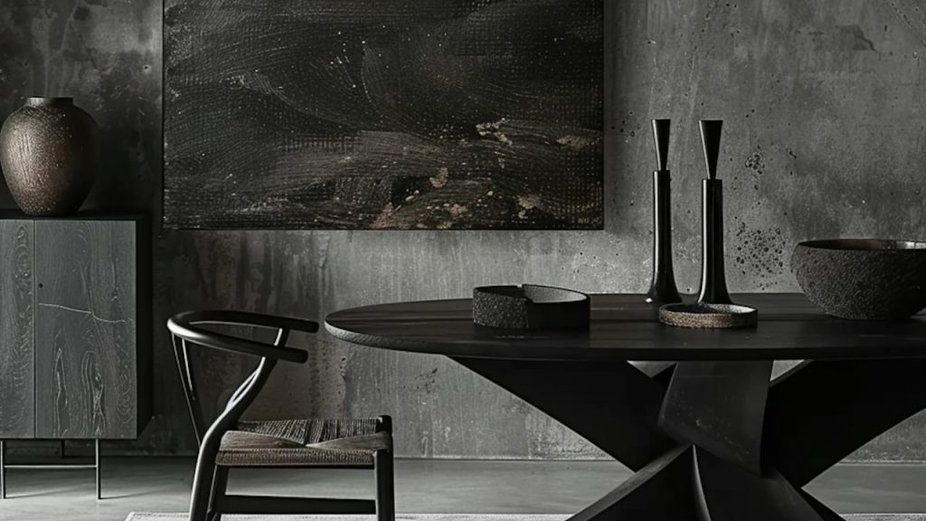
Anthracite is a chalky and earthy near-black or very dark gray. Anthracite itself is a form of coal used in thermal power stations for generating electricity. The color comes from the object and is a favored choice in furniture, home decor, and graphic design projects.
Anthracite is a good option when you want to create a palette that has some nuance and sophistication.
When anthracite is used instead of black it appears slightly softer on the page without the harsh contrast of black. It can also appear slightly warmer and more naturalistic especially if it has more of a green-gray tinge.
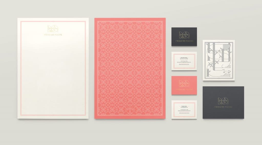
Anthracite pairs well with many colors since it is so dark, but works particularly well with other nuanced colors that are far from primary, secondary, or even tertiary. It also works well with colors associated with metals and minerals and looks great with silver, gold, rose gold bronze and brass.
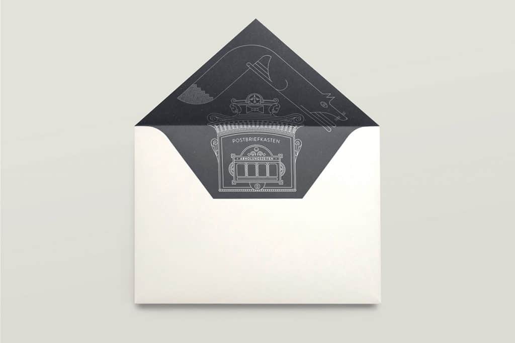
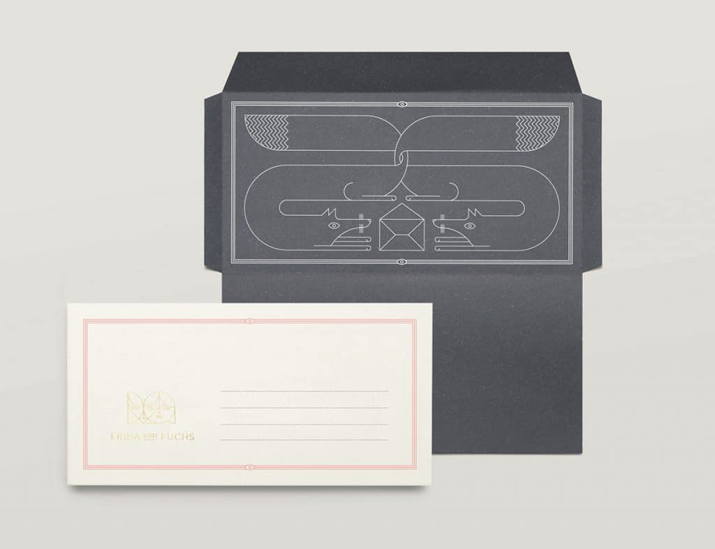
In the Frida Von Fuchs identity project by Jono Garrett above anthracite is used with pink-coral, cream and gold. The palette is warm, soft, and neutral. The design has an upscale feel but also an understated and elegant femininity.
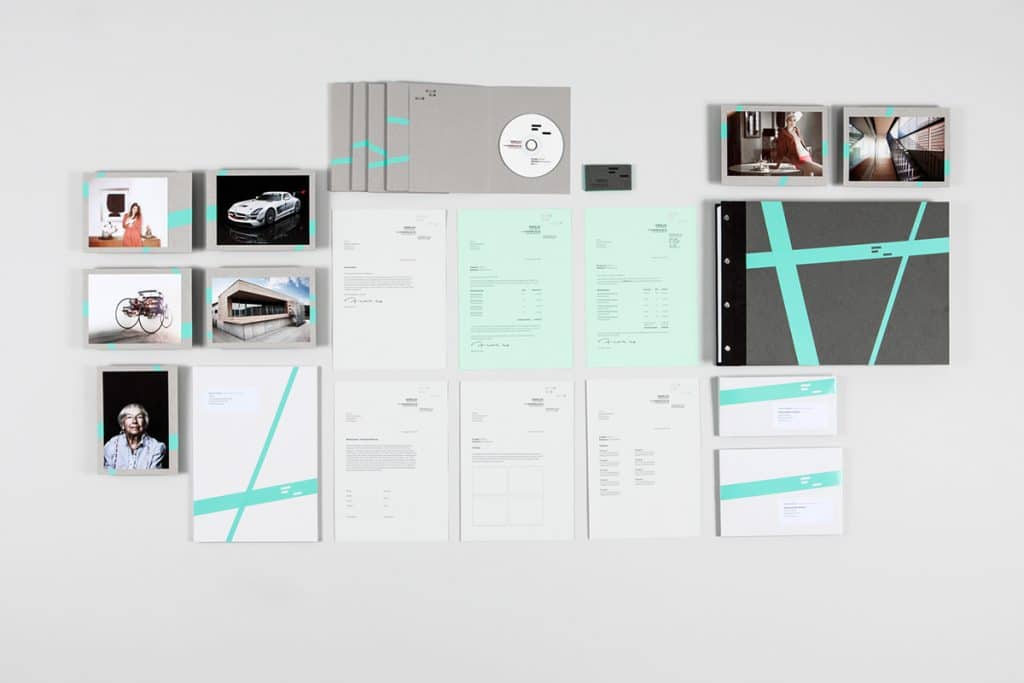
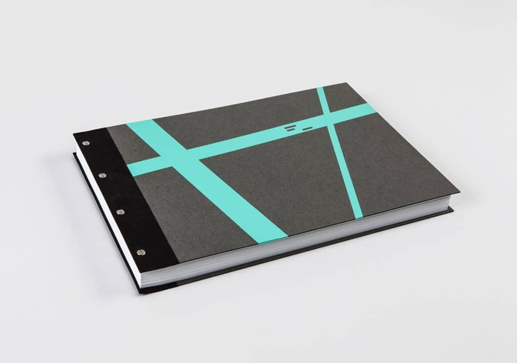
In this gorgeous identity kit for photographer Frederick Laux we see anthracite used as the darkest shade in this palette. Anthracite is again paired with warmer naturalistic colors like this mid-range mossy gray, ash and light taupe.
In this project, we also see how anthracite works with light and vibrant hues in the combinations with the bright and light minty colors. The mint colors bring an on-trend updated feel to the design while the other colors, temper this with a dark classic sophistication.
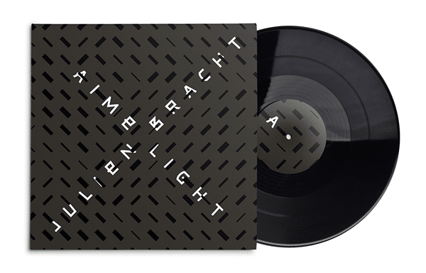
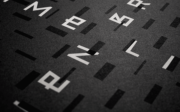
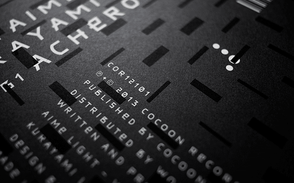
For the ultimate in nuanced low contrast minimalism, combine anthracite with black. In the Julien Bracht Aime Light record sleeve anthracite and black are applied to a complex pattern, that with a more highly contrasted palette would create visual clutter—instead the combination adds visual interest and subtle complexity to the design.
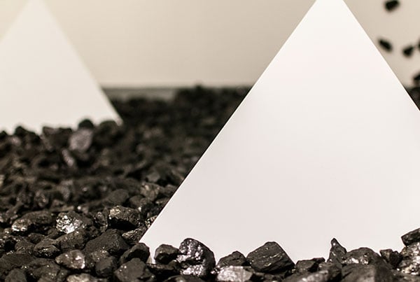
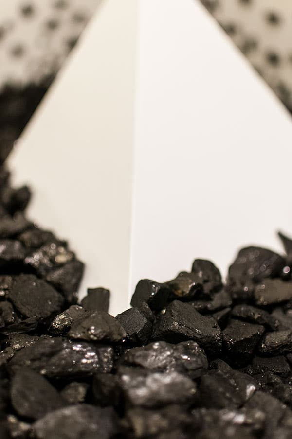
In the Duration: Cold Fracture Dust digital art and sculpting project by Steven Pestana we see a minimalist and austere application of anthracite. The color appears in its true form as coal. As a stark combination with near-white and sharp angles, it appears serious, stark, and formidable.
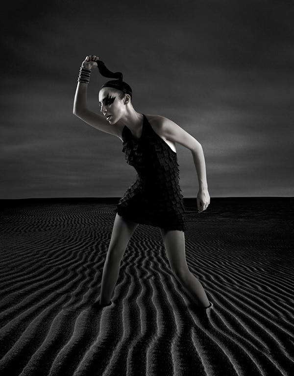
Anthracite is also a popular color in fashion projects where it lends a sleek sophisticated look. It is used in a completely grayscale palette that presents a stylish dystopian vision of a future earth as a harsh inhospitable landscape in this photo series by Benny Yarnell.

Margaret Penney is an experienced Brand Designer and Art Director as well as a teacher, designer, writer, and new media artist and Founder and Principal Designer of The Design Craft and 9& Studio.Read more articles by Margaret.
RELATED ARTICLES:
SESSIONS NEWS:
ENROLL IN AN ONLINE PROGRAM AT SESSIONS COLLEGE:

