Design in Motion: Animated Posters
Creative business tips to kickstart your career as an artist, designer, or content creator.
Technology continues to shape the way we consume and interact with information. The use of feeds has become commonplace across all social media and adapting to this format has had an impact on our viewing habits.
Due to over-exposure to advertisements in both print and digital forms, we’ve developed the unconscious habit of ignoring them. We quickly scroll past irrelevant content until we arrive at something that catches our interest.
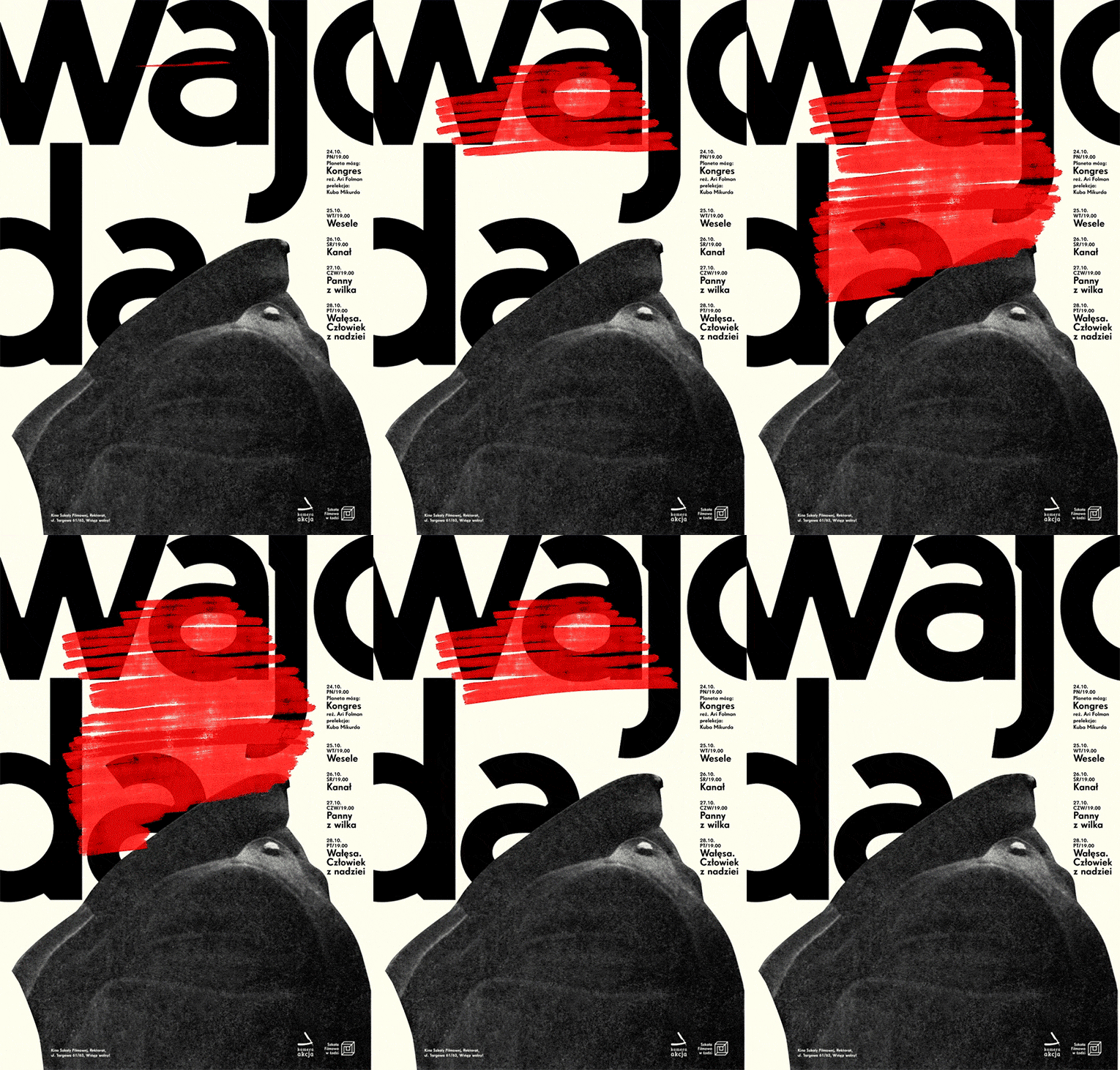
For designers, this can mean bad news. The hours spent carefully arranging elements, selecting colors, and setting type can all be for naught if nobody is willing to look at them. Unfortunately, despite their graphic appeal, their form-factor and attempt at delivering information places them under the same umbrella with the rest of the advertisements and viewers scroll past.
However, not all is lost. There is a way to overcome this habitual ignoring, and the answer lies in the world of animation. Due to evolutionary processes, motion attracts our attention in a way not possible through color and shape alone.
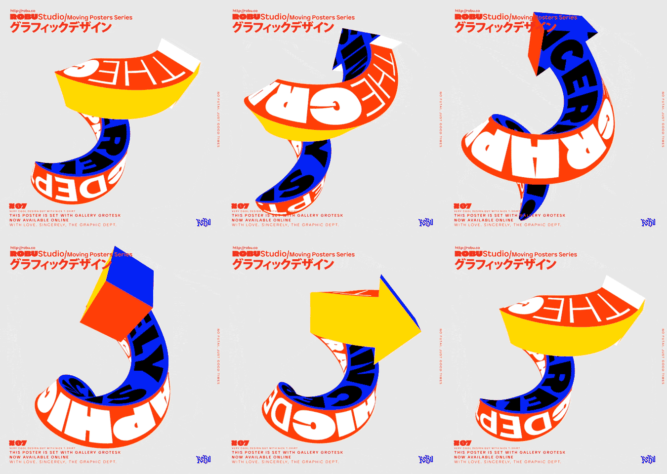
Motion causes us to give pause and explore something more than we likely would have had it not been moving. We’re drawn to patterns and when confronted with an animation or video mid-sequence, we’re likely to see it through to its completion.
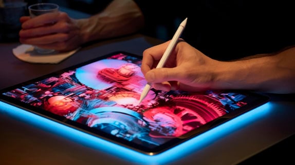
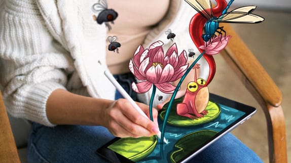
The stylistic groundwork for the current state of animation in design was laid by TV networks like MTV and Adult Swim, who many of those working in motion design today grew up watching. Poster animations can range from simple text animations or color swaps, to elaborate narrative 3D compositions that play out more like a movie than a poster. Animation allows the graphic designer at any skill level to breathe new life into their work, giving viewers a glimpse into their world and sharing personality in ways previously unthinkable.
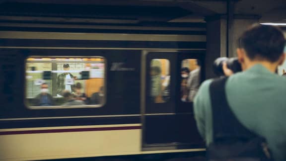
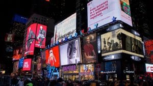
Metropolitan areas and places of transport, like train stations and airports are covered in monitors displaying information and advertisements in the form of videos. The way we consume information is changing, and our increasingly video-based environments present designers with exciting new ways of interacting with viewers.
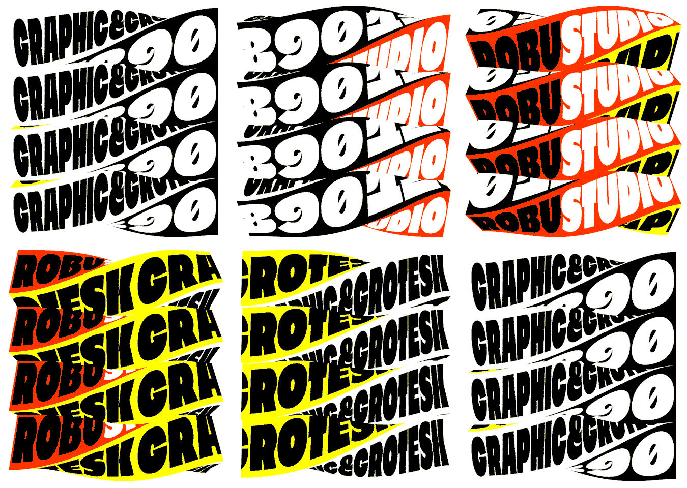
The web presents an increasingly greater reach than traditional forms of advertising. Mobile devices have become the go-to choice for web browsing and video is quickly becoming the way most people prefer to consume media.
As more companies realize this and decide to get in on the action, the demand for designers capable of making eye-catching animations will only increase. With the technology for making these animations and instructional material for using them both becoming more accessible, now is a great time to add some animation knowledge to your skillset.
While there is still something to be said about specialization, having some general understanding of motion design under your belt will undoubtedly be an asset worth acquiring.

Taylor is a concept artist, graphic designer, illustrator, and Design Lead at Weirdsleep, a channel for visual identity and social media content. Read more articles by Taylor.
ENROLL IN AN ONLINE PROGRAM AT SESSIONS COLLEGE:
