Designer Profile: Shigeo Fukuda
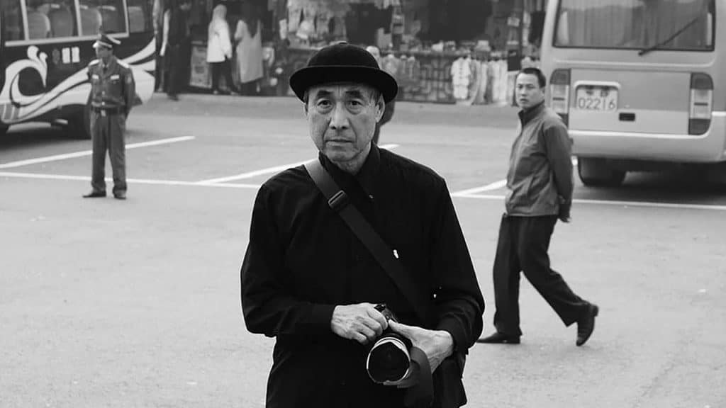
In our Designer Profiles series, we look at designers who have had a major influence on visual culture.
Shigeo Fukuda (February 4, 1932 – January 11, 2009) was a Japanese design prodigy and creative multi-potentate as a sculptor, graphic artist, and poster designer. Most importantly, Shigeo Fukuda was greatly influential as a designer of optical illusions.
Fukuda was born in Tokyo to a family with a thriving toy production business. Growing up surrounded by toys helped him develop an appreciation for creativity and aesthetics. As a young post-war designer, he was intrigued by the minimalist Swiss school of design. While at the Tokyo National University of Fine Arts in the mid-50s he developed a minimalist and simple style that became part of his defining look.
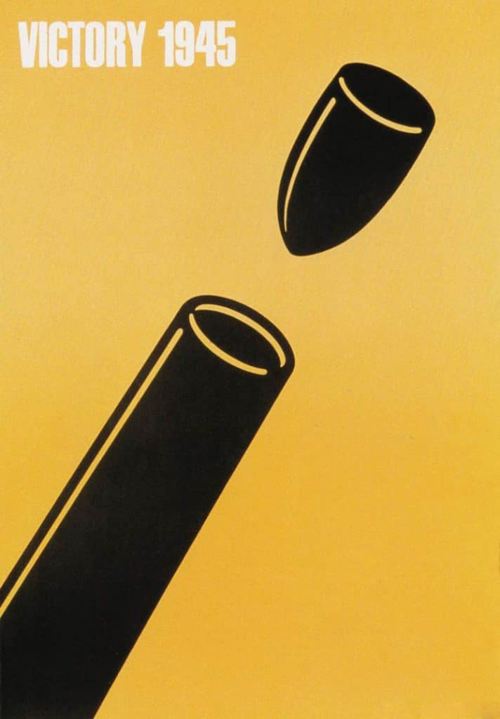
Victory 1945, a well-known minimal design created by Fukuda in 1975.
During the 1960’s, Shigeo Fukuda became deeply intrigued by illusionism. He began writing a column on visual magic in the Ashai Newspaper called “Ryu Mita Ka?” (Have you seen the Dragon?). He also ran Idea Magazine’s Visual Circus, which was a bi-monthly magazine that showcased entertaining visual illusions. In these roles, he became the expert and a master designer of illusion. Here is a great quote from him on the topic of illusion:
“I believe that in design, 30% dignity, 20% beauty and 50% absurdity are necessary. Rather than catering to the design sensitivity of the general public, there is advancement in design if people are left to feel satisfied with their own superiority, by entrapping them with visual illusion.”
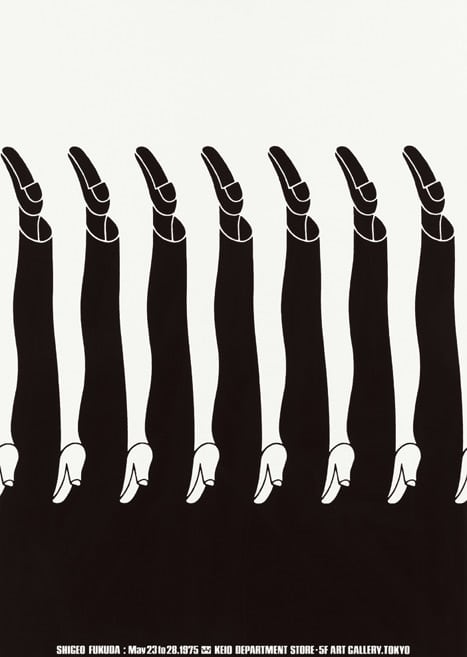
Fukuda’s Illusionism
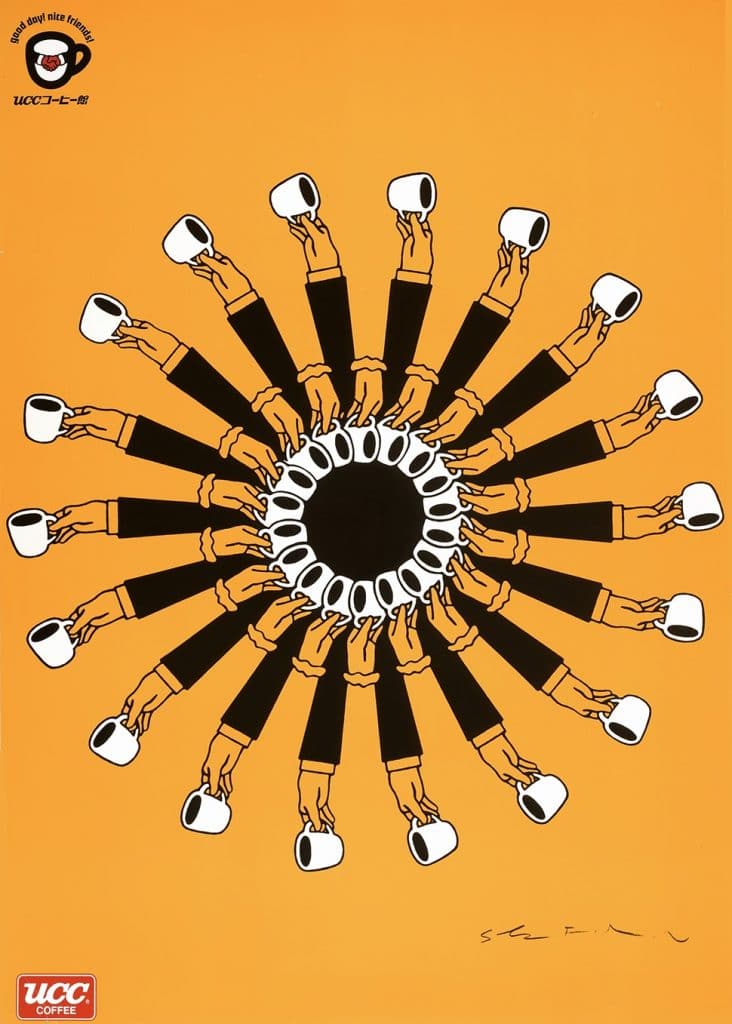
Fukuda’s Illusionism
When describing his posters, The New York Times referred to them as “[distilling] complex concepts into compelling images of logo-simplicity.” His work also included the official poster for the 1970 World’s Fair in Osaka.
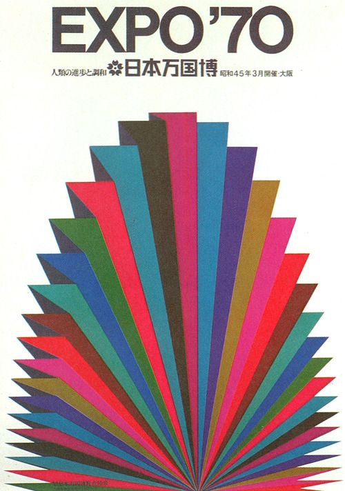
Fukuda’s World’s Fair Poster
Fukuda was an environmentalist and anti war in his beliefs. Twice commissioned to celebrate Earth Day, he designed two posters, one that presents the Earth as a seed opening against a solid sea-blue background and the “1982 Happy Earth Day,” which shows an axe with its head against the ground, having a small branch sprouting upwards from its handle.
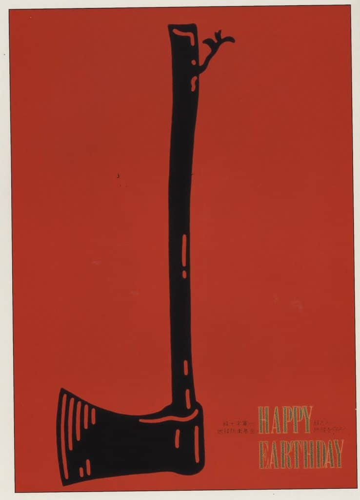
1982 Earth Day poster
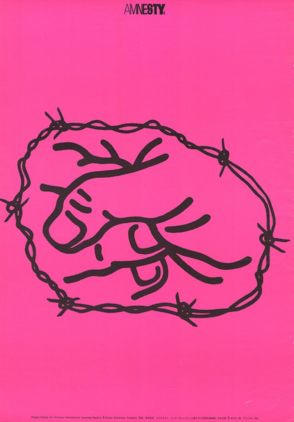
A poster dedicated to Amnesty International presents a clever illusion of a clenched fist interwoven with barbed wire. The letter “S” in the word “Amnesty” at the top of the poster forms an inked shackle.
Fukuda was the first Japanese designer inducted into the Art Director’s Club Hall of Fame. The club called him “Japan’s consummate visual communicator” and described his piece “Victory 1945” as a “bitingly satirical commentary on the senselessness of war.”
Victory 1945 won him the grand prize at the 1975 Warsaw Poster Contest and he gave all the proceeds of the competition to the Peace Fund Movement.
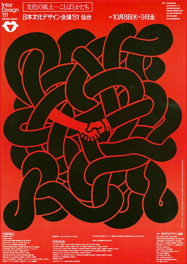
Interdesign ’81
During the span of his career, he created thousands of posters. The use of simply lined illustration and repetition of form combined with illusion has been emulated by many graphic and motion graphic designers. You can see a Fukuda influence in this Pet Shop Boys video by Han Hoogerbrugge.
In his later years, Fukuda took his exploration of illusion even further and created work that used light projections and sculpture to create tricks of the eye. His most famous work, “Lunch With a Helmet On,” is a sculpture made entirely of forks, knives, and spoons which casts a shadow that is a detailed image of a motorcycle.

Margaret Penney is an experienced Brand Designer and Art Director as well as a teacher, designer, writer, and new media artist and Founder and Principal Designer of The Design Craft and 9& Studio.Read more articles by Margaret.
ENROLL IN AN ONLINE PROGRAM AT SESSIONS COLLEGE:
