Free Font Friday: Amatic SC

Our Free Font Friday series profiles the design characteristics of today’s free downloadable typefaces.
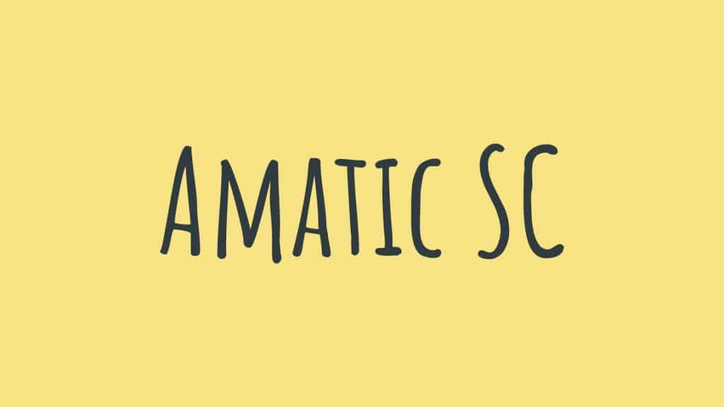
Amongst the sea of Sans Serifs we’re accustomed to interacting with online, a little bit of character every now and then can make a big impact. Amatic SC is a hand-drawn font created by the late Vernon Adams, who also created the extremely popular Oswald typeface.
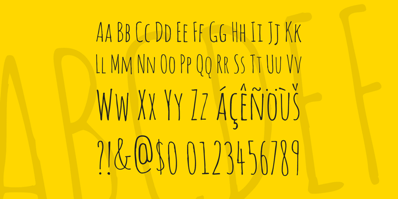
Designed for web use, Amatic SC has great readability in part thanks to its small caps (where it gets the SC in its name). This makes it a great choice for titling and other bits of text that need to stand out from the body. Due to its humanistic feel, it works particularly well for pull quotes in interviews.
It has a very graphic read, but its kerning keeps it feeling very light and airy, a welcome reprise from dense body text. Because it is hand-drawn, it also pairs nicely with a more utilitarian sans serif, the contrast between the two serving to highlight their individual characters.

Amatic SC is available in two styles in both Latin and Hebrew alphabets. If you’re looking to inject a bit of charm into something you’re working on, you can check out Amatic SC here.

Taylor is a concept artist, graphic designer, illustrator, and Design Lead at Weirdsleep, a channel for visual identity and social media content. Read more articles by Taylor.
ENROLL IN AN ONLINE PROGRAM AT SESSIONS COLLEGE:


