Free Font Friday: Aquiline Two
by Taylor Slattery | March 6, 2020
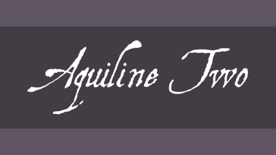
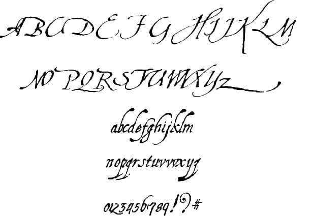
Aquiline Two feels like the type of font you would see in the title sequence of a movie about a guy who goes to sea, leaving his wife behind but writing her letters. He gets shipwrecked but ends up making it back home years later only to find that none of his letters made it to her and she’s moved on and has a new love interest. But then the letters all arrive at once and she breaks down at the evidence of his undying love for her.
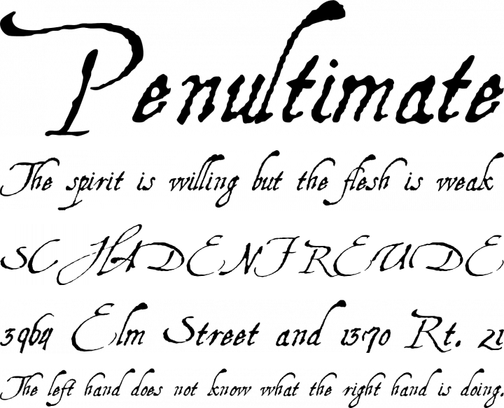
The fact that I was able to generate that much narrative simply by looking at this typeface is a testament to the strength of its character. This typeface is definitely not versatile but it makes up for that by being good at what it does. If you’re currently writing a script, or designing the title sequence or posters for an era romance film, Aquiline Two would be a great choice. It would probably also look nice on greeting cards. You can find Aquiline Two here.

Taylor is the Managing Editor of Notes on Design. Taylor is a graphic designer, illustrator, and Design Lead at Weirdsleep.
Recent Articles

