Free Font Friday: Chomsky
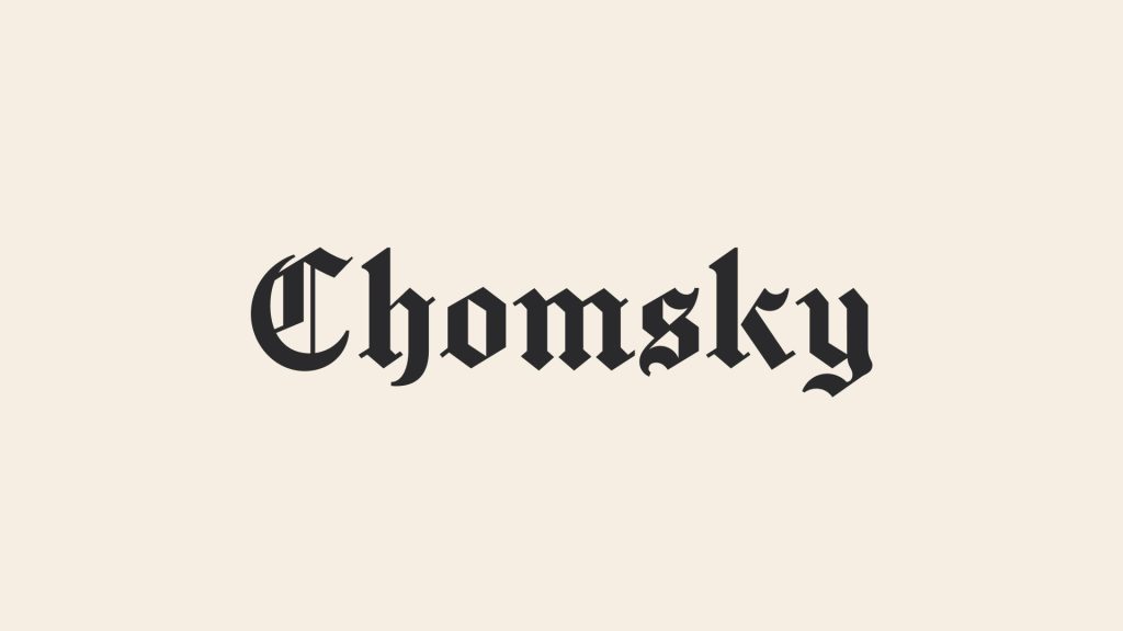
Our Free Font Friday series profiles the design characteristics of today’s free downloadable typefaces.
Chomsky is a blackletter display typeface created by Fredrick Brennan. It’s based on the iconic New York Times masthead but with a few modifications to make it more friendly for use within smaller applications like captions and pull quotes.
Blackletter typefaces have a long history of appearing in handwritten manuscripts, newspapers and other similar forms of print and as such, they tend to carry an authoritative connotation.

Like other blackletter typefaces, Chomsky has thick stems, and its uppercase letterforms feature varying degrees of flourish, though as a whole it’s not overly decorative. It has a certain regal sophistication about it that makes it feel impressive while still hand-made and very human. As you may have guessed, it’s well suited for headlines though if you choose to do so, know that it may feel a bit like a parody due to its New York Times inspiration.
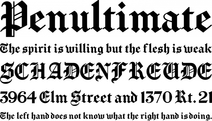
I think blackletter typefaces look best large and proud. Try using them in a way that celebrates the beauty of the letterform, like an abstract typography poster. Chomsky is surprisingly legible at small sizes though a block of text in this typeface would be exhausting for the eyes. Chomsky is best suited for large use in headlines or posters, or smaller bits of running text like captions or quotes.
Chomsky is available in a single weight and can be found here.
Taylor is a concept artist, graphic designer, illustrator, and Design Lead at Weirdsleep, a channel for visual identity and social media content. Read more articles by Taylor.
ENROLL IN AN ONLINE PROGRAM AT SESSIONS COLLEGE:
