Free Font Friday: Coiny
by Taylor Slattery | January 24, 2020
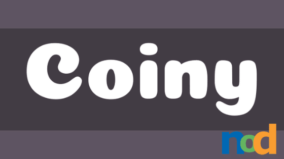
Its playful curves and wide letterforms invite the reader in to take a closer look. It is a bit on the thick side, however, and it’s small negative spaces make it harder to read at small sizes. It’s best used in moderation.
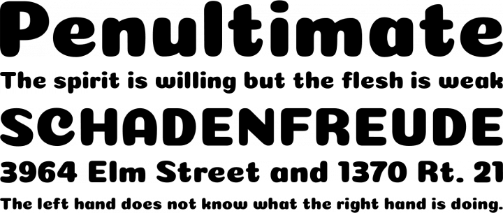
It would look great in a letter mark or used sparingly in apparel or merchandise designs. Depending on your choice of color, you can take Coiny in a number of different directions from the carnival to My Little Pony. In terms of character, Coiny is a bit on the stronger side and can begin to border on juvenile if you aren’t careful.
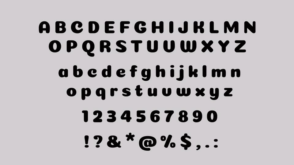
It’s definitely not a Swiss army knife of a typeface. It’s probably more akin to that niche German tool that you bought on eBay and paid an arm and a leg for shipping. You only use it once every few years but when the occasion calls for it, you’re glad you’ve got it in your toolbox. Coiny is available in a single weight and can be found here.

Taylor is the Managing Editor of Notes on Design. Taylor is a graphic designer, illustrator, and Design Lead at Weirdsleep.
If you are interested in learning to use typography, Sessions College offers Basic Typography and Advanced Typography courses as well as a course in Web Typography. Contact Admissions for more information.
Recent Articles

