Free Font Friday: Crimson Pro
Our Free Font Friday series profiles the design characteristics of today’s free downloadable typefaces.
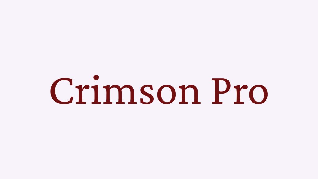
Crimson Pro is a serif typeface designed by Jacques Le Bailly. Inspired by Garamond, Crimson Pro embodies much of the same practical sensibility.
One look and the viewer is struck with a sense of pedigree. Commonly referred to as “Old-style,” descendants of Garamond are known for their readability and sport a more traditional look. Crimson Pro is no different and has a classic air about it, one that, depending on whether you actually read your assigned reading in high school, will feel very familiar.
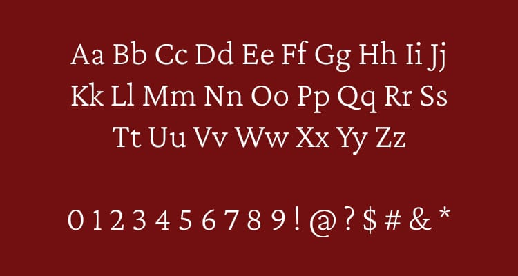
Crimson Pro is actually a hybrid typeface that was born from the best qualities of its predecessors, Crimson and Crimson Prime. Like other old-style typefaces, the design of Crimson Pro is focused on readability. Unsurprisingly, longer applications like books, pamphlets, or newspapers are where Crimson Pro will shine its brightest. Pair it with a sans-serif header and you’re in business.
Compared with other old-style typefaces, Crimson Pro does feel a bit more modern, so don’t be afraid to try it out in a number of different applications. It’s a pretty flexible family in that sense.
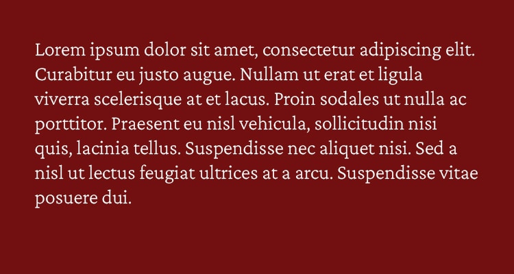
Crimson Pro is available in 8 weights, in Roman as well as Italic, but its true strength lies in its variable weight. Much like people, the typeface takes on an entirely different character depending on the weight it’s viewed at.
The sky’s the limit here, so don’t be afraid to experiment. Crimson Pro is free to use and can be found here.

Taylor is a concept artist, graphic designer, illustrator, and Design Lead at Weirdsleep, a channel for visual identity and social media content. Read more articles by Taylor.
ENROLL IN AN ONLINE PROGRAM AT SESSIONS COLLEGE:

