Free Font Friday: Grifter
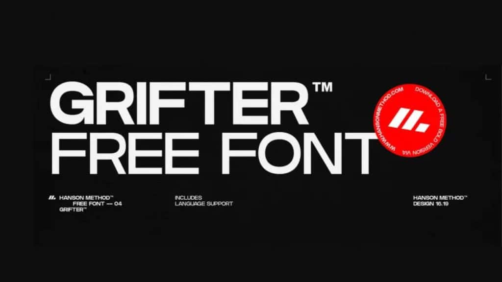
Our Free Font Friday series profiles the design characteristics of today’s free downloadable typefaces.
Grifter is a sans serif typeface designed by Hanson Method. It’s simple in design and has great legibility, making it an appropriate choice in a variety of situations. Grifter would work well in signage, poster designs, and other instances where function comes first.
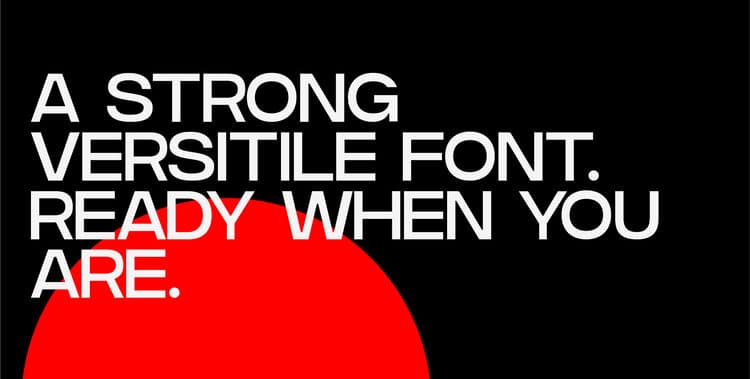
It’s best used in moderation and at larger sizes, though. At small sizes the negative spaces tend to close up making them hard to read. In terms of character, it’s a chameleon. Depending on the context and fonts it’s paired with, Grifter can take on a number of different feels, though it won’t steal the show.
It’s got a clean, modern appearance which is unsurprising considering its geometric sans serif inspiration, the Adidas branding. It works well on its own if your aim is simplicity and functionality, but it also works well playing second fiddle to a typeface with a bit more bravado.
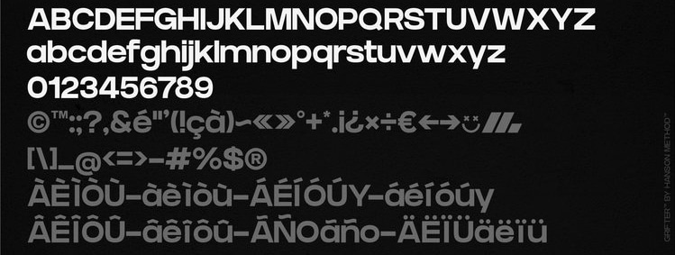
Grifter is available in two weights, regular and bold. You can check it out and try the bold weight for yourself here.

Taylor is a concept artist, graphic designer, illustrator, and Design Lead at Weirdsleep, a channel for visual identity and social media content. Read more articles by Taylor.
RELATED ARTICLES:
SESSIONS NEWS:
ENROLL IN AN ONLINE PROGRAM AT SESSIONS COLLEGE:
