Search Icon A magnifying glass icon.
Subject
Admissions

DEGREES

Next Start:
February 10
Next Start:
February 10
Explore Graphic Design Degree Courses
Discover Sessions Graphic Design Hub

Professional Certificates

Next Start:
February 1, 2025
Explore Graphic Design Career Courses

DEGREES

Next Start:
February 10
Explore Web Design Degree Courses
Discover Sessions Web Design Hub

Professional Certificates

Next Start:
February 1, 2025
Explore Web Design Career Courses

Professional Certificates

Explore Digital Media Career Courses
You can deepen your software skills and keep up with the latest Adobe CC updates in our online Digital Arts courses.
Contact Admissions

DEGREES

Next Start:
February 10
Explore Digital Photography Degree Courses
Discover Sessions Digital Photography Hub

DEGREES

Next Start:
February 1, 2025
Explore Fine Arts Degree Courses

DEGREES

Next Start:
February 10
Next Start:
February 10
Explore Illustration Degree Courses
Discover Sessions Illustration Hub

Professional Certificates

Next Start:
February 1, 2025
Explore Illustration Career Courses

DEGREES

Explore Advertising & Marketing Degree Courses
Discover Sessions Advertising & Marketing Hub

Professional Certificates

Explore Advertising and Marketing Career Courses

CERTIFICATES

Next Start:
February 1, 2025
Next Start:
February 1, 2025
Next Start:
February 1, 2025
Explore Sessions Career Courses
Professional Cert PLUS
Next Start:
February 1, 2025
Next Start:
February 10
Next Start:
February 10
Next Start:
February 10
Explore Sessions Bachelor's Degrees

Graphic Design

Free Font Friday: Hanken Grotesk
Taylor Slattery, NOD Editor

by Taylor Slattery | January 12, 2023

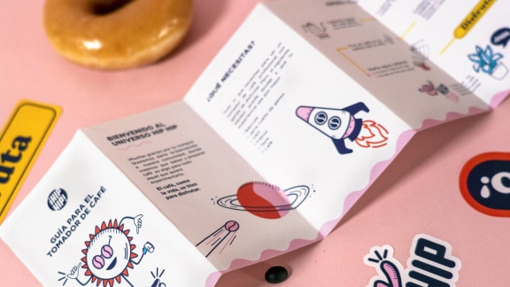
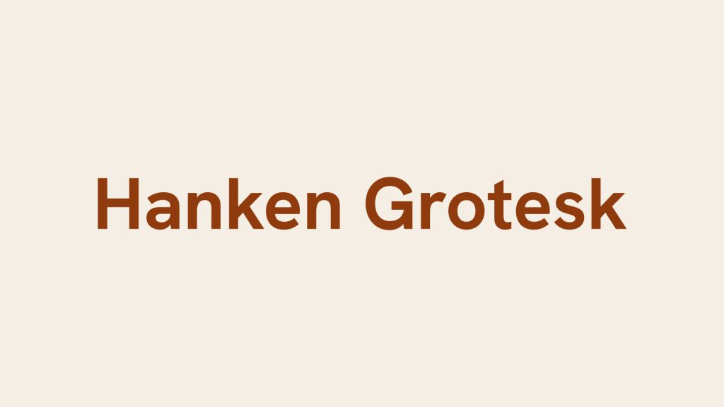
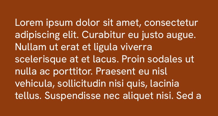
Hanken Grotesk is a sans serif typeface designed by Alfredo Marco Pradil at Hanken Design Co. Pulling inspiration from a deep lineage of typefaces bursting with personality, Hanken Grotesk bears the same hallmark geometry of its spiritual predecessors while sporting some updates that make it a viable choice for modern use both on and off the screen. Like the classic grotesque typefaces with which it shares its name, Hanken Grotesk has fairly uniform strokes and soft, rounded geometry, giving it a clean, modern appearance. Additionally, the typeface is fairly versatile in application, with a wide range of weights spanning from thin to black with italics for each providing additional flexibility.

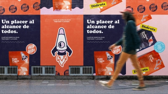
With one of its stated use cases being environmental signage, the combination of its simple, minimal appearance and great readability makes it a compelling option for a design systems across various scales. While Hanken Grotesk is certainly a typeface designed more so with practicality and functionality in mind, it isn’t completely devoid of personality, with quirks like a double-story g giving it a subtle, yet present distinctiveness that becomes more pronounced at larger display sizes and heavier weights. Hanken Grotesk’s quiet character and selection of weights make it an interesting option for designing systems with touch points of both large and small sizes, allowing for moments where the typeface’s quirkiness can shine through while maintaining readability.
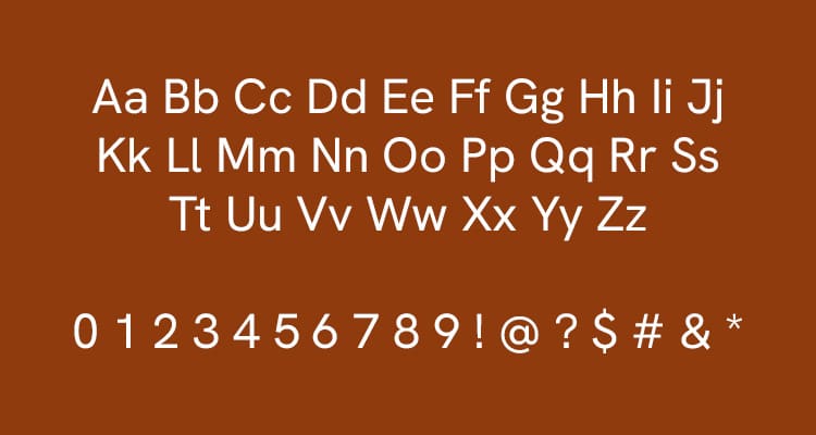
Hanken Grotesk is available in 9 weights with accompanying italics and variable weight versions of both. You can find it for free here.
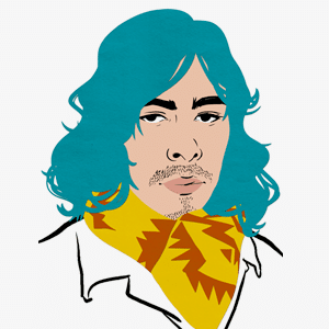
Taylor is a concept artist, graphic designer, illustrator, and Design Lead at Weirdsleep, a channel for visual identity and social media content. Read more articles by Taylor.

©2025 Sessions College for Professional Design  All rights reserved

Terms & Conditions       Privacy Policy