Free Font Friday: Lot
by Taylor Slattery | August 9, 2019
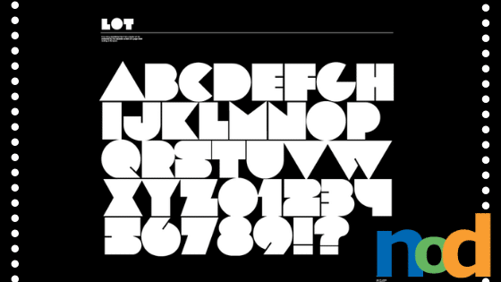
While some of the numbers suffer from a lack of legibility, the letters manage to maintain their readability despite their abstraction. Lot has a pretty unique character that lends itself well to a variety of uses. It feels somewhat retro and familiar, yet its forms are simple enough that they would be equally at home in a more modern context without feeling dated.
Lot has a very graphic read and its heavy weight allows for readability at a distance, making it an interesting design component for use within posters. Its geometry also provides a lot of interesting opportunities for animation. You can find Lot here.
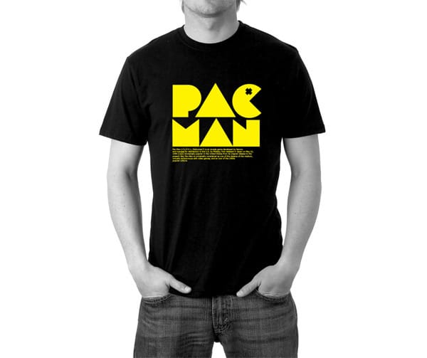
I take it back. Maybe it was inspired by Pac-man.

Taylor is the Managing Editor of Notes on Design. Taylor is a graphic designer, illustrator, and Design Lead at Weirdsleep.
If you are interested in learning to use typography, Sessions College offers Basic Typography and Advanced Typography courses as well as a course in Web Typography. Contact Admissions for more information.
Recent Articles
