Free Font Friday: Merriweather
Our Free Font Friday series profiles the design characteristics of today’s free downloadable typefaces.
As more and more readers turn to screens and digital libraries as their primary means of book consumption, typefaces designed specifically for digital use are in high demand. With this in mind, Eben Sorkin created Merriweather. With the sole goal of a comfortable on-screen reading experience, Eben tailored the typeface to meet the diverse set of needs presented by an endless array of devices.
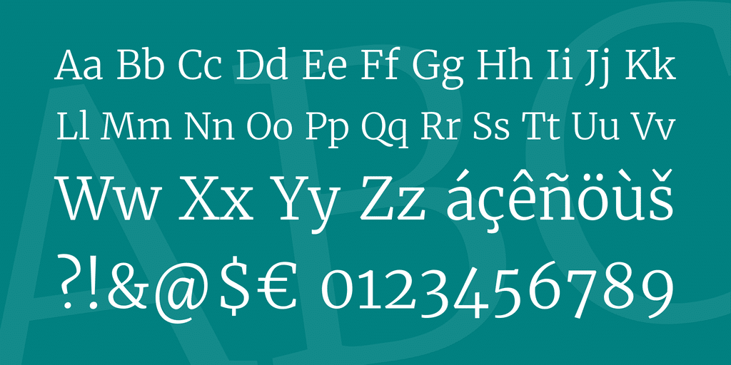
For maximum legibility, Merriweather makes use of a large x-height and its letterforms are semi-condensed. These two traits allow the font to remain readable even at extremely small sizes. Its authoritative yet neutral character allows it to pair nicely with any sans serif typeface for some subtle stylistic contrast.
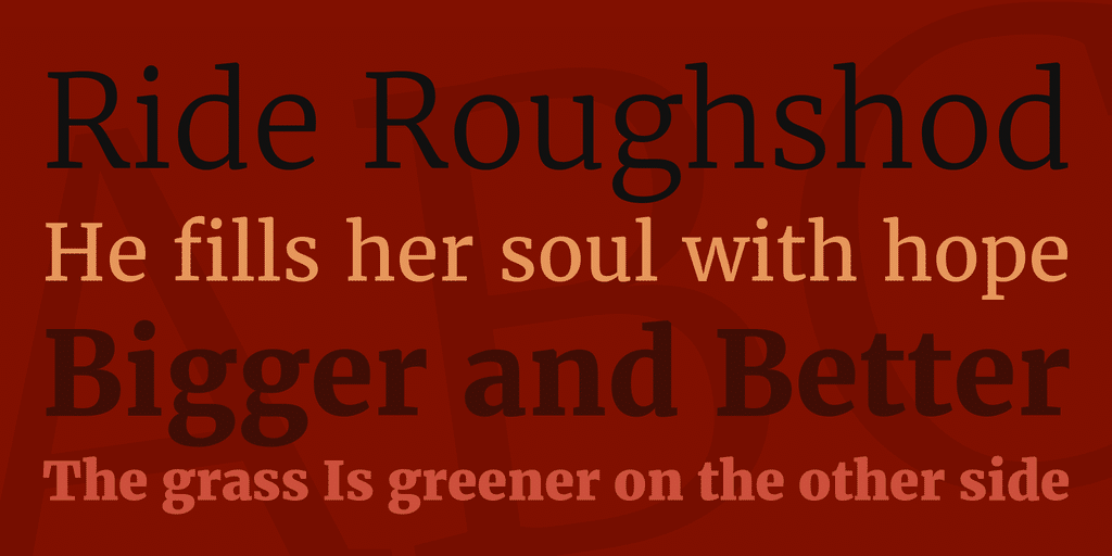
Merriweather is available in 4 different weights with matching italics, making it a great choice for a variety of applications. Blogs, ebooks or even apps that require a range of weights to differentiate between segments all make for possible candidates for this multi-purpose typeface.
For those who design for web or any form of digital publication, having an array of reliable, easy to read typefaces is a must. Make sure you add Merriweather to your collection. You can find it here.

Taylor is a concept artist, graphic designer, illustrator, and Design Lead at Weirdsleep, a channel for visual identity and social media content. Read more articles by Taylor.
RELATED ARTICLES:
SESSIONS NEWS:
ENROLL IN AN ONLINE PROGRAM AT SESSIONS COLLEGE:

