Free Font Friday: Oi
by Taylor Slattery | July 1, 2021
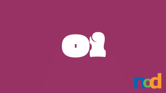
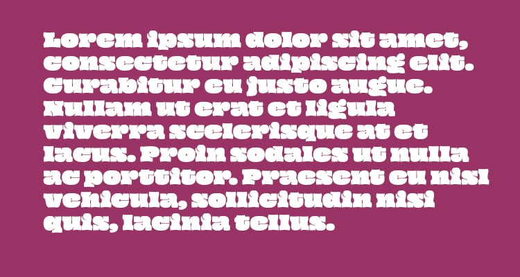
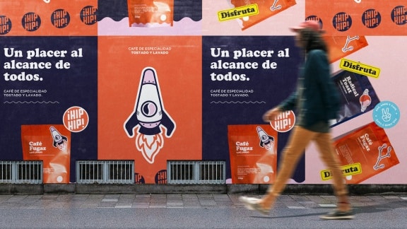
For a number of reasons, this is not a very readable face—it’s not going to be something you reach for when designing signage or any other case where critical information needs to be communicated quickly. The x-height is just a smidge under the cap height and the ascenders aren’t too far off either. The distinctive parts of each letterform’s silhouette have been reduced and all of the negative space in counters, bowls, and apexes are just barely there, resulting in a rather slow reading experience. You didn’t need me to tell you that, though, you can tell from first glance that Oi isn’t the type of face that concerns itself with clear communication. It’s a style-first face.
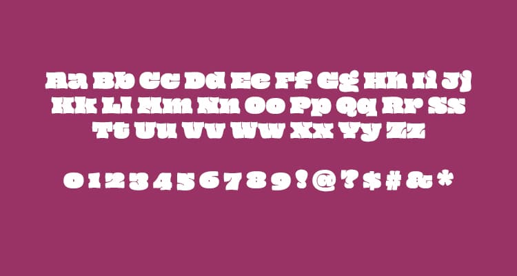
Its extremely tall x-height gives it the appearance of all-caps, even when mixed case, causing it to feel like a friendly shout. It’s best approached as an organic, rhythmic design element used for adding texture or pattern, with the added benefit of readability upon a second look. The thickness of its strokes is somewhat reminiscent of faces popular in the 70s, though Oi sports a character unique to itself.
Oi is available in a single weight and you can find it for free here.

Taylor is the Managing Editor of Notes on Design. Taylor is a graphic designer, illustrator, and Design Lead at Weirdsleep.
Recent Articles

