Graphic Giants: Alan Fletcher

In our Designer Profiles series, we profile groundbreaking 20th century designers who shaped today’s design industry.
Known colloquially as “The Father of British Graphic Design,” Alan Fletcher was an incredibly prolific graphic designer for nearly a half-century starting in the 50s. Through his bold color sense and playful approach to graphic design, he helped businesses to utilize design as a tool for expressing their voice and standing out in crowded markets.

Born in Kenya in 1931, at the age of 5, Fletcher moved to London with his mother after his father’s passing. It was in London where Fletcher would be exposed to graphic design via the world of advertisements and packaging that would ultimately lead him down his chosen career path.
At the age of 18, Fletcher attended the Hammersmith College of Art and Building in West London where he would make the acquaintance of fellow students Colin Forbes and Theo Crosby, with whom he would later come to work.

Fletcher continued his studies at the Royal College of Art and later at Yale, where he would receive instruction from some of the biggest names in graphic design. Having studied under the likes of Josef Albers and Paul Rand at the Yale School of Art and Architecture, Fletcher came from a pedigree of sorts.
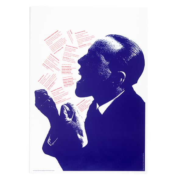
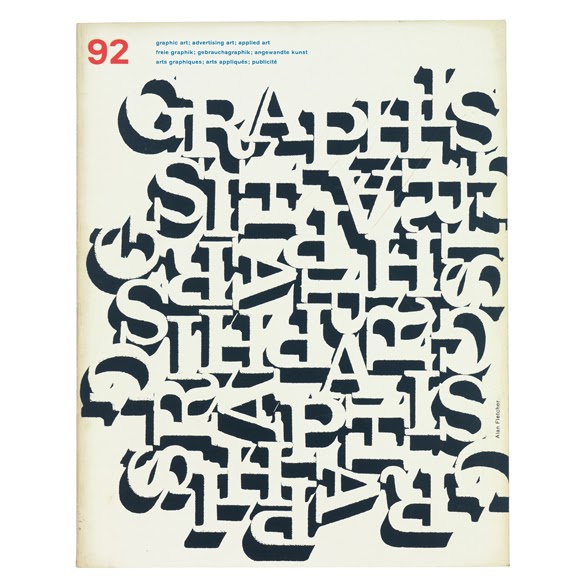
While his work referenced that of his instructors and their influence was clearly visible, Fletcher managed to breathe some new life into these inherited aesthetics. His work merged elements of the clean typographic stylings of the Swiss with pop culture and elements of fine arts.

Fletcher synthesized these two seemingly at odds approaches—the typographic, grid-based precision of the Bauhaus, and the playful, organic stylings of Paul Rand—into a style all his own. This combination paired with his wit made him uniquely well-equipped to design for a British audience.
His designs spoke to both the British sense of humor and love for wordplay, as well as to corporate interests in need of eye-catching advertisements.

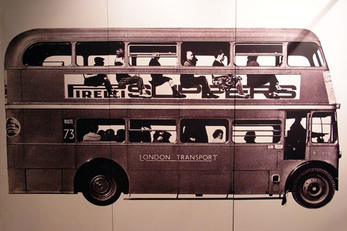
After his time spent studying in America, Fletcher returned to London where he linked up with fellow Hammersmith alumni, Colin Forbes, and fellow designer Bob Gill. Together, the three founded a firm in 1962 bearing their names. It was during these formative years in Fletcher’s design career that he would land the opportunity to work with Pirelli, resulting in some of the most iconic British designs of the period.

In 1965, the trio lost Gill, one of their founding members, and gained Theo Crosby, resulting in a changing of the firm’s name. Throughout the 13 year period since its founding, the firm’s star continued to rise, landing them increasingly larger clients and publicity.
In 1972, the firm gained two more members, Kenneth Grange and Mervyn Kurlansky, and because it would be difficult to fit Crosby/Fletcher/Forbes/Grange/Kurlansky on a business card, the firm needed a new name. Thus, Pentagram (yes, that Pentagram) was born, symbolic of the new firm’s five founding members.

Fletcher and his fellow partners at Pentagram played a critical role in developing the way corporate identities are viewed today. Rather than just a means of selling products, Fletcher helped to shape corporate identity into a means of having a conversation with the public, using design to entertain and share another side of the company.

Taylor is a concept artist, graphic designer, illustrator, and Design Lead at Weirdsleep, a channel for visual identity and social media content. Read more articles by Taylor.
RELATED ARTICLES:
SESSIONS NEWS:
ENROLL IN AN ONLINE PROGRAM AT SESSIONS COLLEGE:


