Graphic Giants: April Greiman

In our Designer Profiles series, we profile groundbreaking 20th century designers who shaped today’s design industry.
For the designers of today, digital tools are the norm. In fact, it’s not uncommon for the entirety of the design process to take place on the computer—from the whiteboarding tools we use for ideation to the image editing software used to complete the final product.
Traditional techniques are now considered more of a specialty than a necessity, pursued mostly by purists hoping to keep the tradition of craft alive or looking to differentiate themselves from the now over-saturated digital space. But while most workflows start and end digitally today, this wasn’t the case not too long ago.

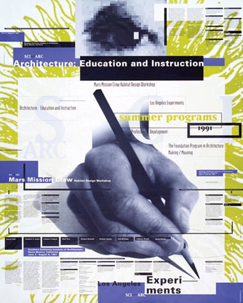
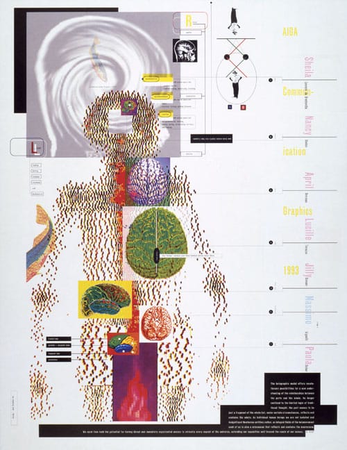
The current state of affairs is owed largely in part to April Greiman, whose work in the 80s ushered in the digital era and paved the way for widespread adoption of digital tools in design.
Her early digital works caught the attention of the design world at large, making such a lasting impression that even the purest of traditionalists was forced to take the medium seriously. Greiman took to the medium quickly, and continued to work exclusively digitally, taking what was once thought of as a novelty and exploring its potential throughout her career.
Since the early days, digital tools have come a long way, changing the landscape of design along with them. The spread of digital tools has democratized design, making it more accessible and increasing its exposure, which in turn, has pushed the evolution of the field as a whole.

Before Greiman became the digital revolutionary she’s known as today, she was learning the traditional techniques the same as any other design student in the late 60s. Originally from New York, Greiman completed her undergraduate degree at the Kansas City Art Institute. Following her undergraduate studies, she then went to Basel, Switzerland, where she attended the Allgemeine Kunstgewerbeschule, studying under the man credited with the creation of the New Wave, Wolfgang Weingart.
In the 70s, Weingart had given a series of lectures in the US to spark interest in New Wave, resulting in a number of students following him back to Switzerland to study at the Allgemeine Kunstgewerbeschule in Basel—one of which was Greiman. New Wave was born in response to the International Typographic Style graphic design, or Swiss Style, as it’s more commonly known.
Whereas the Swiss Style was rigidly grid-based and minimal, with a focus on function, New Wave was markedly more punk in its approach. Rather than focusing solely on the message to be communicated itself, New Wave practitioners gave more attention to how the message was delivered, exploring the ways in which altering this communication could augment the message and add more information.

Rather than acting as a technician or engineer, the New Wave placed the designer in the role of an artist. New Wave compositions were experimental and often significantly more complex than the Swiss Style. Their manipulation of type and use of collage was more expressive and demanding of the viewer, engaging and challenging them, resulting in a more interactive viewing experience. Despite their differences, however, there is still a clear visual lineage that ties the New Wave to the Swiss Style, and this connection is present in Greiman’s work as well.
Greiman first used a Mac in her design practice in 1984, following an early TED conference where she heard from one of the Mac’s inventors, Alan Kay. Her introduction to the Mac began with curiosity and a sense of play, but as she experimented and familiarized herself with the tool, it quickly became a fully integrated part of her design practice. Two years later, in 1986, she used her 512K Mac Plus to produce one of her most iconic images for Design Quarterly.

Koala Technologies was a company that made peripherals for Apple computers. While the KoalaPad, an early graphics tablet, was already available on the market, Greiman chose another Koala product for creating her Design Quarterly piece.
MacVision was essentially a capture card that took an incoming video signal and converted it into a grayscale image. Users could pause the camera on the desired frame and capture a still image on their computer. Using this technique, Greiman created her iconic Design Quarterly self-portrait spread.

Titled “Does it Make Sense,” the piece is quintessential Greiman and embodies her design philosophy of everything being an object in space. She weaves imagery and typography into a multi-layered tapestry, creating a complex symphony of hierarchies and relationships not just between the elements themselves, but also of the space they occupy. By working into the z-axis of the canvas, Greiman is able to effectively create a small world within her compositions, a space that invites the viewer in to explore.
By embracing the artifacts and other inherent shortcomings of early digital tools Greiman was able to squeeze every drop of potential out of what was available to her to create images that are still talked about to this day. Intent on finding ways to circumvent the limits imposed by the medium rather than working within them, Greiman persisted and thanks to her, digital tools have held a place in design ever since.

Taylor is a concept artist, graphic designer, illustrator, and Design Lead at Weirdsleep, a channel for visual identity and social media content. Read more articles by Taylor.
RELATED ARTICLES:
SESSIONS NEWS:
ENROLL IN AN ONLINE PROGRAM AT SESSIONS COLLEGE:


