Graphic Giants: Chip Kidd
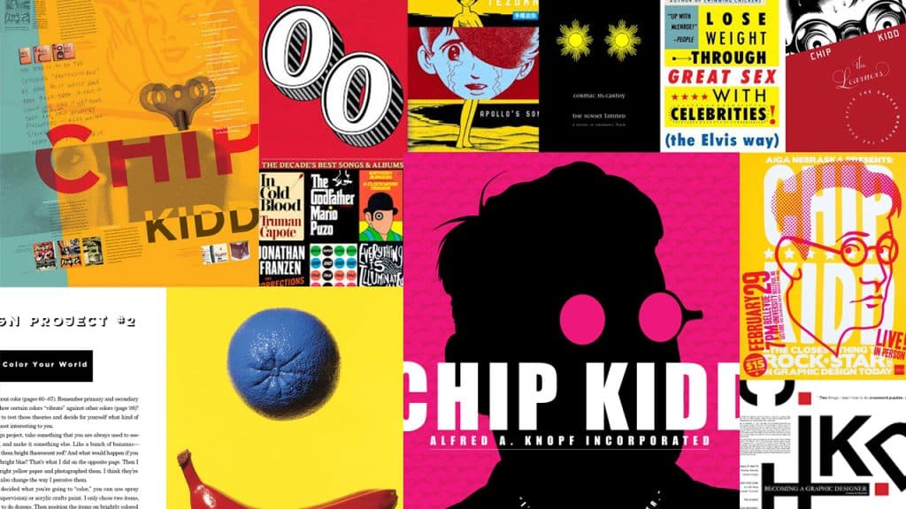
In our Designer Profiles series, we profile groundbreaking designers who have shaped today’s design industry.
Chip Kidd is an American graphic designer, author, and current associate art director at Penguin Random House. He’s designed covers for world-renowned authors like Haruki Murakami, Dean Koontz, and Frank Miller, with perhaps his most important contribution to the world of pop culture coming in the form of the cover for Jurassic Park.
Chip’s cover design for the Michael Crichton classic would serve as the basis for the now ubiquitous logo of the film series by the same name, which as it approaches its 30th anniversary, has maintained its status as a childhood staple for multiple generations.
Despite the large body of work he’s produced throughout his already legendary career, Kidd is still only in his 50s, so writing any sort of career retrospective this early in the game would feel a bit premature, to say the least. That being said, to provide some brief background, he was interested in the field from a young age and after high school, attended Penn State, where he completed his degree in graphic design in 1986.
Upon graduating, he began work at Knopf, a Penguin Random House imprint known as much for its attention paid to design and typography as it is for its signature borzoi logo.
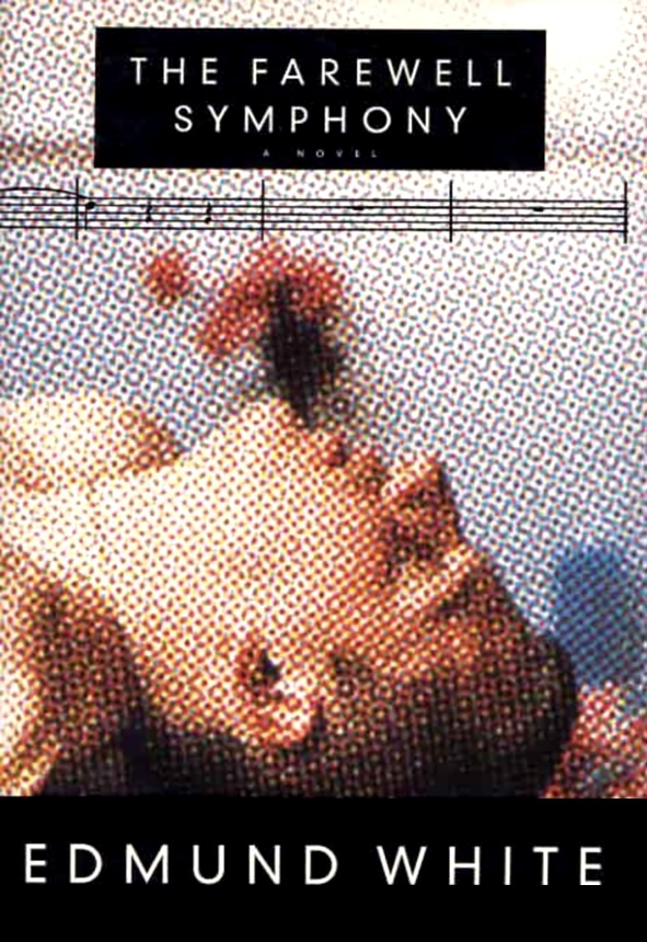
Source: Chip Kidd
Kidd has since become the art director for Knopf where he continues to endlessly churn out well-designed book covers at an alarming rate. It’s here that I’d like to shift the focus to the work itself, where I think we can learn the most about the kind of person Kidd is through his work as a designer.
When you take a look at Kidd’s portfolio, the first thing you’ll notice is the sheer variety of styles he works in. This is due in part to the nature of his role as an art director for Penguin Random House, which would expose him to genres and authors he might not normally gravitate to.
As designers, few jobs present us with the opportunity to constantly leave our comfort zone, but it’s important that we do, for it’s in this space that we stand to grow the most. Kidd clearly has a penchant for comics, though these covers make up only a small portion of his vast body of work.

Source: Chip Kidd
That means that the majority of his work might be for books he wouldn’t have otherwise chosen were it not just part of the job. Environments like this, where the problems to be solved are ever-changing, force the designer to grow creatively, in order to meet the challenges. When you’re constantly presented with new problems to solve, you don’t have easy solutions to fall back on. What works in one genre won’t in another, and even within a genre, each story has its own unique tone and nuances.
In order to create fresh identities for each title, Kidd is not only constantly experimenting with technique and material, but refining his ability to tap into the core of what makes each piece unique, to translate its message and nuances into visuals.
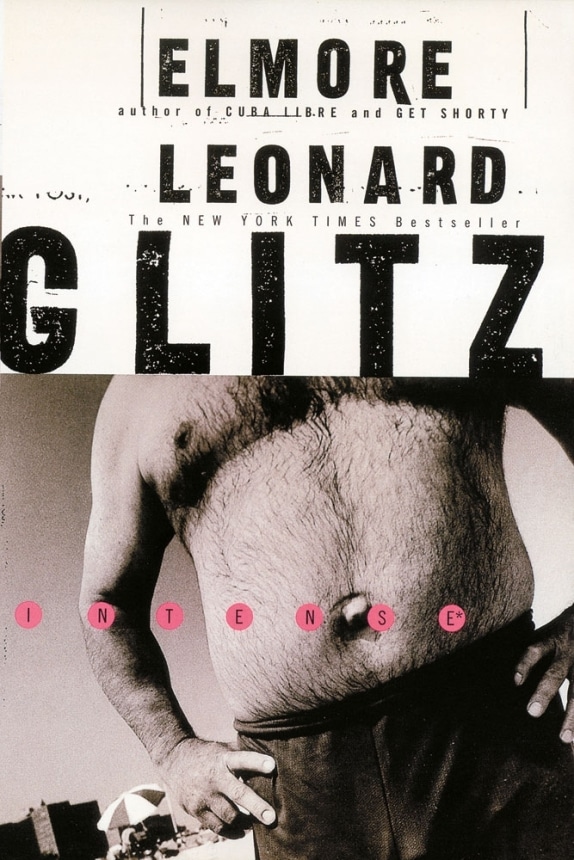
Source: Chip Kidd
I would imagine an environment like this, in which creative exploration and flexibility are the norm, would foster a great deal of creative growth. I can’t imagine a better place for anyone looking to further cultivate their adventurous and inquisitive nature, and I think the fact that Kidd has remained there since starting back in 1986, speaks for itself.
Kidd has already published two career retrospectives collecting his work from 1986-2006, and 2007-2017, though something tells me there will be at least a few more to come.
Heading Image Source: Penguin Random House
Taylor is a concept artist, graphic designer, illustrator, and Design Lead at Weirdsleep, a channel for visual identity and social media content. Read more articles by Taylor.
ENROLL IN AN ONLINE PROGRAM AT SESSIONS COLLEGE:
