Graphic Giants: David Carson

In our Designer Profiles series, we profile groundbreaking designers who have shaped today’s design industry.
Of those considered to be legends within the world of graphic design, I would say few possess an immediately recognizable trademark style.
While Michael Bierut is undoubtedly an incredibly talented graphic designer, I can’t say with confidence that I would recognize his work if I were to pass it on the street. I think for most graphic designers, their talent lies in their ability to shape their vision to match their client’s needs. This is certainly not the case for David Carson.
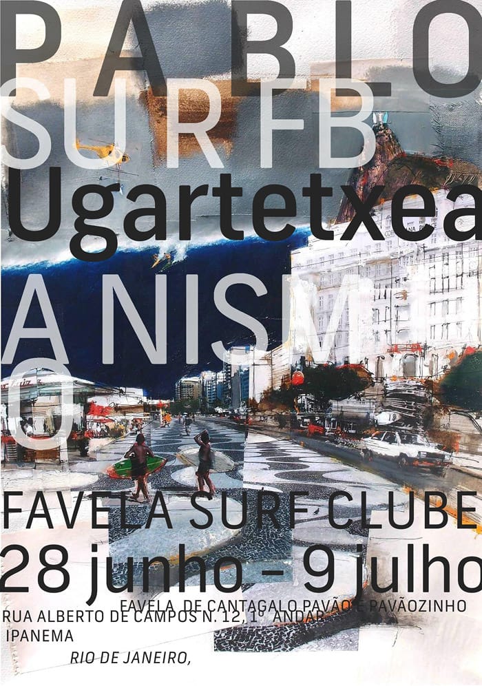
That isn’t to say that Carson doesn’t have range, but the distinctly rough, DIY quality of his work is exactly what makes it so attractive. He doesn’t venture too far from his roots, and even his branding work for clients can’t help but bear some of his iconic visual DNA.
Source: http://www.davidcarsondesign.com/
You Can’t Fake A Carson
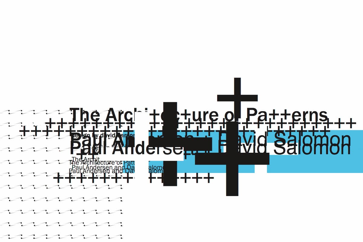
Carson’s style is often imitated, but there’s no mistaking his grungy, anti-grid, birds-nest-like compositions. You can’t fake a Carson. His work has a certain energy as though it were a second away from completely unraveling but he’s somehow managed to wrangle everything back into place before freezing it in time.
Similar to his approach to design, Carson’s entry into the world of design was rather unconventional. Unlike many who grew up inspired by record sleeves or posters, Carson stumbled into the field via a summer course at the University of Arizona. Carson had already earned a B.A. in sociology at San Diego State University and was working as a teacher at a high-school in California at the time.

Source: http://www.davidcarsondesign.com/
A “Hang-Loose” History
Following the brief 2-week crash course in Arizona, Carson’s newly discovered passion led him to Switzerland, where he attended another workshop and met the Swiss designer Hans Rudolf Lutz who would become one of Carson’s earliest influences. Within months of his introduction to the field, Carson hit the ground running. Through professional skateboarder and friend, Stacy Peralta, Carson landed a job working on Transworld Skateboarding.
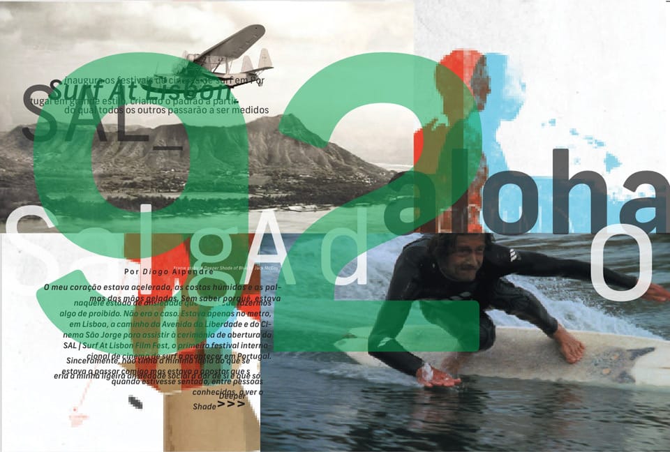
For Carson, Transworld served as a crash course, providing him with on-the-job training that would lead to a lengthy career in publishing. Carson had grown up in California, fully entrenched in the surf world, and even ran a surf shop during his college years at SDSU. Given this history and the growing success of the visual language he was developing at Transworld, it was no surprise when he was asked to join the team of Beach Culture, a quarterly surfing publication.
Source: http://www.davidcarsondesign.com/
Can’t Be Caged In
It was at Beach Culture, where Carson was first given complete creative control, and without any oversight, his style was allowed to freely develop. However, upon his next move to Surfer, where he served as art director, Carson found himself creatively restricted by the more conservative magazine. His energetic stylings clashed with the readership upon his redesign of the cover and his work proved to be an acquired taste for this new crowd.
Carson managed to stay on board for 30 issues before jumping ship to Ray Gun, an alternative music magazine, where he would once again enjoy total creative freedom. It was here that Carson really came into his own creatively and captured the attention of the graphic design world at large. His work for Ray Gun in the early 90s is regarded as some of his best, and is perhaps the strongest expression of the style he is most known for.

Source: http://www.davidcarsondesign.com/
A Rare Kind Of Talent
His work at Ray Gun proved to be a perfect match for the emerging grunge aesthetic and his experimental use of photography and typography managed to capture an emotional quality similar to the music the magazine featured. Carson worked at Ray Gun for three years before leaving to found his own design firm, where he’s worked ever since on a variety of projects ranging from fashion to branding.
Carson possesses a rare kind of talent. Those who try to mimic his style are never quite able to fully capture the same kind of magic because his process relies so heavily on intuition. For Carson, his lack of formal training allowed him to independently develop a design language all his own. They don’t teach this language in schools, which is what makes it such a difficult language to speak, and what keeps Carson in his exalted position.
Source: http://www.davidcarsondesign.com/
David Carson’s Honest Horizons
His work is an honest reflection of his life’s story, and this honesty is what makes it so endearing to audiences. His disregard for convention and outsider approach to design managed to catch the world’s attention, but it’s through his continued efforts and experimentation that he’s managed to keep it. The radically anti-grid, chaotic nature of his designs and his willingness to bend and break type have truly expanded the horizons of graphic design, forever changing what is possible.
Taylor is a concept artist, graphic designer, illustrator, and Design Lead at Weirdsleep, a channel for visual identity and social media content. Read more articles by Taylor.
RELATED ARTICLES:
SESSIONS NEWS:
ENROLL IN AN ONLINE PROGRAM AT SESSIONS COLLEGE:
