Graphic Giants: Josef Müller-Brockmann
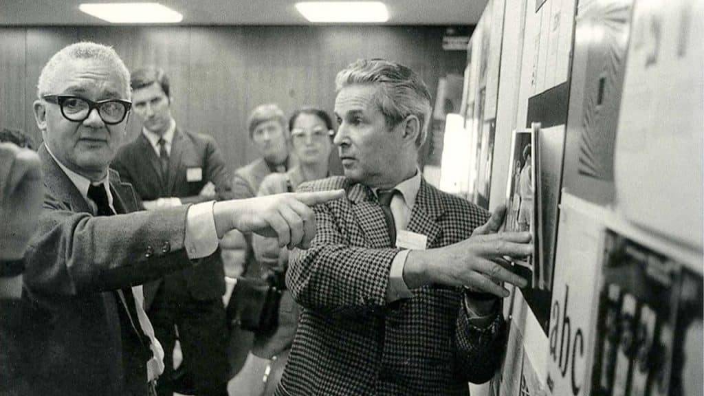
What we do know is that he was born in Rapperswill, Switzerland in 1914 and later attended the Kunstgewerbeschule, or Zurich School of Arts and Crafts, where he studied graphic design and architecture. Showing artistic promise from a young age, Müller-Brockmann was encouraged by teachers to pursue a career in the arts, which would lead him to several short-lived apprenticeships at printing houses and architecture firms. The decision to attend the Kunstgewerbeschule came as a result of his calling graphic designers in a phone book to find out where they had studied.
Following graduation, he found an apprenticeship under Walter Diggelman, where he would cut his teeth working on illustrations and design for advertising. After two years, at the age of just 22, Müller-Brockmann would strike out on his own, forming a Zurich-based studio. Although originally an illustrator, Müller-Brockmann would undergo a drastic shift in style upon reading Jans Tschichold’s Die Neue Typographie.
A recent convert to modernism himself, Tschichold fully embraced the ideas of Russian Constructivism preached by artists and designers like Maholy-Nagy and El Lissitzky.
In Die Neue Typographie, he shares guiding principles that were developed alongside a group he belonged to called, The Circle of New Advertising Designers. Among these principles were the use of sans serif typography, clear hierarchy, asymmetrical balance, and intentional use of white space.
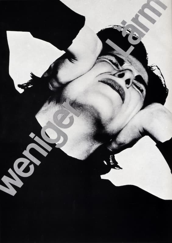
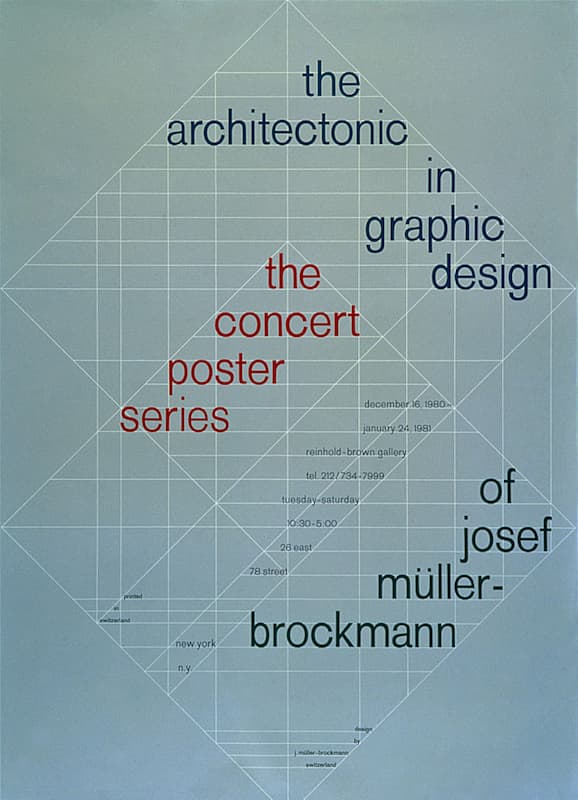
This book clearly had a profound impact upon Müller-Brockmann, as he closely adhered to these rules for the rest of his career. In turn expanding his influences to other movements with a bold graphic nature, like De Stijl and Suprematism, by 1950, Müller-Brockmann’s work had begun to take on a new, distinctive point of view. Utilizing graphic design, illustration, and photography in his practice, he began to carve out a place for himself amidst his fellow practitioners of the International Typographic Style.
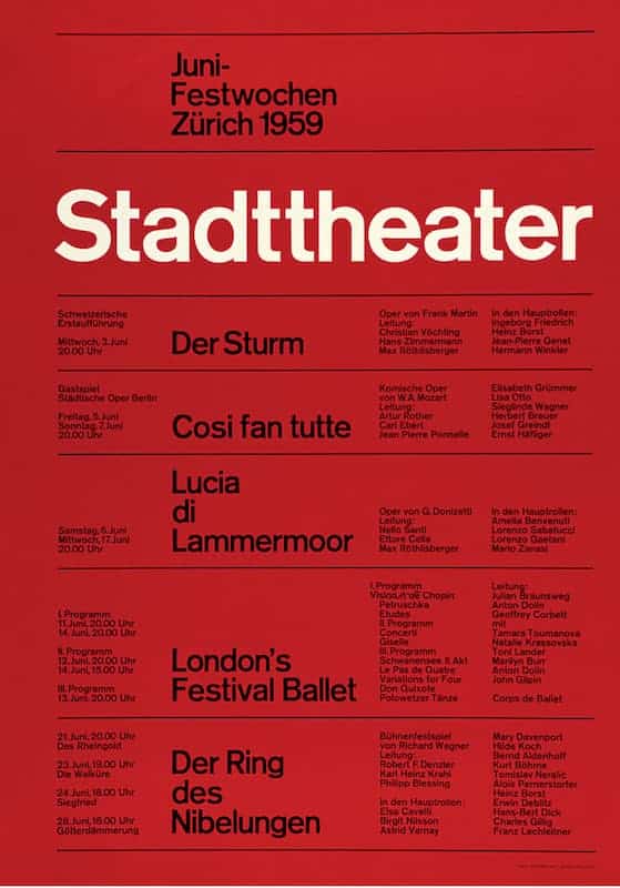
Müller-Brockmann’s approach to design was rooted in objectivity. He sought to inform audiences on a practical, objective, and aesthetic level, striving to remove subjectivity and putting clarity of message above all else. For Müller-Brockmann, practicality meant the use of sans serif typefaces and rigid grids. Sans serif faces prioritized legibility while their mathematical geometry was well suited for the accompanying grid.
Grids reduced the cost of design, allowing for arbitrary arrangements to achieve a strong functional uniformity quickly and with relative ease. This mathematical adherence to the grid created a rhythmic harmony between all elements on the page, which, when paired with well-proportioned white space, created a strong impression equal parts bold and economical.
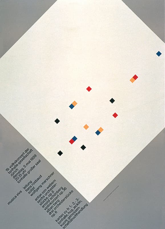
This concerted effort to remove subjectivity would later be viewed as cold, with this lack of emotion causing the style to fall out of favor in the following decades. Before this would happen, though, Müller-Brockmann would go on to create Neue Grafik, a quarterly graphic design journal, alongside fellow designers Richard Paul Lohse, Hans Neuburg, and Carlo Vivarelli in 1958. The journal played an integral role in the spread of the Swiss Style throughout its seven years of publication and its more recent resurgence.
In addition to these visual contributions to the field of graphic design, Müller-Brockmann also pioneered the idea of the ethical designer. He saw the role of designer as having a responsibility to society and demonstrated this when he stopped working for Turmac upon learning of the cancer-causing effects of smoking. A strong believer in placing the general welfare above personal interests, his approach to design was also informed by the role it plays in society. He viewed objectivity of information as a right held by the public and saw excessive ornamentation or subjectivity as an infringement upon that right.
Always thinking of the bigger picture, Müller-Brockmann believed better design to be the result not just of technical skills but through the study of society. By understanding the societal issues and cultural significance of a problem, designers would be better equipped to solve it. By placing these needs above their own, and allowing the design to simply be the anonymous vehicle for the message to be transmitted, harmony on both a national and international level could be achieved. Although not much is known about Müller-Brockmann, what little we do know paints a portrait of a kind man, who, like the grids he loved so much, was rigid in his pursuit of a better world.
Taylor is a concept artist, graphic designer, illustrator, and Design Lead at Weirdsleep, a channel for visual identity and social media content. Read more articles by Taylor.
ENROLL IN AN ONLINE PROGRAM AT SESSIONS COLLEGE:


