Graphic Giants: Lucille Tenazas

In our Designer Profiles series, we profile groundbreaking designers who shaped today’s design industry.
Lucille Tenazas is a graphic designer and teacher whose storied career has spanned the better part of the past three decades.
Tenazas is the current Henry Wolf Professor in the School of Art, Media and Technology at Parsons the New School for Design in New York, where she has lived since 2006. Prior to that, Tenazas called America’s other coast home, where she spent two decades building her practice, Tenazas Design, and serving as faculty at the California College of Arts and Crafts, now known as California College of the Arts, where she was also the founding chair for the MFA program in graphic design.

Originally, Tenazas was from the Philippines, where she got her creative start, earning a Bachelor of Fine Arts in her hometown at the College of the Holy Spirit Manila. It wasn’t until 1979, when Tenazas was 26, that she would make her way to the United States for her postgraduate studies.
This was where her relationship with the California College of Arts and Crafts began, though this initial contact would be brief. After a chance encounter with legendary designer Katherine McCoy while visiting her aunt in Michigan, Tenazas would leave San Francisco to attend the Cranbrook Academy of Art where McCoy served as the co-chair of the graduate design program.

After completing her MFA in Michigan, Tenazas moved to New York to begin her career, though her link to her time spent in Michigan under the tutelage of McCoy would live on through her work. Unlike the environment she had just left, the climate surrounding graphic design on the East Coast was much more traditional.
This made it harder for Tenazas, whose portfolio was full of experimental typography from her time at the Cranbrook academy of art, to find employment. After countless failed interviews, Tenazas finally struck gold, finding a job at a communication consultancy called Harmon Kemp. Being that the company was without a strong aesthetic, the wide-eyed fresh graduate was given free rein and encouraged to experiment—and experiment she did.

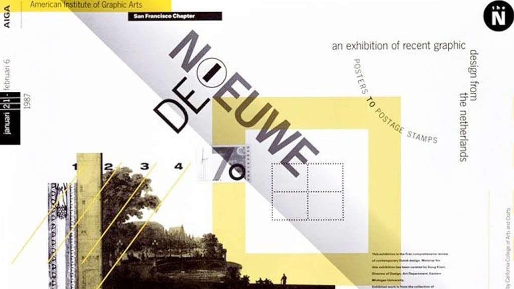
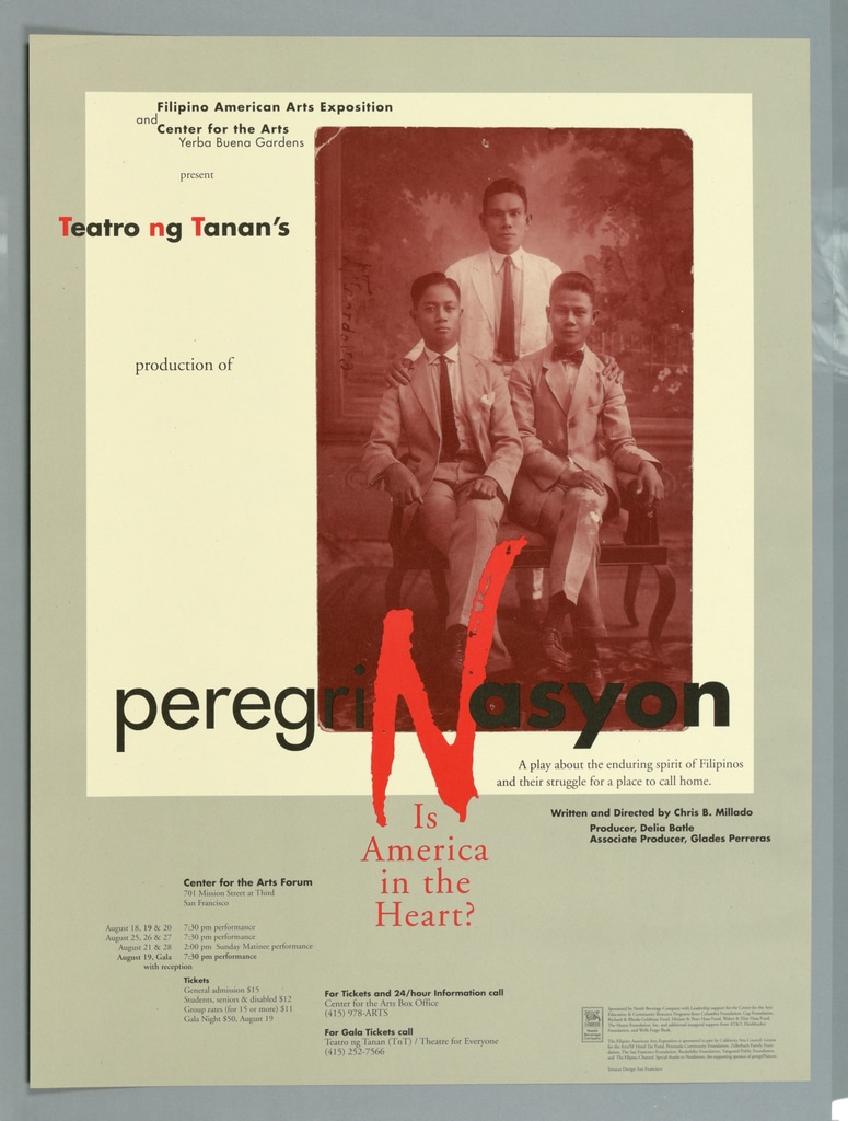
Tenazas’ aesthetic is anything but neutral. Her point of view is strikingly subjective without detracting from the work’s objective utility. Her design decisions, rather than interfering with the message being communicated, augment it, adding additional layers of information that speak to Tenazas’ unique perspective as a designer.
Describing design as “the only field in which science and art are merged,” Tenazas makes sure this mindset is felt keenly across her body of work. While her work bears a connection to her time at the Cranbrook Academy of Art and its associated style, it was her analytical outlook and interpretive approach to design that led to her legendary status throughout the 80s and 90s and resulting awards and accolades.

Taylor is a concept artist, graphic designer, illustrator, and Design Lead at Weirdsleep, a channel for visual identity and social media content. Read more articles by Taylor.
RELATED ARTICLES:
SESSIONS NEWS:
ENROLL IN AN ONLINE PROGRAM AT SESSIONS COLLEGE:


