Graphic Giants: Saul Bass

In our Designer Profiles series, we profile groundbreaking 20th century designers who shaped today’s design industry.
Saul Bass is without a doubt one of the most iconic American graphic designers and filmmakers in history. His pioneering work in the film industry changed not only the way films were made but the way they were experienced by audiences. Like most legendary names you often see in top 10 lists and history books, Bass’s contributions to the world of design have had an impact on us all.
Bass was born in the Bronx, New York in 1920. After graduating high school he continued his studies at the Art Students League and Brooklyn College where he was exposed to the Bauhaus and Russian Constructivism movements that would later influence his work in title sequence design.
Upon graduating, Bass began his career as a commercial artist designing advertisements in New York before moving to California in the late 40s. It was here that his lifelong love affair with films began.
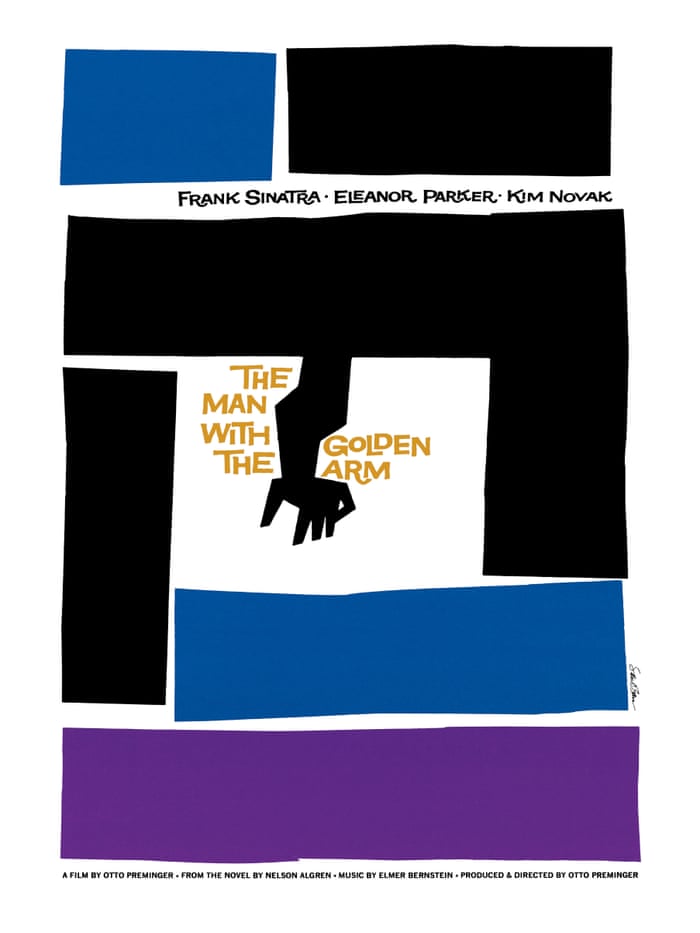
At first, his work was relegated to print, where he spent several years working on advertising assignments, creating symbols and posters for films. It was through this work that Bass established a working relationship with the director Otto Preminger. Impressed with his work on previous films, Preminger entrusted Bass with the graphic treatments for his next two films, Carmen Jones, and The Man With the Golden Arm.
It was while working on the titles for these projects that the two first decided to experiment with motion.
Up until this point, titles in movies had been mostly static images that only served the purpose of fulfilling contractual obligations and providing some legal information. Bass saw this as an opportunity to “create a climate for the story that was about to unfold.”
Carmen Jones marked his first foray into title sequences and featured a black rose set against a flickering red flame to match the film’s promotional material. Today, it’s certainly nothing to write home about, but for Bass, this served as a proof of concept. Emboldened by the success of the first film, Bass decided to take a greater creative risk with the next title, The Man With the Golden Arm, opting for an animation featuring a minimal black & white treatment and set against a menacing jazz backdrop.
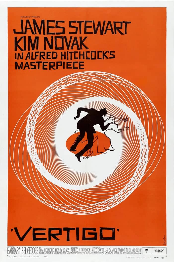
His risks paid off. His choices turned out to be a hit amongst audiences and his peers in the film industry alike, catapulting him into the limelight and providing audiences with the first glimpse of what was to become his trademark style. His innovative approach made him the go-to-guy for title sequences, leading to work with directors like Hitchcock, Kubrick, and Scorsese.
With an influx of jobs, Bass expanded his operation, bringing on additional hands to help, two of whom belonged to Elaine Makatura. 1955 marked the beginning of a lifelong collaboration between the two who would wed five years later. Together, the two expanded upon Bass’s graphic treatments to create a visual language and style of storytelling all their own.
Over the next 30 years, they experimented with a variety of styles and treatments, ranging from Bass’s distinct graphic stylings rooted in typography to live-action and time-lapse.
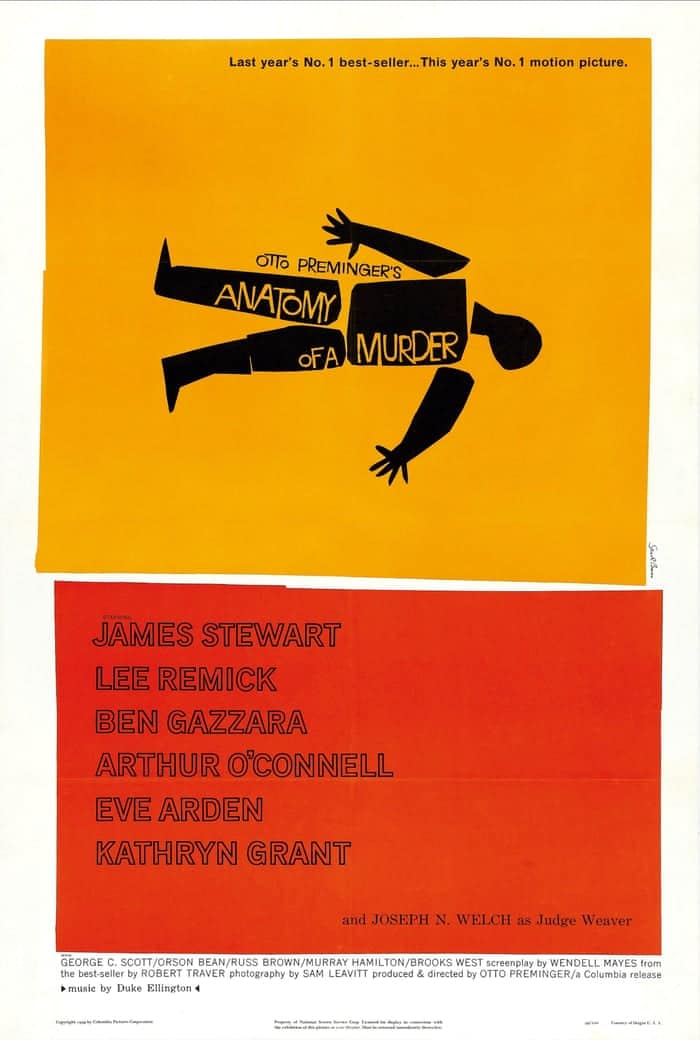
In addition to his work in film, Bass is also responsible for some of the most iconic logos of the 20th century. The echoes of Bass’s work both in and out of cinema can still be felt in modern graphic design. Bass’s bold, minimalistic approach to color and composition is a style that is still imitated to this day.
Bass ushered in motion into the world of title design, forever changing the way we experience a film. Through his clever use of design and music, Bass managed to establish an emotional state right from the beginning, priming the viewer for the rest of the film.
To see some of Bass’s work in motion, check out the collection of his title sequences below.

Taylor is a concept artist, graphic designer, illustrator, and Design Lead at Weirdsleep, a channel for visual identity and social media content. Read more articles by Taylor.
ENROLL IN AN ONLINE PROGRAM AT SESSIONS COLLEGE:


