Homogenization in Design: The Danger of Trends
Creative business tips to kickstart your career as an artist, designer, or content creator.
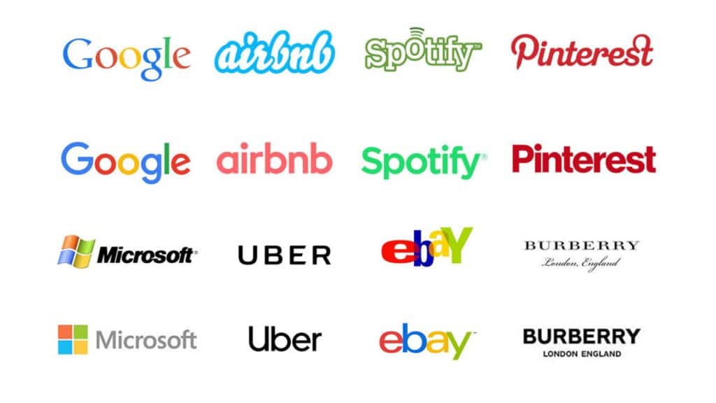
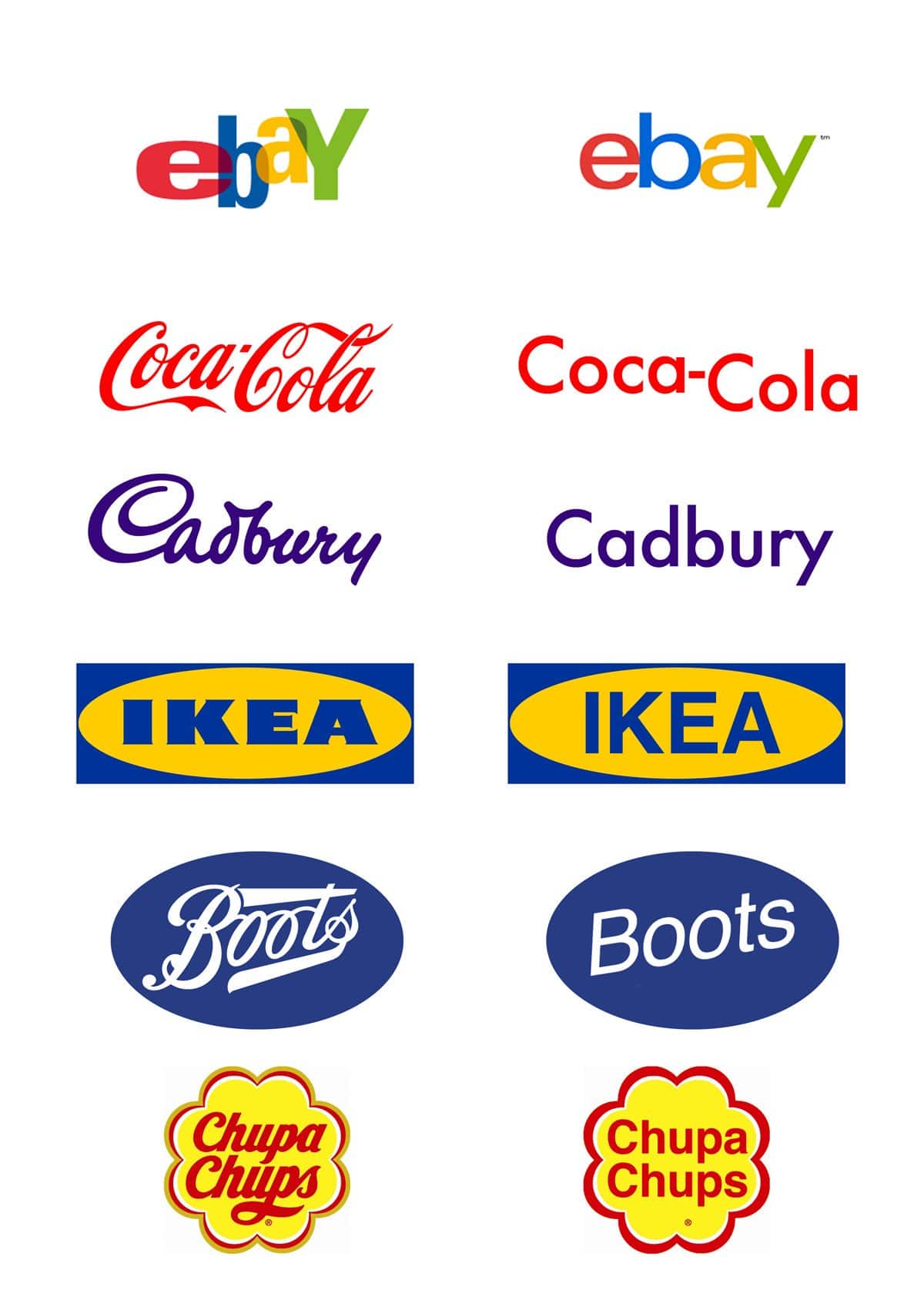
Is it just us or is everything starting to feel kind of… the same? Take a look at any tech company’s website and you’re bound to be struck with a feeling of deja vu. It could just be the case that we’re collectively maturing and our online environments reflect our current taste levels.
After a few decades of experimentation, we’ve figured out what works and how users prefer to interact with sites and now it’s just a matter of following the formula. Or maybe we’re just less creative now. I think there are a few reasons for the current state of web design and branding. Taking a look at why things have become this way might help you out in your own work, so let’s dive in.
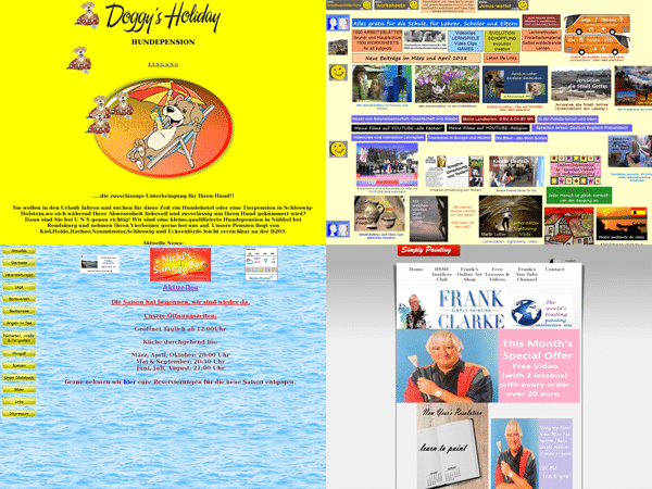
We’re a few decades into experimenting with the Internet and we’re at a point in our journey where we’ve finally overcome the majority of usability challenges. For the most part, using any given site is a smooth experience (who designs government sites though?).
This is the natural progression of design. If we take a look at early cars, planes, or even phones, their timelines follow a similar path. The initial versions are wildly experimental. Their creators explored a variety of different form factors and through trial and error, both theirs and their competitors, learn what works and what doesn’t.
Somewhere along the way, things start to look very similar. The same thing has happened with web design and branding. The early days of the internet saw a wide variety of design approaches and branding tactics. We’re now at the point where everything feels pretty much the same.
It’s easy to see why this is the case, though. Today, regardless of what industry you work in, it seems like everybody needs to have a website. This is especially true for small businesses selling goods or services. But not everybody is capable or comfortable designing their own site, nor can they afford to hire a designer.
This is where site-building services like Shopify, Squarespace, and WordPress come in. Large companies have the resources to throw at research and development and emerge with sites that have been thoroughly tested for usability and audience alignment. Site building services then create templates based on these tried and tested formats and make them available to the masses. Now, everybody is a designer.
So you can see, one major reason for this trend into sameness is the democratization of tools. The widespread adaptation of computers and the growth of the internet has forever changed not only the way we communicate and conduct business but also the way we learn.
Our education is no longer restricted by location or income. Online schools and tutorials, free software, and communities like Behance and Dribbble have allowed many people to foray into design. Digital tools have also removed a lot of barriers presented by traditional art, allowing people who may not feel comfortable drawing or working with physical mediums to find their creative voice in a digital space.
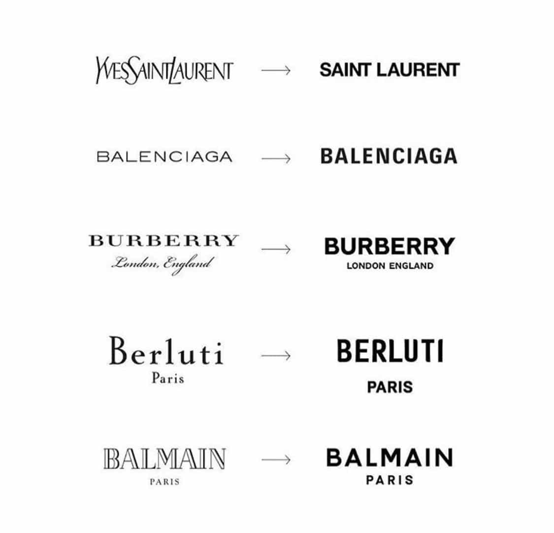
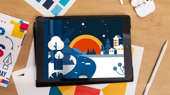
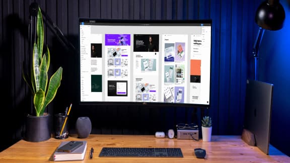
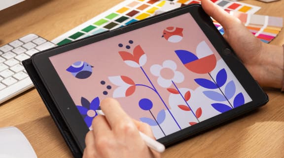
While the broadening of the creative fields is undoubtedly a good thing, there are some unfortunate byproducts as well. If you’ve ever spent any amount of time on either Behance or Dribbble, you’ve probably noticed some pretty distinct trends, namely that kind of sterile geometric aesthetic that vector-based programs create. In this case, this has a lot to do with the tools shaping the outcome.
Another reason for this kind of incestuous type of design is that when a new style emerges on one of these platforms it has the potential to gain a lot of visibility. If it does well, others will begin to ape that style to cash in on the new trend.
The instant something becomes popular is the same instant it loses its uniqueness, as it will undoubtedly give birth to copycats, whose work will be seen by others, and the cycle will repeat ad nauseam. Thirdly, when everyone is learning from the same teacher, their work tends to feel derivative of their instructor’s aesthetic.
When a Skillshare course about designing animal logos becomes popular, you’re bound to see countless similar looking logos all over Behance and Dribbble. Combine all of these together & things start to make sense. We’re learning from the same people and referencing the same sources, so it’s no wonder our work looks the same.

So how do we stand out? The good news is, while now, everyone may be a designer, not everyone is creative. But you are, so standing out should be easier than ever. Don’t think in the same linear way others do. Don’t look to Behance or Dribbble for inspiration. Avoid the predictable and find unique sources of inspiration to influence your work.
Think about the unique perspective you can offer. What are your personal ideas and tastes? If you have hobbies or other interests, find ways to merge them with your creative work. There are likely some surprising aha moments just waiting to reveal themselves.
Our work can feel like a reflection of ourselves, and sharing it online for others to see and judge can make us feel vulnerable. The resulting self-doubt and insecurity can be too much for some people to handle, so they look to see what’s popular because they need proof that something works before trying it. Don’t be like those people. Step outside of yourself and get uncomfortable. Embrace the discomfort that comes with taking creative risks because it’s the only way to find your voice.
How do you stand out from the crowd? Do the opposite of what everyone else is doing. Clean, minimal, geometric logos are what’s popular right now? Interesting. Then I’m going to carve my logo into a piece of wood, stamp some paper and then scan it, retaining all of that grit and character that these other guys lack.
If that’s not your cup of tea and you just want to design to pay the bills, then hey, at least you don’t need to think very hard to reach a solution. Just head over to Dribbble.

Taylor is a concept artist, graphic designer, illustrator, and Design Lead at Weirdsleep, a channel for visual identity and social media content. Read more articles by Taylor.
ENROLL IN AN ONLINE PROGRAM AT SESSIONS COLLEGE:
