Illustration & Art Styles Utilized In “Spider-Man: Across The Spider-Verse”

Why Is This Film So Popular?
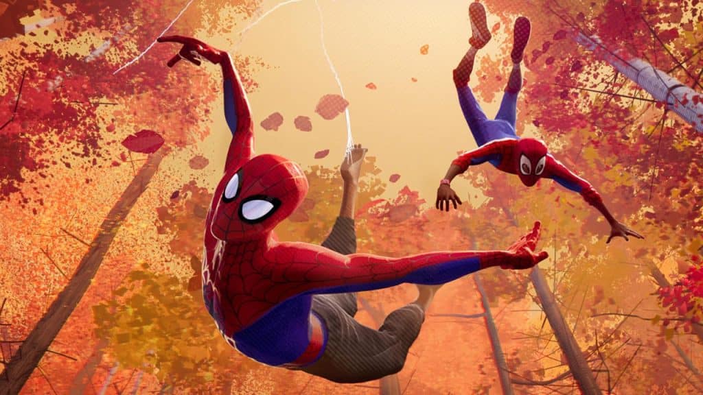
In 2018, the animated film Spider-Man: Into the Spider-Verse took movie audiences around the world by storm. With an animation style ripped straight from the pages of a comic book, Into the Spider-Verse was a breath of fresh air not only for the Spider-Man franchise but for the animation industry as a whole.
The sequel Spider-Man: Across the Spider-Verse, released in 2023, met with much of the same critical acclaim as the first movie. The recent trend toward realism, popularized by animation juggernaut Pixar, has proven to be a viable formula for captivating young audiences, but the signature Pixar look hasn’t evolved much since the early days.
With Toy Story approaching the 30th anniversary of its release, it’s really no wonder audiences of all ages are responding to the fresh, imaginative animation style of the latest Spider-Man animated films.
What Makes It Unique?
Part of the reason the animated Spider-Man movies look the way they do is because the film rights to Spider-Man are owned by Sony.
Without an established “house look” to adhere to, the creative team was granted a great deal of freedom to explore a variety of different visual approaches to bring the pages of the Spider-Man comic universe to life. In the film’s early stages, Sony sought the expertise of Spanish artist, animator, and director Alberto Mielgo, who, over the course of two years, assembled a team of rock-star artists to develop what was to be the film’s signature look.
The team, which included concept art legend, Craig Mullins, and Beeple, of recent NFT fame, produced the foundational style frames and animation tests that would guide the film’s overall visual direction.

Animating on Twos
What about this film made it so unique and why can’t anyone stop talking about it? From an animation point of view, one of the techniques the animators employed that contributed to the film’s overall signature look was to animate on twos.
For those unfamiliar with the way films are made, most are shot or animated at a frame rate of 24 frames per second, meaning for every second of film, there are 24 still images. The human eye sees at a frame rate of around 25 frames per second, making 24, with the addition of motion blur, appear the most realistic. Movement captured at 24 frames per second on camera feels fluid and natural, as does animation utilizing the same frame rate.
In contrast, animating on twos results in a total of 12 frames per second, with each being held for twice the length. The animators who worked on Spider-Man: Across the Spider-Verse made the stylistic choice to alternate between animating on ones and twos depending on the scenario and character.
One example is the way twos were used to make the movement of Miles Morales feel sticky and staccato in comparison with the fluidity of Peter Parker, who was animated on ones. This helped to heighten the contrast between the skill level of the two characters.

Smears Instead of Motion Blur
Speaking of motion, another creative way the animation team chose to distinguish the movie from the current trends in animation was a reversion to the now antiquated technique of using “smears.”
Using modern technology, it’s incredibly easy to apply a realistic motion blur that simulates the way something would be caught on camera when filmed at 24 frames per second. This is part of what makes movies in the Pixar catalog feel so real. In contrast, the use of smears involves using multiple instances of an object in frame at once, at various points along its path of motion. When timed properly, these imply motion and can successfully trick the eye.

Halftones and Registration Errors
The art style of the film as a whole is a direct homage to its comic book origins, with each second feeling like an illustration ripped straight from the page—frames and all. From hand-drawn stills in moments of emphasis to the creative use of halftones and misaligned colors which hearken back to the offset printing techniques that were used to make comic books, Spider-Man: Across the Spider-Verse manages to pay homage to its roots while crafting a creative lane all its own.
Illustration: A Multiverse Of Opportunities
One of the most thrilling aspects of the broader Spider-verse as a whole is how new artists, animators and illustrators are continuously given the capacity to breath new life into these beloved characters while also having the liberty to create new ones along the way.
If you’re interested in learning how to create the next iteration of Miles Morales, Gwen Stacey, or Peter Parker, the best way is by gaining hands-on experience through an affordable online Illustration degree. Whether you’re interested in character design, mark-up, color grading, 2-D animation, clean-up, background illustration or comic stills, gaining an education in Illustration is a cornerstone to any number of potential artistic paths.

Taylor is a concept artist, graphic designer, illustrator, and Design Lead at Weirdsleep, a channel for visual identity and social media content. Read more articles by Taylor.
ENROLL IN AN ONLINE PROGRAM AT SESSIONS COLLEGE:


