Line Control: Saying a Lot with a Little Part 1
In our Learn How series, we recommend some effective learning resources for drawing.
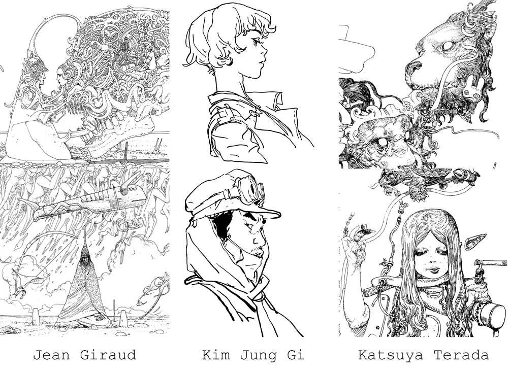
In a world full of an endless amount of mediums and techniques to explore, sometimes it’s through restriction and simplicity that we say the most. A great deal of personality and expression can be communicated through line alone. Contemporary artists such as Jean Giraud, Kim Jung Gi, and Katsuya Terada have each created distinct visual styles all based upon line.
In order to build a foundation for the more advanced line control techniques we’ll be exploring in later articles, let’s first cover the basics. At the most fundamental level, there are only 3 different types of lines.
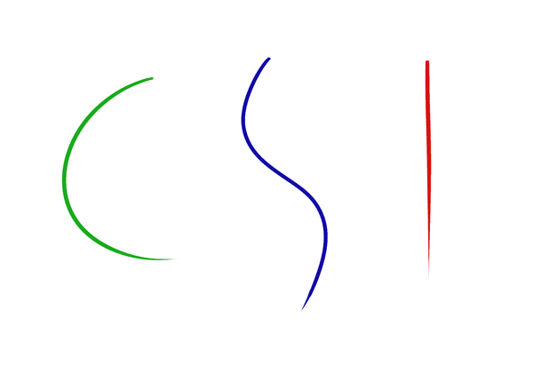
They resemble the letters, C, S and I, and moving forward, will be referred to as such. Despite the varied appearances of the examples above, each was constructed using only these 3 basic line types. Don’t believe me? Let’s take a closer look.
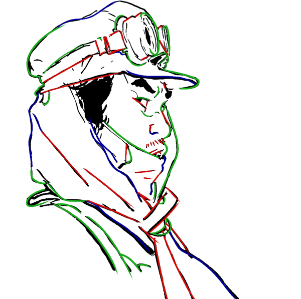
As far as the more complicated drawings are concerned – you’ll just have to take my word for it. When interpreting form, much of what an artist does is to simplify things, or reduce them to their most basic and expressive shapes. Notice how at certain points, a line might change from one of the three types to another. Even the most complex forms can be constructed using combinations of these basic lines. Thinking in these terms can help you to remove a great deal of extraneous information and get to the core of the form.
Now that we understand that everyone is working with the same basic set of tools, we can begin to look at how each artists’ use of line contributes to their overall style. Let’s start by taking another look at this drawing by Kim Jung Gi.
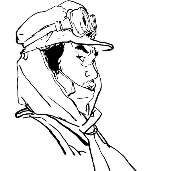
Besides its simplicity, what stands out the most to me about this drawing is the variation in line weight. In some areas, the line is light, while in others it’s heavy, and some lines end much wider than they start. This is because it was drawn with a brush pen.
Unlike a ballpoint pen or fine tip marker, brush pens can achieve a variety of line widths simply by controlling the pressure with which they’re pressed. In this case, that variation in pressure and line weight gives the drawing a great deal of expressiveness. The mark making tells a story, and as viewers, we can imagine it being drawn.
This drawing by Jean Giraud has an entirely different feel. The line weight is consistently thin throughout, giving it a much more constrained, deliberate air. It’s also rich in detail, making the drawing appear very complex, though a closer look reveals repetitions of the same three basic line types.
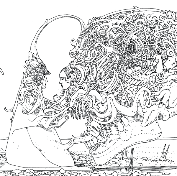
The consistent line weight also gives it a very flat feel in contrast with the Kim Jung Gi drawing where the tapered line moved the viewers’ eye through the piece. Giraud also lightly employs hatching in some areas to hint at form.
Similar to the previous piece, this drawing by Katsuya Terada is somewhat complex. This is also due to visual interest added through small repetitive lines, though in this case, they serve to communicate form.
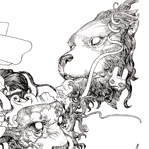
Terada also plays with the spacing between his lines, using tighter spacing to communicate overlaps in the hair and hint at lighting on the nose. Though this was also drawn with a single line width, longer lines have visible breaks and overlap where they were clearly constructed with several smaller lines. In contrast with the smooth, deliberate linework of Giraud’s drawing, Terada’s has a sketchier, loose quality to it.
Of course there’s much more to a style than just its line, but hopefully these examples helped illuminate just how much character line can communicate. To recap, there are three different types of lines.
The tools you use to draw them, the nuances of your hand, and stylistic decisions in regards to form and detail can have a large impact on the character and feel of your drawing. For now, that’s all you need to know. Deceptively simple, isn’t it? Combinations of these three line types comprise every drawing, and once you’re aware of them, they become hard not to notice.
Taylor is a concept artist, graphic designer, illustrator, and Design Lead at Weirdsleep, a channel for visual identity and social media content. Read more articles by Taylor.
ENROLL IN AN ONLINE PROGRAM AT SESSIONS COLLEGE:


