Print Picks: Layout Essentials
by Taylor Slattery | June 15, 2021
A good layout is like a good piece of music—when it works, it’s like magic. It’s got a rhythm that just feels right, it’s notes and accents are placed in all the right places, effortlessly guiding the eye along through the piece. It lends order to the material while not overly stating its presence.
This is what makes grids so tough to teach. As with music, you need to start with the basics, which are a far cry from the exciting pieces that got you interested in learning in the first place. Striking the right balance between exposure to the rules and guidelines that govern the creation of grids and the creative possibilities of their application is difficult.
Older books like Grid Systems in Graphic Design by Josef Müller-Brockmann take a more rigid approach to the subject of grids, focusing more on the technical considerations. I would liken this approach more to something like learning scales when you pick up a new instrument. It’s an important first step to familiarize yourself with the material, and it serves as the foundation through which you will navigate more complicated concepts.
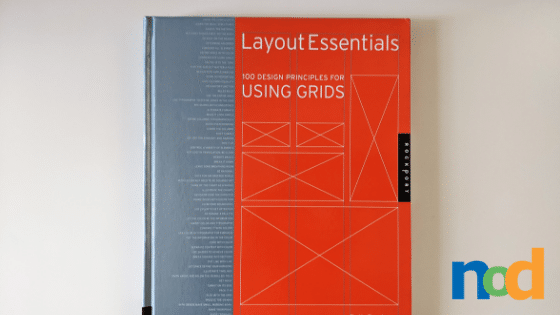
If you’re looking for an instruction manual or set of rules that will guide you through the grid construction process, Layout Essentials is not that book. It doesn’t cover the intricacies of matching type and leading sizes to column depth——for that, you should refer to Grid Systems in Graphic Design. What it does offer, however, is a lot of advice on best practices and things to consider while designing your grids
Once you’ve got a firm grasp of the basics and are looking to expand your understanding of grids, the best way to do so is to study real-world examples. By deconstructing the work of better designers and trying to understand their decision-making process, we become more capable of judging a layout’s successes and shortcomings.
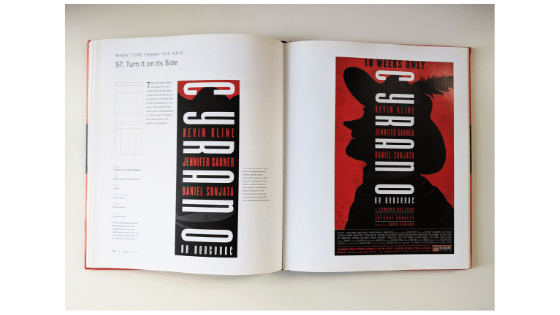
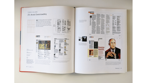
The value of a book like Layout Essentials is that the work of analyzing layouts has already been done for you. It features a selection of layouts curated to specifically highlight different layout considerations, spanning a wide range of content and problems to be solved. If you find yourself confronted by a layout dilemma, having a selection of successful solutions saves you the trouble of trial and error and helps you get straight to the insights.
For the beginner to whom these seemingly magical layout solutions feel elusive, this insight into their creation is an invaluable resource. Layout Essentials goes to great lengths to dispel the idea that grids have to be rigid. Rather, it takes an approach that focuses on the myriad ways in which grids can be used expressively, communicating different focuses and intentions.
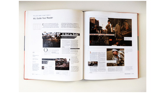
I have yet to find everything I’m looking for in a single book but perhaps that’s for the best as it allows you to examine a subject from multiple different angles and gain a more complete picture in the process.
While I wouldn’t recommend this book to the absolute beginner, as I think you will walk away still feeling lost, I do recommend it to those who’ve completed the foundational steps and are curious to learn more. It contains the sorts of information you might only receive via the feedback of an experienced art director. Access to this sort of knowledge at the early stages of your development will have you punching above your weight and making layouts with impact.

Taylor is the Managing Editor of Notes on Design. Taylor is a graphic designer, illustrator, and Design Lead at Weirdsleep.
If you are interested in developing your graphic design skills, Sessions College offers a range of graphic design courses for students at all levels. Contact Admissions for more information.
Recent Articles

