The World of Flat Design
by Margaret Penney | March 13, 2017

#1: It’s Clear
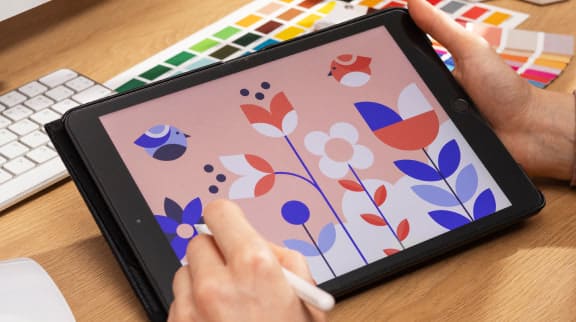
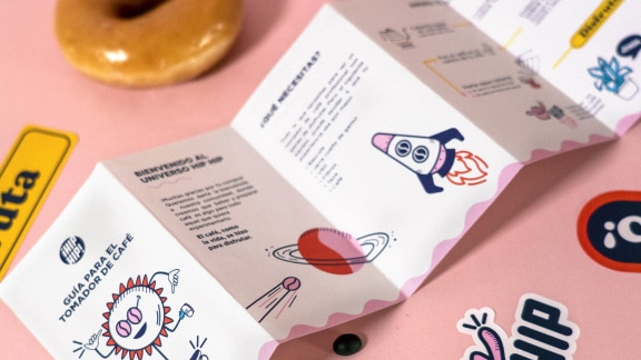
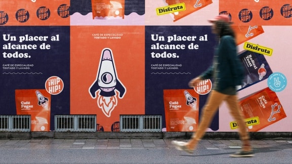
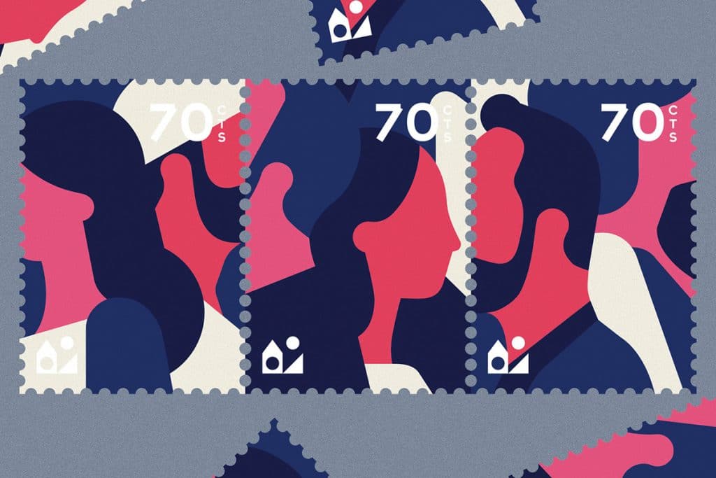
Flat design is geometric, similar to modern design and made up of basic shapes like circles, rectangles, rounded rectangles, triangles, and squares. Uncomplicated shapes like this look great on digital displays because they look good in pixels. They render well and appear sharp, clean and clear.
If you combine simple shapes with bright intuitive color palettes you can have great looking design. Flat design has a visual presence, an understandable color system and it’s easy to read, navigate, and generally traverse. Flat design uses color effectively to help a user know where buttons are and what page they are on. Flat design also uses bold sans serifs usually, which are very easy to read.
#2: It’s Simple
Flat design follows the tried-and-true “less is more” rule of design and has simple straightforward layouts that work on a grid and have lots of white space. The design presentation is simple, which is exactly why it works well for presenting complex information. Flat design is perfect for distilling complex ideas and data into simple and clear presentation formats.
Flat design is also great for presenting a clear concept or idea. For illustration and visual storytelling in general, flat design is useful for presenting a clear story or narrative that anyone can understand. For a great example of this, take a look at the Airbnb Cuba motion graphic project from Laundry:
#3: It’s Quick
Flat design is quick in a couple of different ways. First, it’s quick to load. Flat design uses flat colors, so the images lack complexity and can be only a few bytes in size. If you are working on a large detailed infographic but you are using a flat design style — you don’t have to worry about the file size of the graphic. Instead, you can focus on presenting the information in the most excellent way possible.
Flat design is also relatively quick to create. The goal is to present ideas and information clearly and directly without adding a lot of decoration. If you can come up with your visual concept and then create it quickly, using simple shape forms, all the better.
#4: It’s Pleasant
Finally, flat design is just really, really pleasant. Online there is just so much visual information that a design style like flat design seems like a relaxing oasis in comparison.
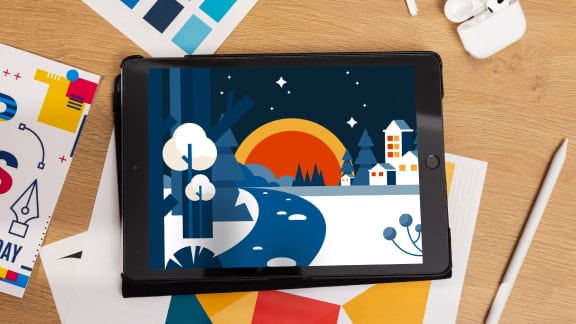
It’s clean, colorful, and simple, maybe even a bit cheery, and just really nice to look at. Take for instance, these illustrations by Andrew Kirp that are quintessentially flat. They really are just gorgeous and they are actually not that simple either. A world of detail can be found in the shading and use of transparency in these designs.

Margaret Penney is the Managing Editor of Notes on Design. Margaret is a teacher, designer, writer and new media artist and founder of Hello Creative Co.
Thinking about stretching your Adobe Illustrator skills? Sessions College offers beginner and advanced online Adobe Illustrator courses and a wide variety of graphic design courses and programs for the creative professional.
Recent Articles

