Type in History: Futura
by Margaret Penney | June 22, 2016

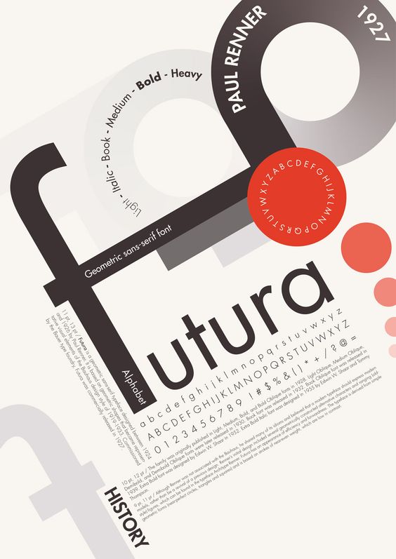
Homage to Futura designed by Clément Thorez @ http://clementthorez.com/
Futura was designed by Paul Renner in 1927 and was created as a contribution to the New Frankfurt project. The design is based on the simple geometries that became representative of the Bauhaus style. Renner was not part of Bauhaus but he shared their beliefs regarding fonts as expressions of modernity. Renner rejected the font styles of the past, the grotesques, their narrowness and lack of a consistent system to their weights and shape forms. The design of Futura helped usher in a new Modern age and was emblematic of the era.
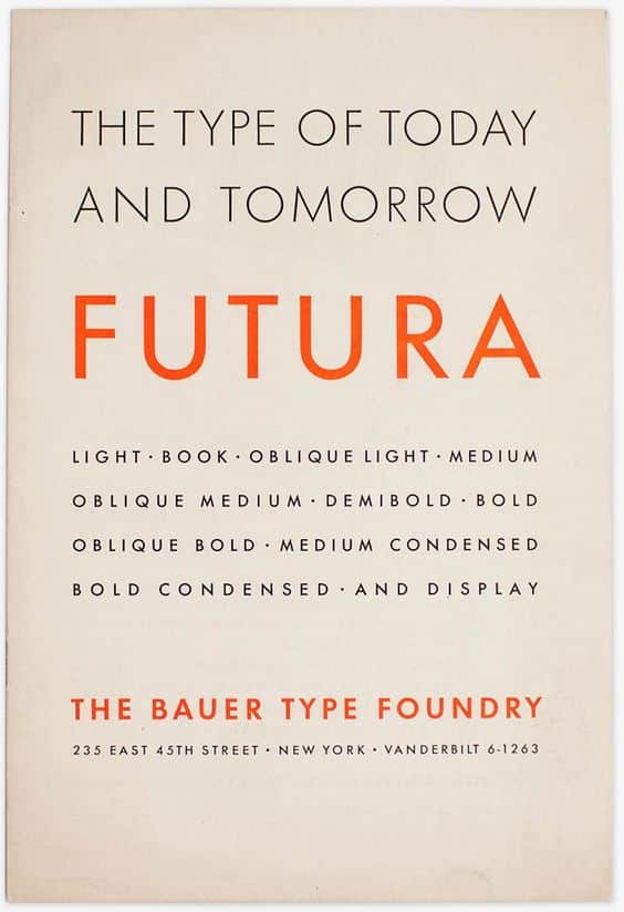
The Bauer Type Foundry
Futura’s design is based entirely on simple geometric forms — triangles, squares and near-circles. The stroke weight is almost even throughout, except for on letters like the lowercase a. Futura is distinctive for its long ascenders and almost classical Roman capitals — these elements give it its stylish elegance and differentiate it from other geometric san-serifs.
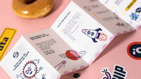
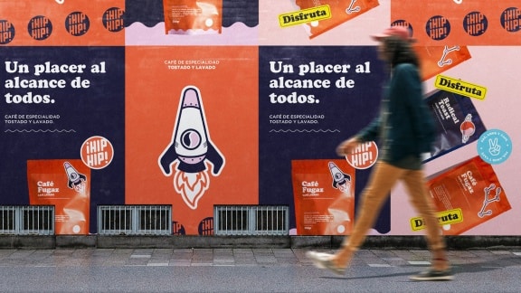
Futura can be used as a display and paragraph font and is seen in many notable and historic projects.
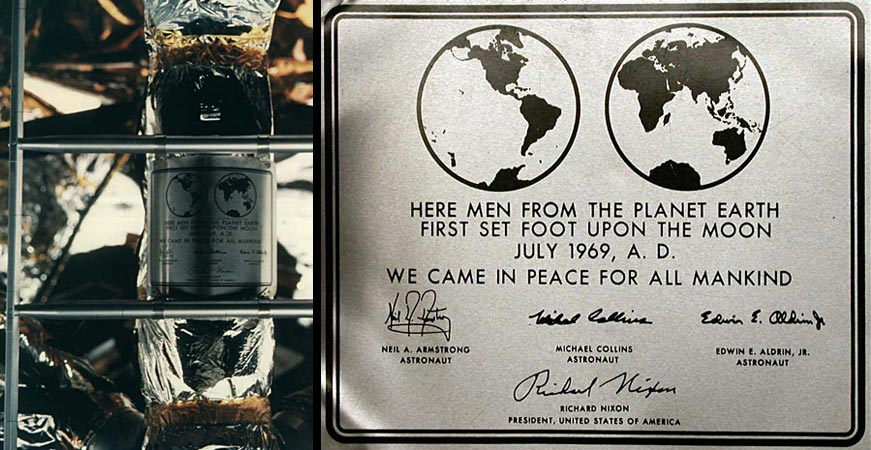
Apollo Moon Landing Plaque
The commemorative plaque left on the Moon in July 1969 is set in Futura.
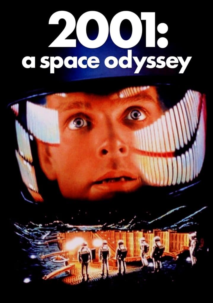
2001: A Space Odyssey
Stanley Kubrick said Futura was his favorite typeface of all time and used it for 2001: A Space Odyssey.
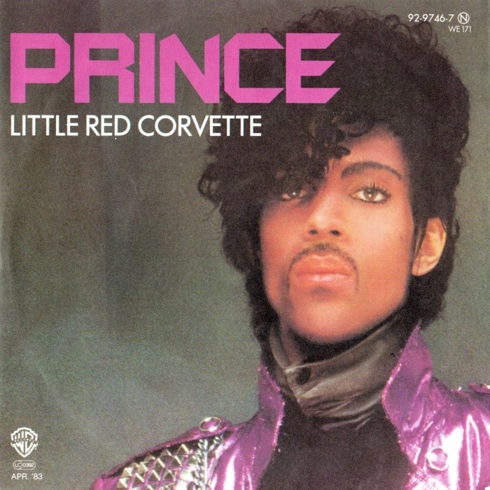
Prince Little Red Corvette
Futura is on the cover of the album release of Little Red Corvette by Prince.

Calvin Klein logo
Futura is used as inspiration for minimal logotype projects for fashion designers Calvin Klein, Louis Vuitton and Dolce & Gabbana.
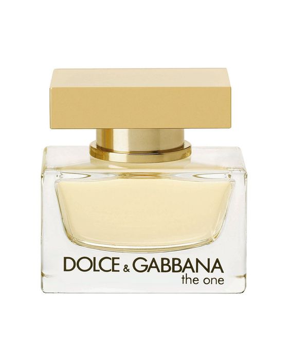
Dolce & Gabbana
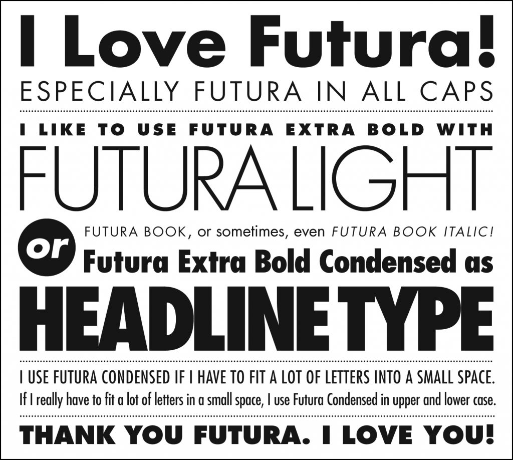
Futura Sample from https://visme.co/blog/type-anatomy/

Margaret Penney is the Managing Editor of Notes on Design. Margaret is a teacher, designer, writer and new media artist and founder of Hello Creative Co.
If you are interested in learning to use typography, Sessions College offers Basic Typography and Advanced Typography courses as well as a course in Web Typography. Contact Admissions for more information.
Recent Articles
[Modal-Window id=”1″]

