What Color is Your Instagram?
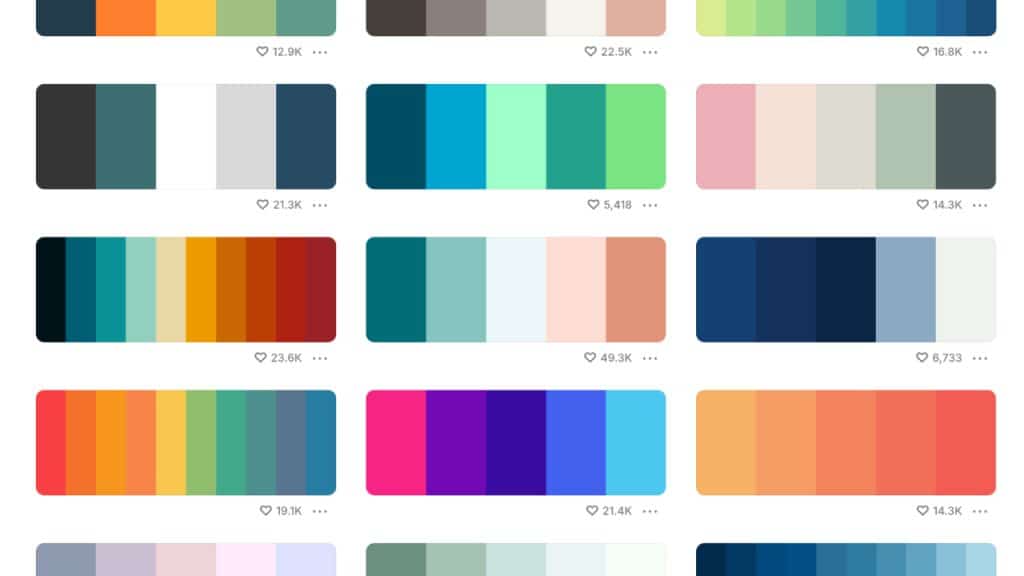
How do you use color effectively? Our Understanding Color series explores the psychology of color.
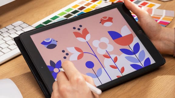
If you’re looking for ways to come up with attention-getting and market-savvy Instagram color palettes, Coolors might be just what you need. Coolors is a super fast Instagram color palette generator that can give you ideas for Instagram, design projects, and more in a simple setup that’s built to spark inspiration.
Try out the Coolors tool here: Coolors Instagram Color Palettes
Instant Instagram Color Palettes
Although every graphic designer knows the importance of Pantone or HEX codes, this is where the wonder of Coolors comes in. This platform gives you on-the-spot palette suggestions. It also gives the direct HEX codes associated with each color in the generated palette. No more guessing or extra-step color-picking.
You can also upload an image, then generate a color palette selection based on the image.
If you want to pull a color palette from your Instagram’s 9-square template, you can take a screenshot of a 9-block you believe truly captures the essence of your profile. Then upload it into the image upload tool for it to analyze.
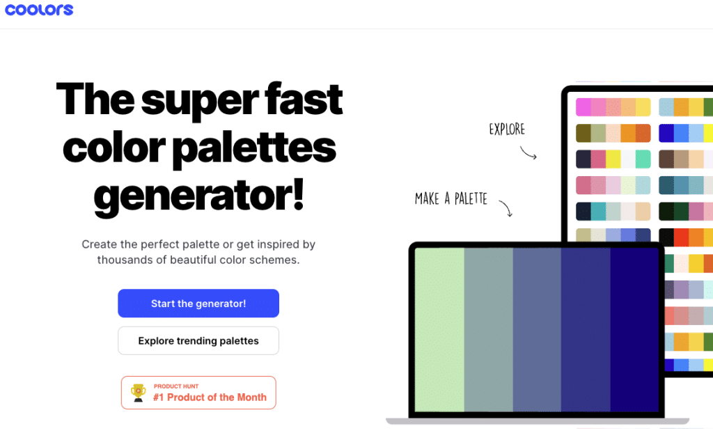
Designers can create a free Coolors profile and start collecting and creating color palettes to their heart’s content. And if you really want to go to the extra mile, you can unlock exclusive palette organization tools, layouts, and much more.
Popular Instagram Color Palettes
Below are some of the most popular color palettes being used and referenced for Instagram right now. There’s plenty to explore and the only limit is your creativity.
By sticking to one specific palette formula and using it routinely throughout your Instagram’s 9-square templates, you can make a lasting brand impression for your profile, whether it’s an influencer page, a business, or all your own.
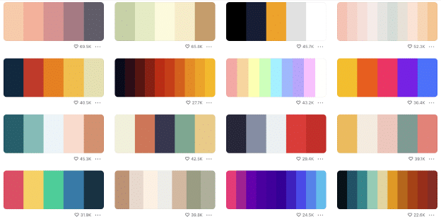
The web is full of vivid color palettes for designers to use. Your goal is to simply find the right one that speaks directly to you.
What Is My Instagram Color Palette?
An Instagram color palette is a set of colors that build a consistent look for your Instagram posts. Creating an Instagram color palette can help your Instagram posts stand out. It can also establish your brand identity and resonate with your audience, increasing engagement with your followers.
Why Do You Need an Instagram Color Palette?
An Instagram color palette helps your audience quickly identify your posts and engage with your brand. It creates a consistent brand by making your feed more recognizable and appealing to your audience. The right palette can help your channel attract more viewers and engage with them more.
How to Create an Instagram Color Palette
You’ll create a better group of Instagram colors if you know a little about how colors interact, and how they create emotion. Using one of the color schemes below can help you make the most of a color palette generator tool. Choose from:
Monochromatic Color Palettes
A monochromatic color scheme uses variations of a single color. Think different shades of blue for a calm, cohesive look. The simplicity here can set the mood for a consistent feed. Play with contrast by adjusting lightness and saturation to keep things visually interesting without overwhelming your audience.
Analogous Color Palettes
Analogous colors are next to each other on the color wheel. Together, they create a soothing, harmonious vibe. Examples are an ocean theme (blue, teal, and jade), sunset theme, (pink, peach, and orange), or a forest theme (olive, moss, and forest green). An analogous Instagram color palette can make your content feel effortlessly connected.
Learn more about The Dynamics of the Analogous Color Scheme in this article.
Complementary Color Palettes
Complementary colors are across from each other on the color wheel, like red and green. They come in pairs and create bold, dynamic contrasts that catch the eye. Here are some examples:
- Blue and orange: Make elements pop in travel or sports-themed posts.
- Purple and yellow: Add a playful or artistic feel.
- Teal and coral: For fresh, tropical posts.
- Pink and lime green: Create a youthful, energetic feel for your Instagram feed.
- Red and Green: An old favorite for seasonal or festive content.
Triadic Instagram Color Palettes
Triadic color schemes use three evenly spaced colors on the color wheel. They create a vibrant look while staying balanced. Try combining primary colors like red, blue, and yellow. Or, mix three other vibrant hues that suit your theme.
Neutral and Pastel Color Palettes
Use neutrals like beige, gray, or white along with pastels, for a soft, understated charm. You can use them to build serene, minimalist designs that wow without distracting from your content. Think of neutrals as the setting, and pastels as a touch of warmth and approachability.
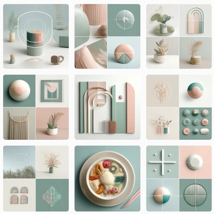
Want to learn more about color theory? Check out our Guide to Color Theory.
Or maybe you’re ready to take your understanding of color to the next level and enroll in an Online Color Theory Course. You’ll learn fundamental color concepts and dive into practical applications of color, like how to work with color and develop color schemes.
Check out our online color theory course here: Color Theory: Learn how to design with Color.
Consider Your Theme
If all this color theory seems a bit highbrow for an Instagram color palette, come back to your roots. That is—think about your theme. Are you all about fitness, fashion, the outdoors, or urban cuisine? Your Instagram theme can help you choose your color palette.
Teva is known for its superb Instagram branding. They use an earthy and neutral color palette on their profile. Their outdoor brand identity and theme helps dictate their Instagram palette. Their brand colors are tied to their rugged vibe.

Use Tools to Make Your Instagram Color Palette
Here are the best tools to build your Instagram palette:
- Coolors: Coolors is a fast, intuitive color palette generator that creates digital palettes on the fly. It’s easy to use and perfect for those who need a quick, no-fuss solution. It gives HEX codes for web design and lets you fine-tune your colors. It also offers advanced features for professionals, such as exporting palettes in various formats.
- Adobe Color: If you want more control and precision, try Adobe Color. It’s a comprehensive suite of tools grounded in color harmony and theory. It lets you make custom palettes based on color rules (like complementary, triadic, and analogous). It also integrates with Adobe’s suite of design tools, so it’s a good fit for professional designers.
- Canva: While Canva’s simple color palette generator isn’t as advanced as Adobe Color, it’s user-friendly and great for beginners. It also integrates with its broader design tools, so it’s perfect for users who want a consistent color scheme across their Instagram posts, presentations, or other designs.
- Pinterest: Pinterest doesn’t have a dedicated Instagram colors generator, but you can use it to look for specific color themes or browse curated boards.
- Sessions Color Wheel: The Sessions color wheel and color picker can help you create color schemes for your Instagram and other design projects.
Tips for Making a Great Instagram Color Palette
Here are a few tips for creating a uniquely personal Instagram color feed palette.
Be consistent
Once you’ve created a good Instagram color palette, stick to it for all your posts. That makes your feed more visually attractive and helps your followers identify your images and videos in an eyeblink. This in turn can keep followers coming back to you and grow your feed.
For instance, when dance and fitness influencer Danielle Peazer started out, she created a consistent feed with a clear brand identity. She stuck to a specific color palette that made her posts instantly recognizable. Over time, she gained over a million followers. This led to collaborations with major brands and a growing fanbase.
Make changes gradually
Don’t worry about getting stuck with a bad color palette that’s now “set in stone.” As you develop your Instagram presence, you can evolve your palette. If you start to feel like your brand colors no longer reflect your style, introduce new colors slowly. This lets your followers adjust without overwhelming them. Gradual shifts maintain a balanced look while still offering fresh updates.
One great example is fashion influencer Noelle Downing. She started out with bright red tones, but found that posts with warmer colors like orange and rust got more engagement. She slowly changed her palette as she grew her audience.
FAQ
Here are a few frequently asked questions about creating an Instagram color palette that your followers will notice.
How do I choose the right color palette for my Instagram?
Choosing the right color palette starts with understanding your theme and audience. Think about the mood you want to evoke. Do you want it to feel vibrant, calm, professional, playful? Match that to a palette that aligns with your content. Coolors and tools like Canva and Adobe Color can help inspire and fine-tune your choices.
Can I use multiple color schemes on my Instagram?
Absolutely! Consistency is important, but you can use different color schemes for specific types of posts. For instance, use a complementary color palette for eye-catching promotions and a more neutral palette for lifestyle content. Just make sure the overall tone of your feed stays cohesive.
What are some common mistakes to avoid when creating an Instagram color palette?
One common mistake is choosing clashing colors. It’s tempting to try and fit every color into your palette, but it can make your feed look cluttered and chaotic. Stick to a few key colors and adjust their shades and tints to add variety.
Another common mistake is overlooking how your audience sees colors. For example, overly bright colors might feel overwhelming to some viewers, while others may not resonate with muted or pastel tones. Choose colors that reflect your brand but also appeal to your target audience. Test and adjust as you go.
How can I tell if my Instagram feed has a cohesive color palette?
If your posts look like they belong together when you view your profile grid, then you likely have a cohesive palette. Try scrolling through your feed with the sound off and see if your photos and videos naturally flow together. If they feel disjointed, consider refining your palette.
How often should I change my Instagram colors?
You don’t need to make drastic changes frequently. Make small shifts in your palette over time, as your content and brand evolve. Tiny changes can keep your feed fresh and relevant. Introduce new colors gradually, and avoid sudden, overwhelming shifts to maintain continuity.
Do I need to be a professional designer to create a successful Instagram color palette?
Not at all! With tools like Coolors, Canva, and the Sessions Color Wheel, anyone can create a visually appealing and effective Instagram color palette. It’s all about finding what resonates with your style and audience. Even without design expertise, experimenting with colors and being consistent will give your Instagram a professional feel.
What colors attract people on Instagram?
Bright colors (red, orange, yellow) grab attention and evoke energy, while pastels (pink, mint, lavender) create a calm, elegant vibe. High-contrast combos (blue/orange) pop, earth tones (beige, olive green) feel authentic, and neutrals (black, white) are timeless. Stick to a palette for consistency, Use bold colors sparingly to draw attention to important details, and use Instagram insights to see what colors resonate most with your audience.
What color gets the most likes on Instagram?
Studies by visual analytics firm Curalate, which analyzed over 8 million Instagram photos, found that images with predominantly blue hues receive 24% more likes. Blue tones evoke feelings of calmness, trust, and serenity, making them highly appealing to viewers. Balance blue with complementary colors (like white, beige, or soft pastels) for a clean, engaging aesthetic.
Which color profile is best for Instagram?
The best color profile for Instagram is sRGB (Standard Red Green Blue). Here’s why:
- Compatibility: Instagram is optimized for the sRGB color profile, which is the standard for web and mobile platforms. Using sRGB ensures that your images display consistently across different devices.
- Color Accuracy: Other color profiles, like Adobe RGB or ProPhoto RGB, may have a wider gamut, but they can cause color distortion when compressed or viewed on non-color-managed screens.
- Compression Handling: Instagram applies heavy compression to images. Images in sRGB retain their colors better after compression.
What are some additional tips for Instagram images?
- File Format: Use JPEG or PNG files for better quality retention.
- Resolution: The recommended resolution is 1080 pixels wide by 1350 pixels tall for vertical images, or 1080×1080 pixels for square images.
- Color Editing: Edit your photos in sRGB to avoid unexpected color shifts when uploading.
- Export Settings: When exporting from software like Photoshop or Lightroom, ensure the color profile is set to sRGB.
Conclusion
Tools like Coolors and Adobe Color can help you find the perfect Instagram colors, fast. Don’t worry about getting locked into colors you don’t love. Even after you choose a color palette for social media, you can make small, gradual changes based on how much your audience engages with your different posts. You can always archive or delete old posts if you want to change your color scheme. As you evolve the best palette, you can grow your follower base, increase your visibility, and build a strong brand identity that is true to you or your business.

Margaret Penney is an experienced Brand Designer and Art Director as well as a teacher, designer, writer, and new media artist and Founder and Principal Designer of The Design Craft and 9& Studio.Read more articles by Margaret.
ENROLL IN AN ONLINE PROGRAM AT SESSIONS COLLEGE:

