Why They Work: Craig Mullins
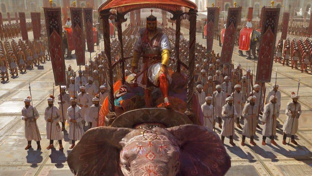
Our Why They Work series explores what makes a leading artist unique.
If you’re interested in concept art, particularly for the game and film industries, Craig Mullins is an artist to check out. He’s your favorite artist’s favorite artist.
Mullins is one of the few people to achieve legendary status since the advent of digital art. He’s left his mark on some of the biggest titles in entertainment over the past few decades and carved out a path for future digital artists to follow in his footsteps. He is regarded by many within these industries as the godfather of digital painting.
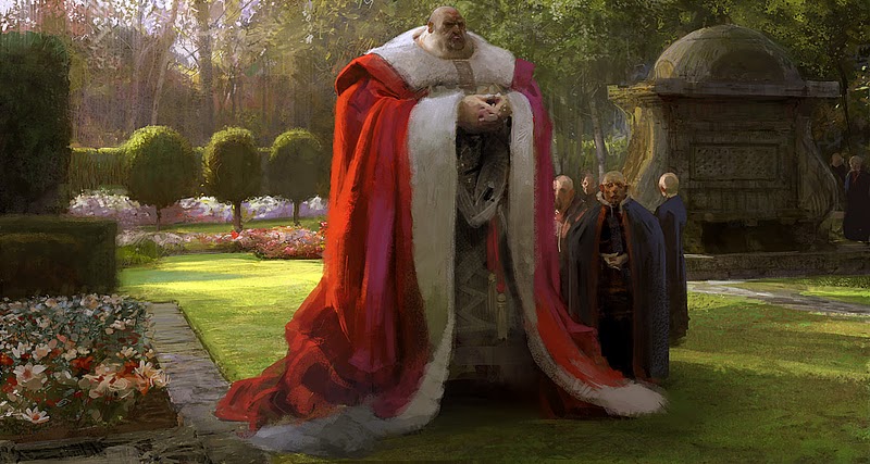
Mullins got his start in the art world while studying at Art Center College of Design, where he learned product design and illustration. Upon graduating, he began work as a transportation designer for Ford. The job was a poor match, however, and he headed back to Art Center where he obtained a BFA in illustration.
It wasn’t long before Mullins found work in the film industry, contributing concept art and matte paintings for some of the most iconic films of the 90s, such as Jurassic Park, Armageddon, and Forrest Gump, just to name a few.
Beyond film, he’s also worked in print and video games, with his name once again attached to some of the industry’s heavy hitters, like Halo, BioShock, and Mass Effect. If video games aren’t your thing, he’s also illustrated a number of cards for Magic: The Gathering. His artistic fingerprints can be found throughout pop culture over the last three decades.
In addition to his film and game accolades, he’s also credited as being one of the first artists to utilize digital tools in his professional work. Progress within the art world is always met with resistance. Like the use of oil paints and acrylics, digital art, too, was met with an old guard reluctant to acknowledge its legitimacy.
Fortunately, with Mullins at the helm, they had no choice but to concede. It was impossible to ignore his talent, and as studios grew privy to the benefits of digital art, such as its speed and freedom of location, it wasn’t long before its use became more widespread. Mullins himself realized this early on as well, moving to Hawaii, where he continues to produce work to this day.
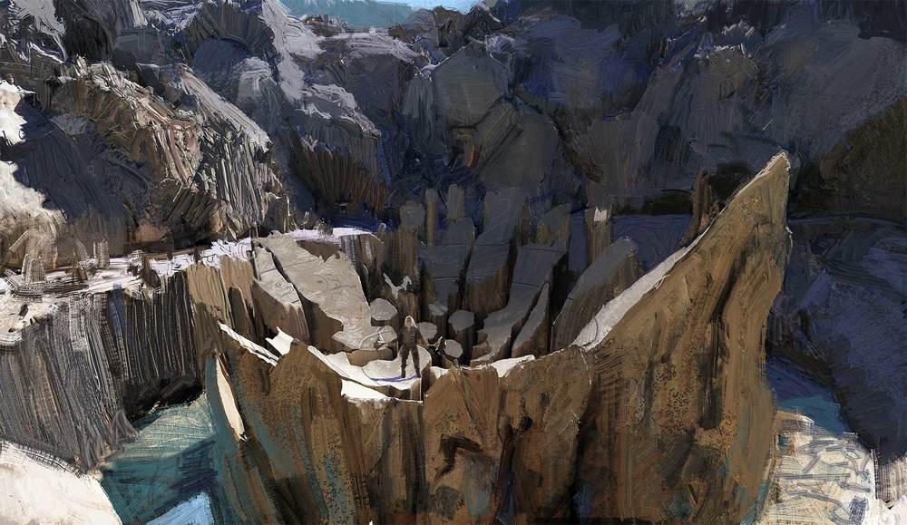
Mullins is known for his painterly style. Having first learned his craft using traditional mediums, he simply applied what he knew to the digital canvas. His works possess many of the same hallmarks of a master oil painter. Like Sargent, Mullins shows great control over his brush strokes, switching between broad, confident strokes and smaller scribbles used to add visual interest and texture. He masterfully guides the eye through his pieces, controlling the tempo through lighting and selective detail.
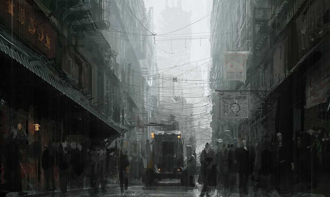
The skilled use of subtle shifts in hue and the value structures in Mullins’ compositions display a keen eye for drama. Upon closer inspection, many of his works don’t actually possess a high level of render. The details of his pieces are more implied than carefully designed, but this, in my opinion, is part of what helps his work to feel less digital.
With the ability to zoom in and render every single pixel, many digital artists over-render their paintings. This contributes to the flat, sometimes sterile quality of the medium.
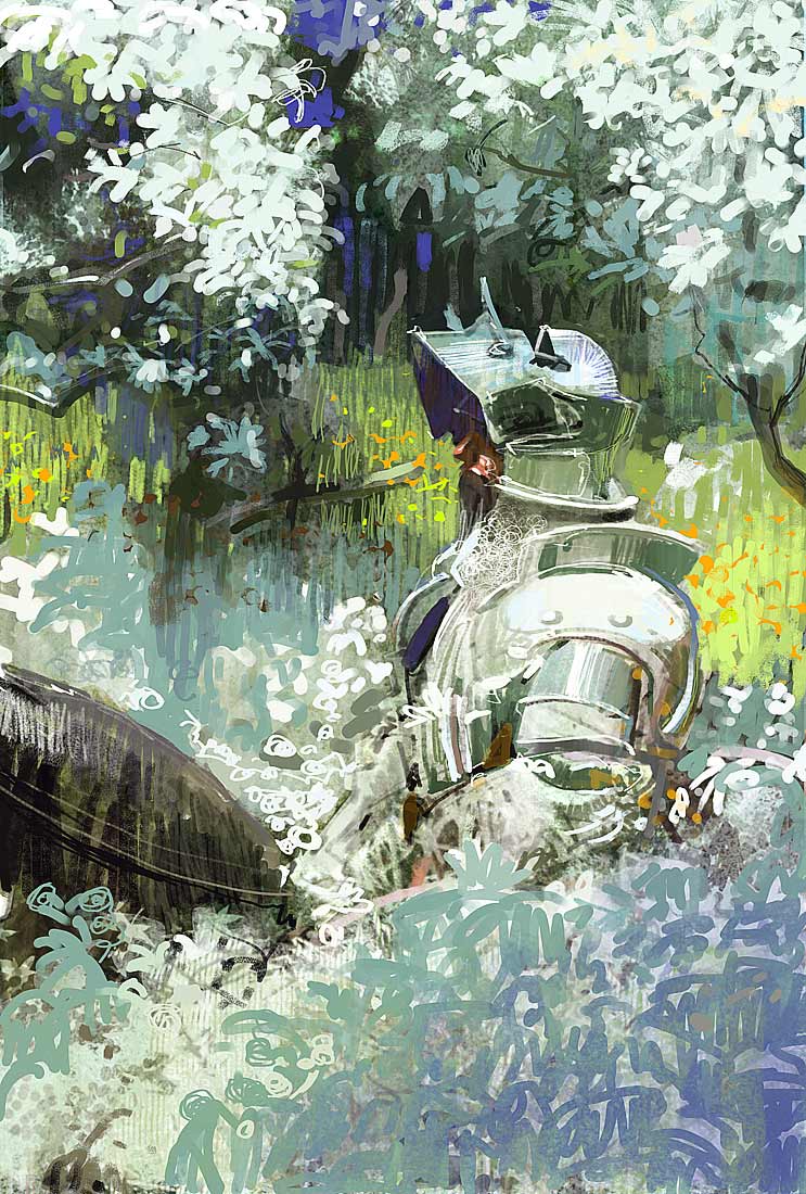
When looking at a Mullins, on the other hand, you’re aware it’s digital, but not in a distracting way. He’s successfully bridged the gap between traditional and digital mediums. His works feature the charm of the traditional while highlighting the strengths of the digital, and that, is why they work.

Taylor is a concept artist, graphic designer, illustrator, and Design Lead at Weirdsleep, a channel for visual identity and social media content. Read more articles by Taylor.
ENROLL IN AN ONLINE PROGRAM AT SESSIONS COLLEGE:


