Why They Work: James Jean
Our Why They Work series explores what makes a leading artist unique.
James Jean is a Taiwanese American artist who was born in Taiwan and grew up in New Jersey. Though at a young age he dedicated himself to music, he would later develop an interest in art and go on to study illustration at the School of Visual Arts in New York City. Upon graduating, James’s job prospects were bleak. After making the rounds in person with his portfolio in hand, James was rejected by every art director he met with.
With New York still a chaotic mess following the attacks that had taken place on September 11th the month prior, James fled to Austria where he found peace drawing in parks and cafes. At this point in time, James had a blog where he shared his sketchbook work. The drawings he made while in Austria began to attract a great deal of attention to his site.
When he returned to New York, he had a message on his answering machine waiting for him. It was DC Comics, and they were offering him the opportunity to illustrate covers for their new project, Fables, which was being produced by Vertigo, an imprint of DC.
This gave birth to a long career as a cover artist, for which he won six Eisner Awards. During this period of time, his work attracted the interest of many new commercial clients in industries including advertising, music, film, and even fashion.
He’s created cover art for My Chemical Romance, Talib Kweli, and Linkin Park, and has worked with Prada on multiple occasions designing installation spaces and textiles. In 2007 he began to distance himself from the commercial art world and transition into a career as a fine artist.
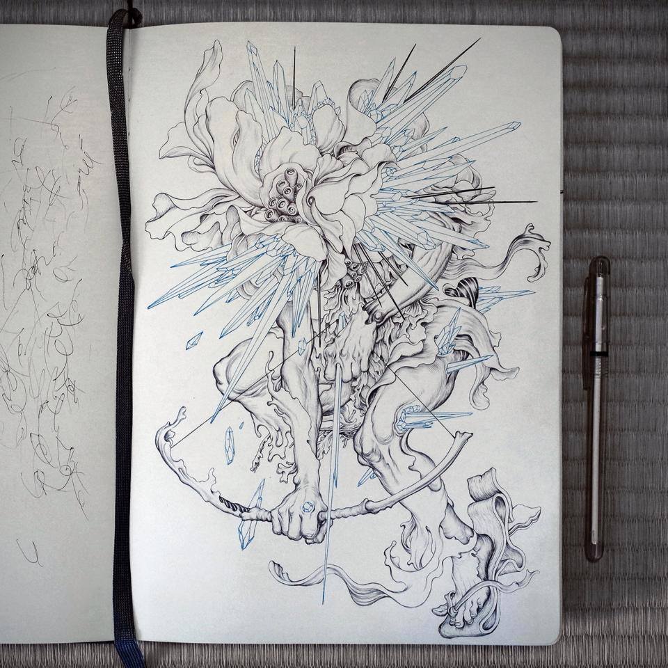
Over the past 20 or so years, James’s style has undergone several different evolutions. In 2010, his drawings took a radical turn.
Born from a series of intricate sketchbook drawings done with a ballpoint pen, James began to incorporate highly detailed linework in his pieces. This has since become a trademark of his style in his illustration work.
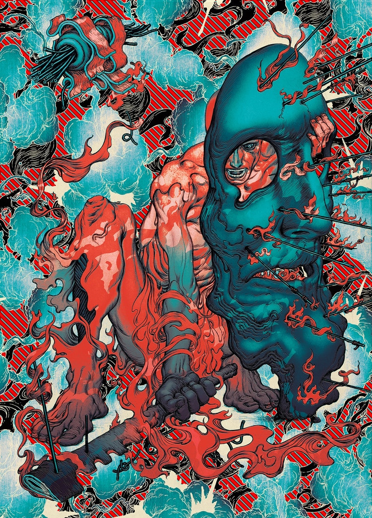
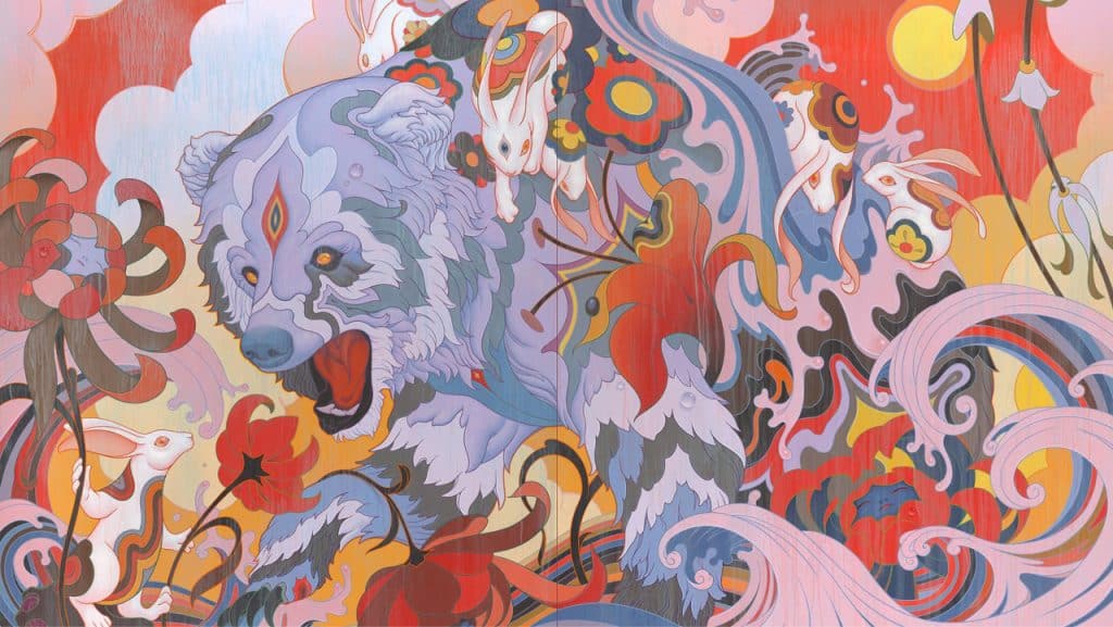
Regardless of medium, there are some aspects of his work that just scream James Jean. The loose, gestural quality of his figures is one such feature that appears in both his illustrative and fine artworks.
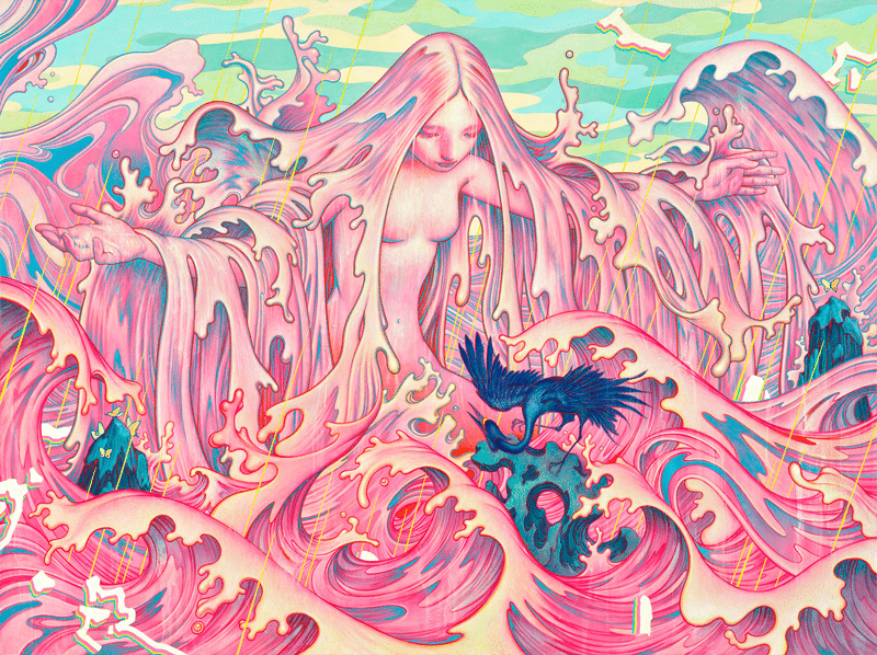
His love for curvilinear forms and layers shows, as he often employs shapes that flow like liquids, melting into one another, creating surreal scenes suspended in time and space.
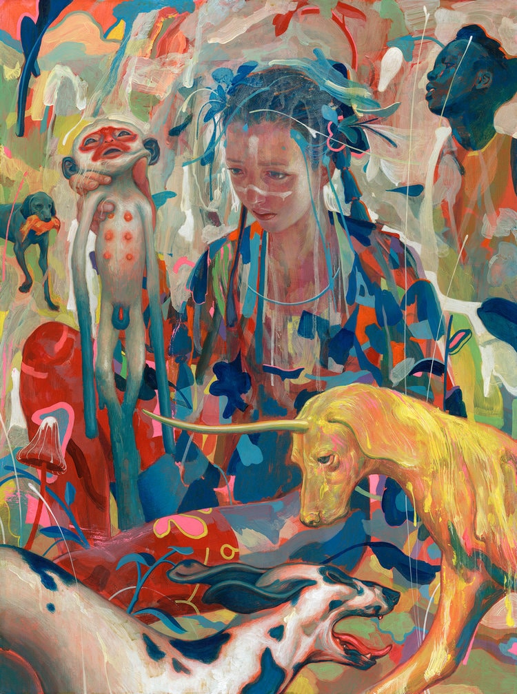
In more recent exhibitions, he seems to have struck a happy balance between the looseness of his forms and the tight, neatness of their execution. While the use of line still makes his paintings clean in appearance, James makes use of acrylic washes over top both his lines and fills. The randomness of the blending and bleeding of the colors results in an aged appearance that gives his paintings a sort of patina and character that would be impossible to achieve with intent.
This contrast between the cleanliness of his line and the muddiness he introduces, mimics the process of paint being exposed to the elements. This contrast is also mirrored in the often historical subject matter of the pieces and their contemporary execution. Relics and folktales feel at once old and new as their ancient forms are depicted in bright color, melting and unraveling like the boundaries between past and present.
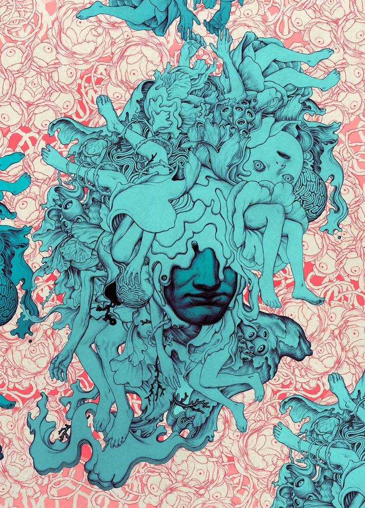
Only recently turning 40 years old, James Jean has already had an incredibly diverse career. He’s successfully transitioned from the commercial art world into a career as a fine artist and his paintings have been displayed in exhibitions all over the world. Artists tend to get better with age and I’m excited to see what the future holds for James.
His clean, fluid lines and thought-provoking symbolism have captured the minds of millions, and that… is why they work.

Taylor is a concept artist, graphic designer, illustrator, and Design Lead at Weirdsleep, a channel for visual identity and social media content. Read more articles by Taylor.
ENROLL IN AN ONLINE PROGRAM AT SESSIONS COLLEGE:


