Why They Work: The Brushwork of Giovanni Segantini
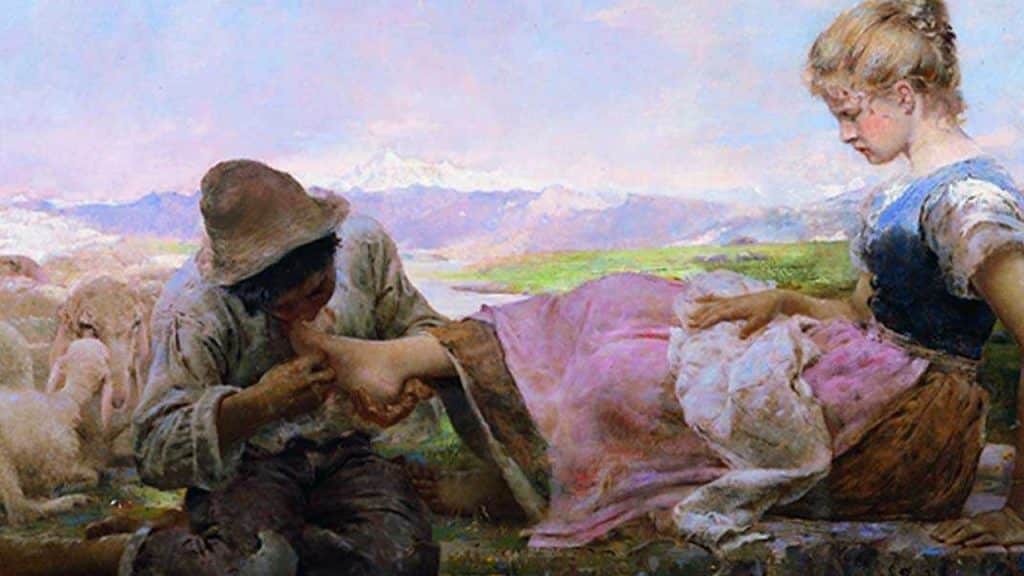
Our Why They Work series explores what makes a leading artist unique.
Giovanni Segantini was a 19th Century Italian painter whose work is most closely linked with the Symbolist movement, though this association came at a later point in his career. He painted in a Divisionist style, similar to Pointillism, in which small amounts of varying colors are placed side by side, giving the impression of a unified whole when viewed at a distance.
Practitioners of both Divisionism and Pointillism believed that painting in this matter, scientifically, gave their work greater luminosity when compared to more traditional styles of painting. Let’s take a look at why that might be the case.
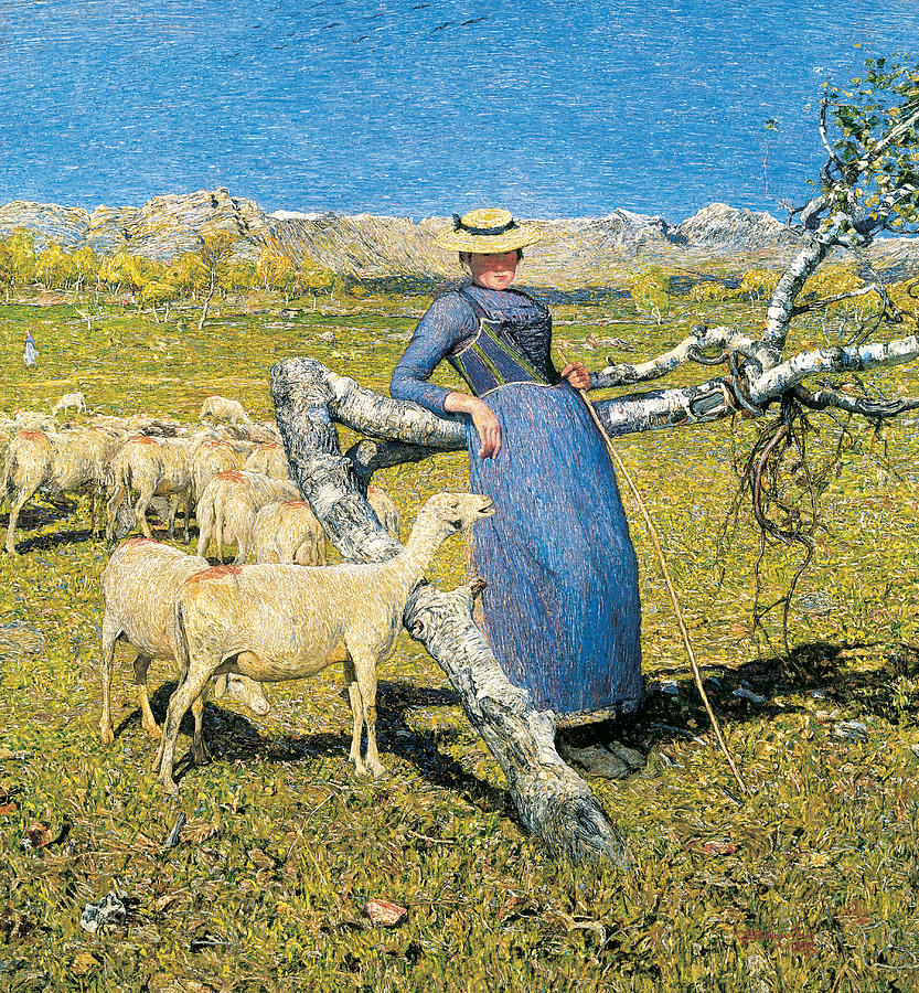
Let’s start by looking at “High Noon in the Alps”, completed in 1892. Immediately, the piece has a lifelike quality about it. Though it’s a still scene, it has a sense of gentle movement to it. This is due to its thousands of tiny brushstrokes, but we’ll explore that more in a moment. It’s important to note that when painting in this manner, the color choices are not selected at random.
Within any given inch of the painting, there’s an intricate balance between cools and warms at play. Traditionally, this sort of color unity is achieved by creating desaturating versions of the palette colors and introducing them into other areas of the composition. For example, the warmer flesh tones of the face might be mixed with a bit of the blue from the sky. The result would be a desaturated cool, a purplish-grey, that, due to its parents, could be incorporated into various other parts of the painting without standing out.
One of the greatest strengths of the Divisionist/Pointillist approach to painting is that because the paint is applied in such small amounts, pure amounts of color can be used without broadcasting their presence. Rather than mixing the paint, the painter relies on the human eye to do the mixing. In the example below, I’ve isolated a few different parts of the painting & pulled out some surprising colors.
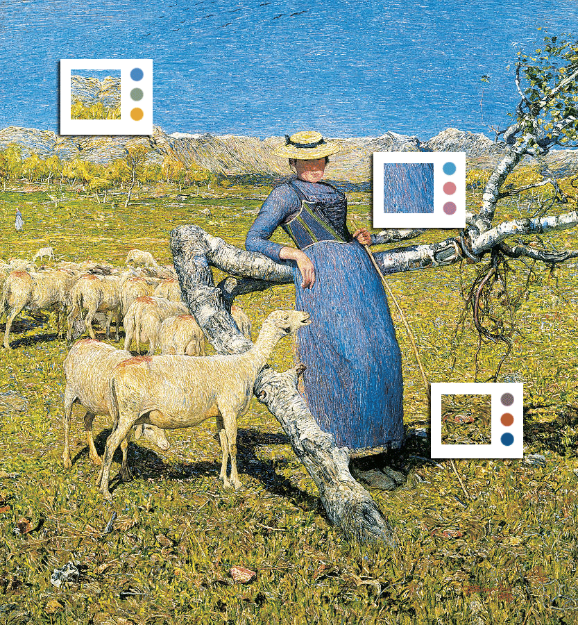
As I mentioned before, the color choices are not random. In order for this piece to work as a whole, the colors used must conform to an underlying value structure. By squinting your eyes, you can get an idea of what I mean. Squinting removes some of the nuances of color and brushwork. This allows you to focus more on the forms created through careful placement of dark and light values.
Below, I’ve desaturated the image and blurred it to remove some of the brushwork. As you can see, you can still make out the subject matter of the painting.
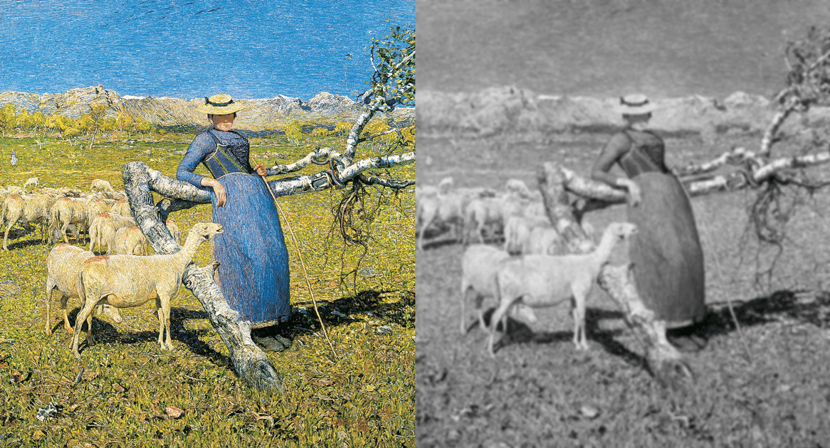
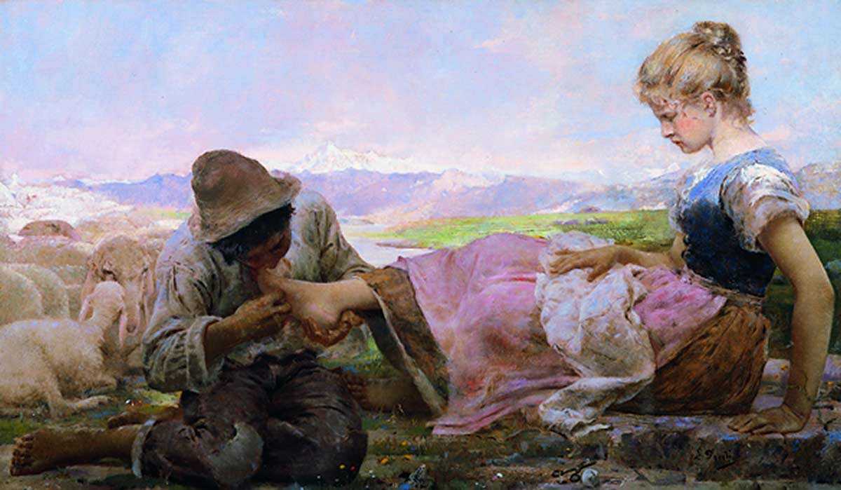
Key to this technique is the size of the brush used. Though not consciously, the eye is aware of the presence of the tiny brush strokes working together to communicate form. Without a solid surface to serve as a resting point, the eye continues to move through the painting. This causes the viewer to feel a sense of movement and life. Segantini also masterfully uses the direction of his brush strokes to communicate form and control his focal point.
In the painting below, he uses diagonal brush strokes for the grass in the foreground to imply movement in response to the horse above. He also uses a higher level of both detail and value contrast in the front half of the horse and the grass closest to the viewer. This gives the piece depth and makes the horse feel as if it’s moving towards the viewer.
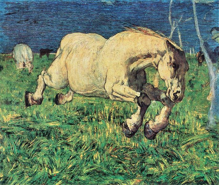
Another effect of these tiny brush strokes is their ability to communicate a sense of time. As we take a closer look at the piece, we consciously or subconsciously sense the amount of time it must have taken to paint each individual stroke.
As we’ve seen, much of the beauty of Segantini’s work lies in its ability to evoke a physical response in the viewer. He utilizes tricks that prey upon the human eye and the way it processes information. However, beneath these techniques, his paintings operate on solid fundamentals, and that… is why they work.
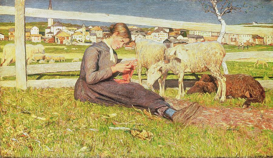
Take a look at the paintings below to see more examples of these techniques in action.
Taylor is a concept artist, graphic designer, illustrator, and Design Lead at Weirdsleep, a channel for visual identity and social media content. Read more articles by Taylor.
RELATED ARTICLES:
SESSIONS NEWS:
ENROLL IN AN ONLINE PROGRAM AT SESSIONS COLLEGE:


