Winter Whites Palette Inspiration
How do you use color effectively? Our Understanding Color series explores the psychology of color.
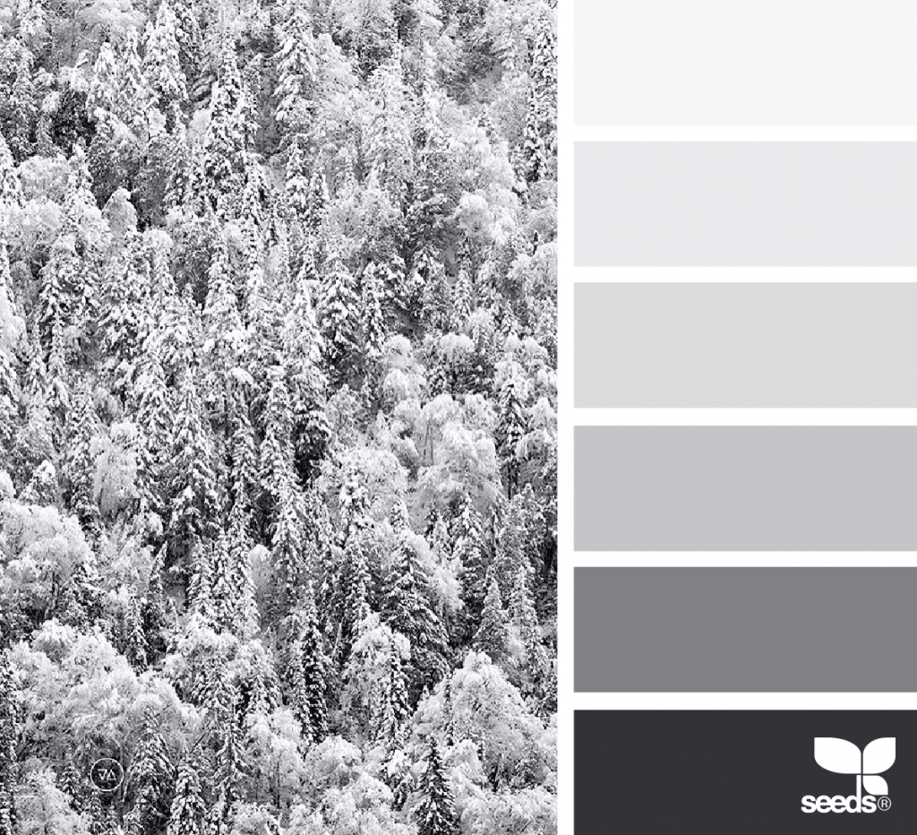
Winter is a wonderful time to explore cooler and neutral colors in design projects. Subtle and nuanced, winter white tones can appear festive, frosty, or elegant depending on how they are applied. Snow-topped mountains, fields and trees, sparkly ornaments, sugar cookies, snow globes, and the North Pole are all a source of inspiration.
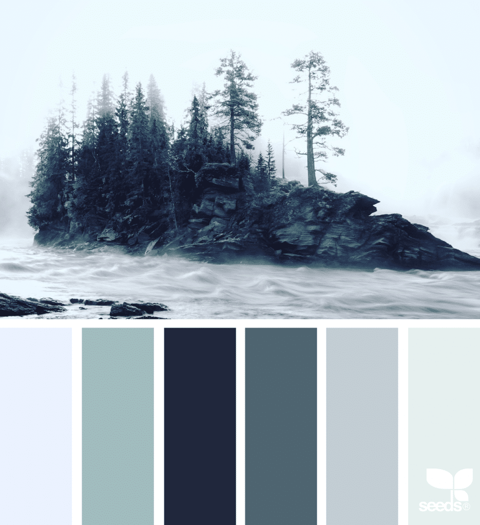
Let’s explore some lovely wintery white palettes.
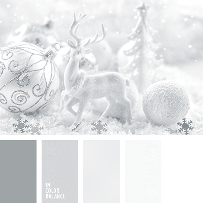
A nuanced and subtle palette that moves from pure white to a green-tinged gray, this palette evokes a menagerie of winter wonderland ornaments.
A winter white palette doesn’t have to be too frosty, in the palette above the trees peep through as a warmer gray-brown.
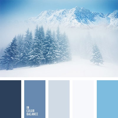
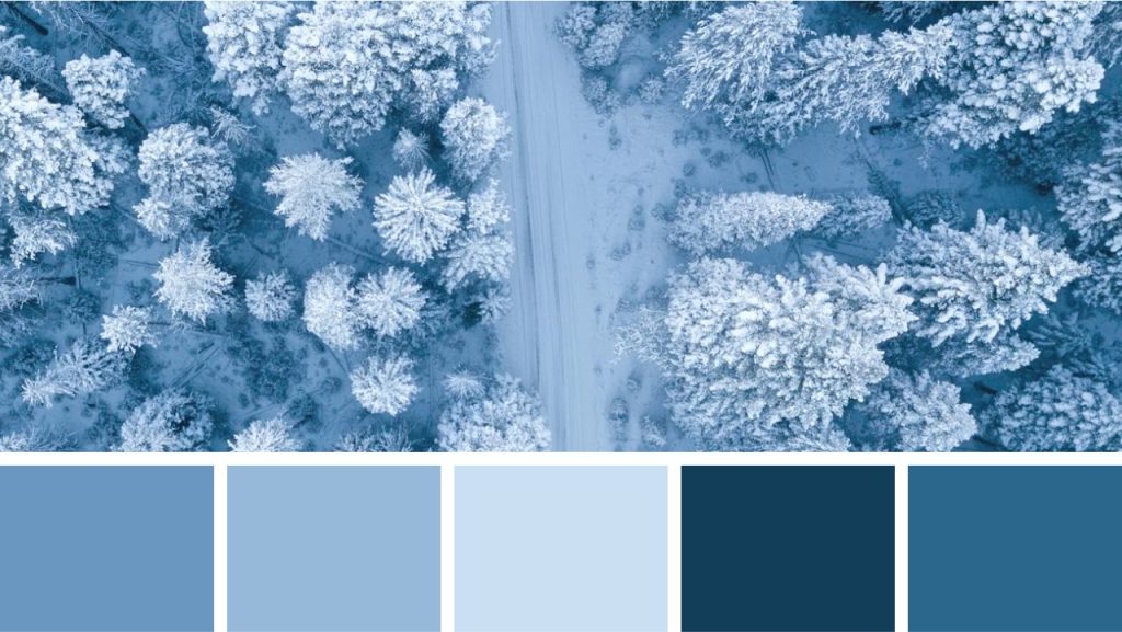
You might mistake this wintery palette as something nautical and by the seaside, with all this blue.
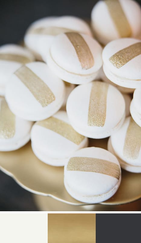
Combine winter white with gold and a very dark blue and you have something quite sophisticated.
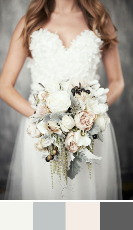
Add some light sage and blush pink and you have something rustic and feminine.
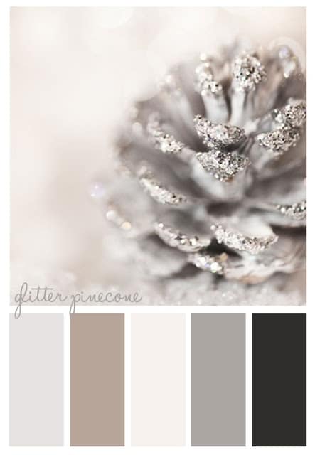
Nothing says holidays like a glitter pinecone, this palette works because it is neutral but actually has a lot of contrast.
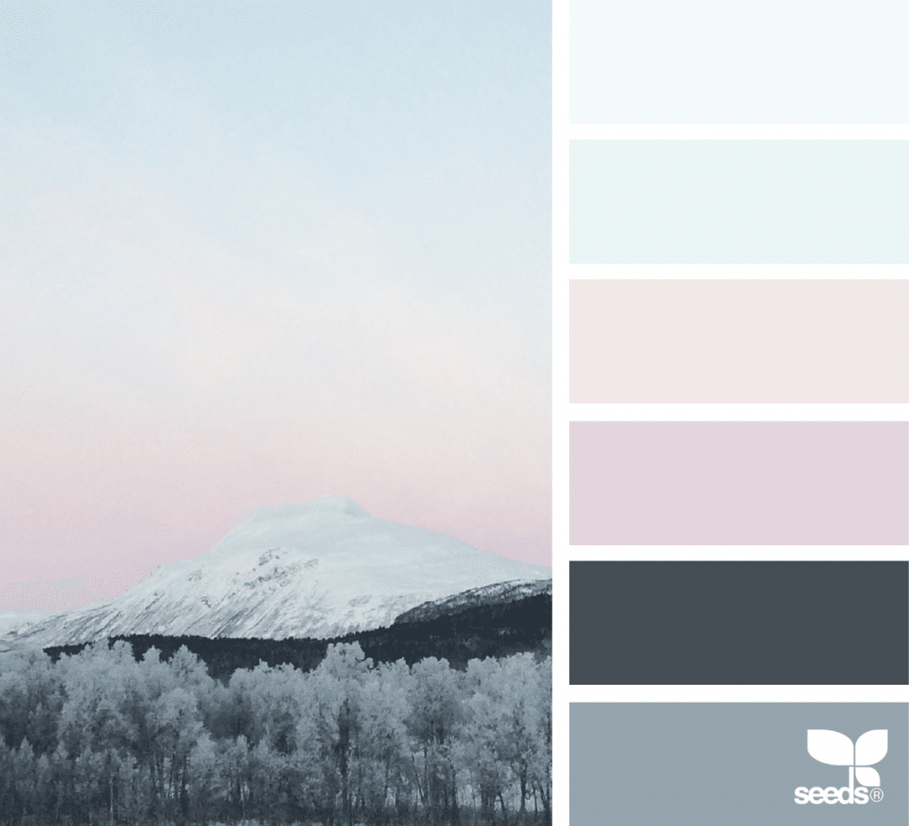
The Arctic Chill palette at Design Seeds works relaxing pastels into the mix.
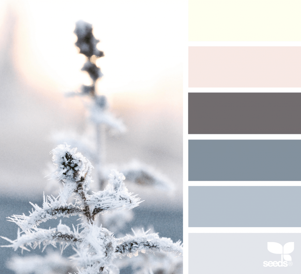
The Arctic Frost palette evokes the feeling of a new day with a sunny light yellow.

Margaret Penney is an experienced Brand Designer and Art Director as well as a teacher, designer, writer, and new media artist and Founder and Principal Designer of The Design Craft and 9& Studio.Read more articles by Margaret.
ENROLL IN AN ONLINE PROGRAM AT SESSIONS COLLEGE:
